Home Decor Designed for Living with Style: Kips Bay Showhouse 2017
 |
| Moon Gate in the Janice Parker-designed Garden at the Kips Bay Showhouse 2017 |
With the NKBA annual Kips Bay Showhouse breakfast today - well yesterday by the time I completed this post - I was pinched to put design into high gear and share my recent tour of this ultimate home decor storybook; brimming with inspired fantasy and creative design.
The Kips Bay Showhouse runs through June 1st.
The Kips Bay Showhouse runs through June 1st.
If you’re in town (NYC) for the 29th Annual International Contemporary Furniture Fair (ICFF) (and today the show is open to the public) - you and your design cohort can take in a double-header.
Be sure to visit the Baden Haus RETRO Collection -- it’s online too. RETRO was designed by my Homegrown friend, Toni Sabatino. And crafted in Italy. Toni is the goddess of design -- and social media! The collaboration and the collection is all so exciting and glamorous. More on this marriage of artful design shortly…
Kips Bay Showhouse
As a storyteller and garden designer, I was especially enchanted with this year’s Kips Bay locale and pedigree. The brick Georgian townhouse at 125 East 65th street was designed by Charles Platt, an early 20th century American architect and landscape architect and artist -- certainly the trifecta of design talent. From the mid-1940s until recently, the house was the headquarters of the China Institute in America, thereby lending the showhouse some spectacular “bones” for the delightfully astonishing garden.
There are 18 decorators displaying their talent on five floors. Give yourself time to explore - and to chat with the designers - it’s wonderful to have the opportunity to talk to them and learn about their inspiration and design process.
(A full list of designers below.)
Here are my favorites:
Enter up steps to the front hall and the nook designed by Powell & Bonnell stops you in your tracks. What a grand entrance (and what a conversion from the “before” space.) That I counted no less than 30 elements that comprise this small space amplifies the significance of the details needed to produce this eclectic composition that the designers refer to as “a transitional, garden-like casual atmosphere.”
The Farrow & Ball black walls are a luxurious backdrop to the composition. I just adore both Farrow & Ball’s line of highly pigmented and environmentally friendly paints -- as well as dark, mysterious walls… The brooch-like gem of a table shimmers with flowers. Its elegant look beckons all - the - way - down - the - staircase…
I covet their “Narcissus” table.
I started my tour from the top down -- which is never a bad way to go -- for many reasons. Foremost, I was thinking the garden room design would be on the roof. It wasn't. And in a twist on things, I almost missed the garden - which would’ve been a heartbreaking loss of epic proportion. However, upon heading out after we concluded our house tour, me and a treasured friend who is also a garden design client - were asked if we'd checked out the shop. We hadn't. So we did a roundabout back in -- to discover all that awaits on the lower level. More on that later.
Master Bedroom
The top or fourth floor began with Dineen Architecture + Design Here, I was delighted to find a swing in the room, designed by Christopher Kurtz.
I love this whimsical folly -- that at the same time provides blissful utility.
I too designed a swing into my country house spa - and while some thought it more than curious, and while it is a folly - it’s also elegant -- with a modicum of playfulness! My swing was made to order by B. Pila Design.
Further, the swing ties in my kind of tree theme there - riffing off the opposite solid wall of cherry blossom Ann Sacks hand cut, glass mosaics that pays homage to the incredible Kanzan cherry blossom tree just outside - tantalizingly close beyond the window. Oh those double cluster pink blossoms are breathtaking. And not just for spring when in my spa!
I’m looking to acquire the Dagmara Weinberg erotic cherry blossom art I first encountered at the Architectural Digest Show - for the wall behind the swing. (see earlier Garden Glamour coverage)
And there’s the original tree art painting on the wall above the sleek, grey velvet divan with its shapely lucite legs. Perfect for tree gazing.
Seeing the swing at the showhouse was the sort of design reinforcement and support for my own swing design concept. Thank you.
The other moment of design serendipity was their use of the blue shimmery plate on the wall.
The color and the texture adds dimension and drama.
My design simpatico is this blue mirror that I saw in House Beautiful magazine late last year:
After more than six months of negotiating and scheduling, the mirror is expected to arrive this week after a very protracted delay… Fingers crossed.
The Dineen room was a mix of understated refinement with elements such as the graceful sheer drapes (Pierre Frey) lined with grass cloth (Schumacher) and bed’s elevated headboard.
Along with the unexpected, such as the console table with built in bowl-like container inserts for coins, jewelry and such.
Loved these quirky punctuations: lights that are made from computer motherboards!
Attic Sitting Room
Meeting designer Neal Beckstedt was joyful! I asked how he came about the sensuous and rather undulating room design, Neal explained his inspiration was falling in love with this fine art painting by Pieter Hugo he’d discovered at the Yossi Milo Gallery . Neal described the captivating color palette and texture that in turn allowed him to play off the North African patterns and texture to create a room that is both primal and sophisticated. It seems so of this time…
| Neal Beckstedt & his artful inspiration |
Allow me to emphasize that one shouldn’t be diminished or distracted by “smallish rooms” - there is an overabundance of design opportunities that exist in every room size. I daresay that is why designers and decorators cringe at the McMansions vision that rooms need to be “Huge..” uh oh. There’s that word…
With a mix of sensual elements, there isn’t one thing that stand alone, except for the undulating, biomorphic, black plaster fireplace Neal created.
Or then there’s the standout Jean Michel Frank stool created by Neal Beckstedt Studio or the vintage Swedish rug
and the inventive, multi-layered Roman shade (Dedar) window treatments (James Malone) - with fringe (Rogers & Goffigon).
The oak-paneled walls, sexy, curved cinnamon-colored couch and fuzzy Fritz Hansen armchair added to the ambiance of cozy and sophisticated.
Salon Du Beau Monde
The Nick Olsen Inc. designed room is straight up glamour. Of note to me were the Drapery floor lamps by Mecox -- that really looked like a ball gown!
The Nick Olsen Inc. designed room is straight up glamour. Of note to me were the Drapery floor lamps by Mecox -- that really looked like a ball gown!
Along with a kind of Finishing Touches cocktail composition that should be worked into most every room - given the mix of art, cocktail accessories, and the James Samson Georgian Gessoed Bar Table. The bottles and tools are pieces of shimmery art unto themselves.
The look conjures the pomp and tradition or creating a drink -- with a special garnish -- and the promise of fabulous cocktail conversations….
The Attic SRO
This oh-so-sexy shadowy room, designed by Billy Cotton, is one of three or four rooms with the most intriguing backstory… It positively reeks of humid languor…
According to Cotton: This is the final home of a woman who had seen all sorts of tragedy, some self-inflicted. She loved too much, and all the wrong men; there was definitely addiction and financial ruin,” he said. “In her last stage of life,” Cotton reported, “she is holed up in the top floor of an S.R.O. hotel, once a grand townhouse, surrounded by donated finery — a spangly pillow on a chair with a tropical print, a leopard-print carpet, the novels of Graham Greene — the largess of her decorator friends. This (interior design) has long been a profession of gay men,” he said, and this room celebrates the relationship “between the decorator and his female patron.”
The room had me at the peacock art on the entry wall! I adore peacock art! This keeper is by Brooklyn-based floral artist, Carol Bove - who I learned shows at the Maccarone Gallery
The shimmery fireplace (Samuel Amoia Associates), the mix of florals on window treatments and chairs (Pierre Frey), hand-painted silk walls (Fromental LLC), and leopard print carpet (Stark) was assuredly my cup of tea. Why? It’s a mix of sultry patterns, sophisticated glamour, and relaxed lifestyle.
Whew! Give me a cigarette. And we'd only made through one floor... Next up: we headed down to the third floor.
Master Bedroom
Susan Ferrier of Mcalpine is a vast bedroom worthy of focused exploration. Which dovetails with Ferrier’s backstory once it’s revealed: She says the bedroom inspiration started with a collection of archaeological prints,
followed by “A little romance. And that romantic partnering is between “A league of extraordinary male archaeologists,” she said. Think Explorers Club meets the Ritz.
The wall behind the bed is flanked by hand embroidered mossy green drapes and a whale bone sculpture. On the bed is a long lumbar pillow, a bed accessory Susan has long loved. Languidly lying on a goatskin hide is a rather huge tray (oh that word once carried no baggage…) Regardless of the words, this is one sexy composition.
I liked the draped wool and satin drapes with silk, hand embroidered trim.
The placement of mirrors and crystals was carefully situated to add light, shadow; reflection...The room appealed to my ying-yang sense of adventure and glamour.
Madame’s Magical Menagerie
The Ken Fulk designed room has gotten a ton of press coverage. Its back story is a fairy tale and the preppy, Lilly Pulitzer colors are just Instagram darlings. You can’t help but coo upon entering this room.
The back story is a picture book page turner: Fulk explains the dining room belongs to a grande dame who had outlived three husbands and was enjoying being single until she was visited by several escapees from a local zoo, including a monkey, a zebra and a polar bear. Makes perfect sense! Well, in the room it all comes together. What fun.
The custom murals are by de Gournay.
The over-the-top tablescape is crowned with flowers by Ken Fulk’s Flower Factory and scads of formal dining details.
I love exuberant tablescapes -- filled with delightful discoveries: here is embroidered napkins, colored glass, Hermes dinnerware, and crystal.

Is this not one of the happiest sideboards you’ve ever seen?
Here is a close up of that antler wine cooler:

And happy hostess accessories:

Vintage menus graced the accent side table:

Simpatico
Is this not one of the happiest sideboards you’ve ever seen?
Here is a close up of that antler wine cooler:
And happy hostess accessories:
Vintage menus graced the accent side table:
Simpatico
In contrast, the Kirsten Kelli designed room was very adult - quiet sophistication. Don’t misunderstand - there is lots of color here - and it too is a happy room, but rendered in an enduring, classic way. Kelli painted the old walnut paneling white, and the ceiling beams blue. With my favorite wallpaper designer, Phillip Jeffries on key areas of the walls to add drama and wooded texture. (I’ve used Phillip Jeffries incredible designs in a few rooms of our home -- they elicit great admiration on the part of guests - and me and my husband.)
Floor to ceiling French doors deliver an open airy lightness that is uplifting and calming at the same time.

The use of gold is warm and reflective; while bronze and silver and glass sparkle. Even the fireplace birch are caressed by the gold. Be sure to check out the two mid-century armless settee benches covered in royal blue velvet. And the gold “tree” art by Michael Arami -- rather Sputnik looking!
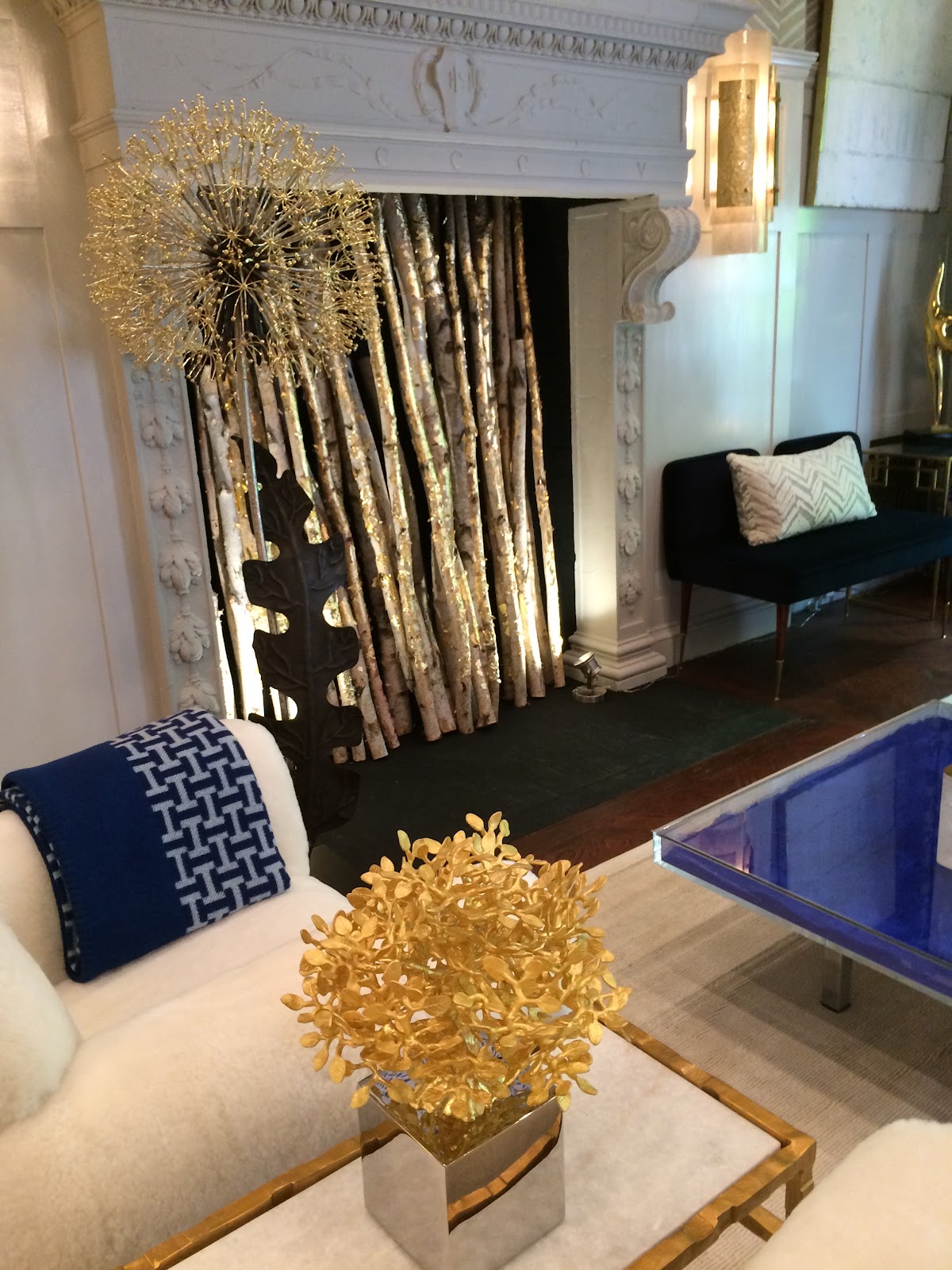
A Lorin Marsh table boasts a very unique Mario Testino book and holder that is an accessory in itself.
Floor to ceiling French doors deliver an open airy lightness that is uplifting and calming at the same time.
The use of gold is warm and reflective; while bronze and silver and glass sparkle. Even the fireplace birch are caressed by the gold. Be sure to check out the two mid-century armless settee benches covered in royal blue velvet. And the gold “tree” art by Michael Arami -- rather Sputnik looking!
A Lorin Marsh table boasts a very unique Mario Testino book and holder that is an accessory in itself.
It amplifies the purple velvet love seat on the opposite side of the room.
The formal yet modern armchairs by John Salibello showed off a kind of armchair jewelry - look at these sidebands. Don’t you love that extra touch?

One of The most outstanding spaces -- no backstory needed -- is the “Stairway to Savage.” That Nashville born designer Jonathan Savage’s crafted creation was the lead image in the New York Times’ coverage of the Kips Bay showhouse is no surprise.
What is a surprise, as I mentioned to Savage, is that warranted or not, most guests will walk through the space -- as they see hallways as transitions -- “just” a space to get you from one room to another.
However, this hallway and stairwell are heart-clutching show stoppers.
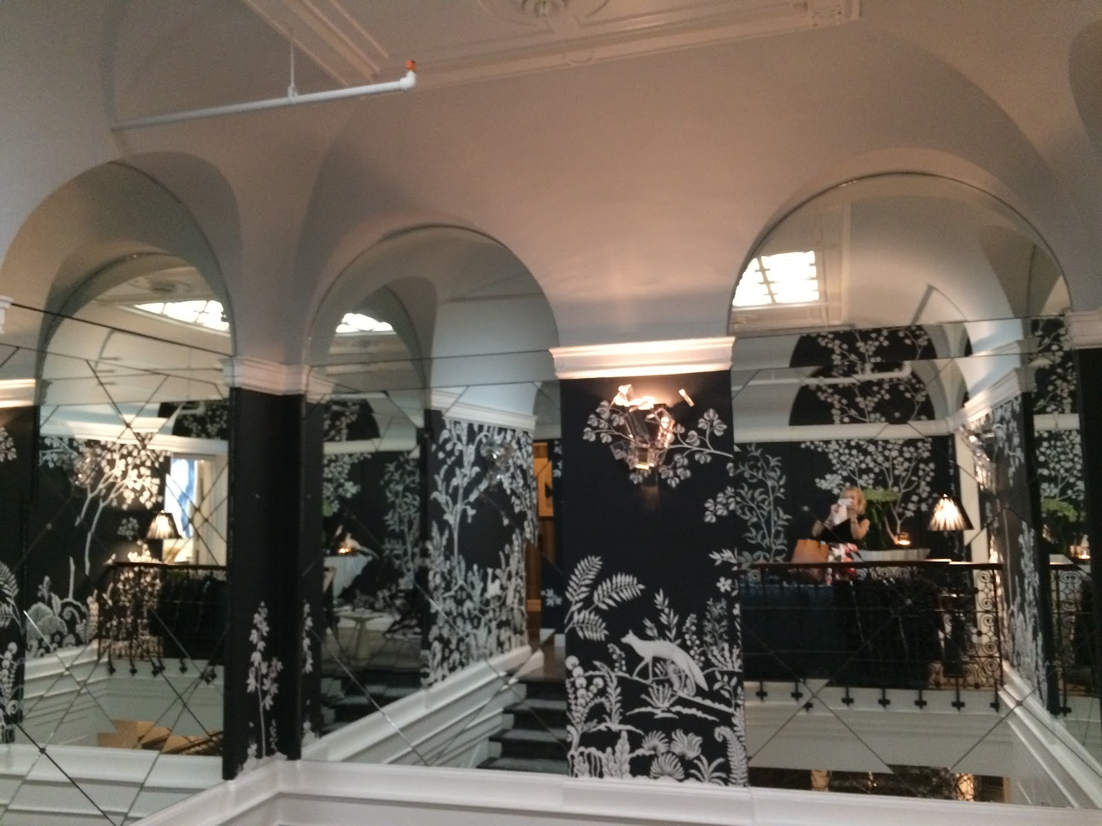
One has to acknowledge that this is a most challenging space to design. It’s a hallway and a stairwell, after all! But what a testament to a genius designer’s talent.
Savage took to the challenge. He added mirrors, Billy Baldwin sconces,
and worked to fulfill a concept - his vision. Aided by “a posse of people,” Savage noted.
If walls could talk...
Here they’d tell a story of hand-crafted, hand applied plaster -- like icing a cake! To create a relief or raised wall art.
Look close enough and you’ll discover some of Savage’s favorite Nashville native plants and animals: a red fox here, a turtle there, a hoot owl, snake, white-tailed deer, raccoon and a tiny mockingbird perched just so on the rail!
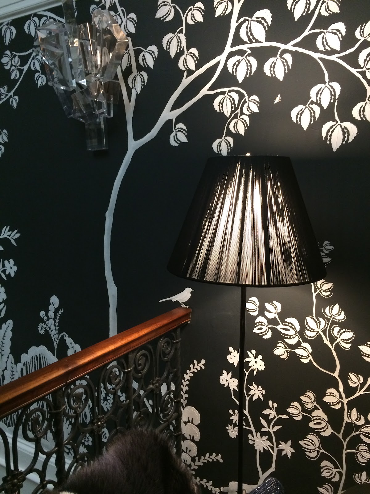

There is perfectly proportioned console from Brooklyn’s Stephen Antonson topped by artfully crafted floral design by L’Olivier Floral Atelier.

The diminutive sofa is by Michael Bagley - and slung with a big-time/big-ticket Fendi fur!
I can’t say enough about this thoughtful designer and his brilliant creation. Follow Savage on Instagram at Savage Interior Design.
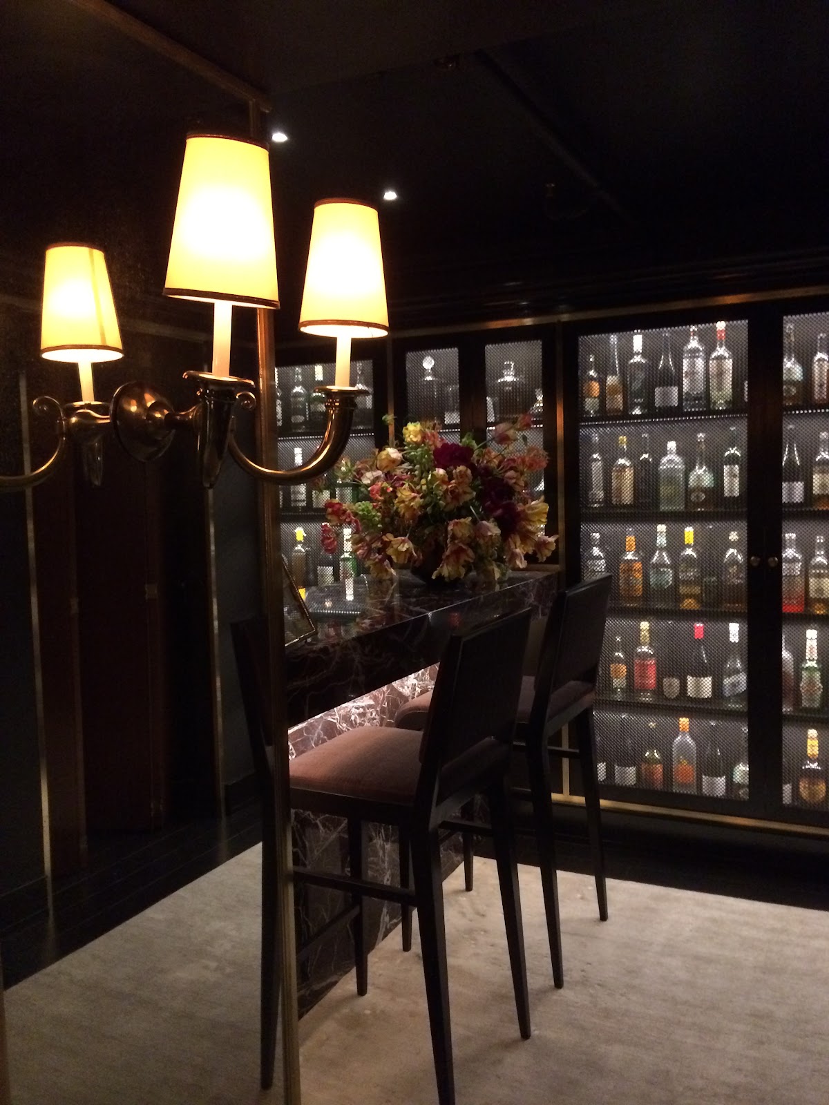
This year the garden was on the lowest level of the townhouse. But before we even got to the little slice of Asian Eden, we alighted off the stairs to find ourselves in the darkened “Lounge and Bar” to discover a furtive place -- a glamorous speakeasy that at once gave rise to thoughts of canoodling; sultry, swanky parties.
To see the ragtag “before” images, I could only marvel at Litchen Craig Architecture + Interiors visionary talent to create such a cool space fueled by frisson and style.
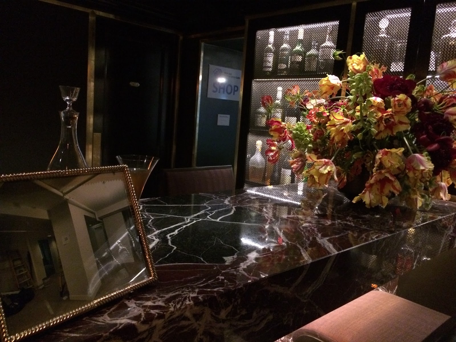
This room will leave you swooning and shaking your head with respect for the wonders of design.
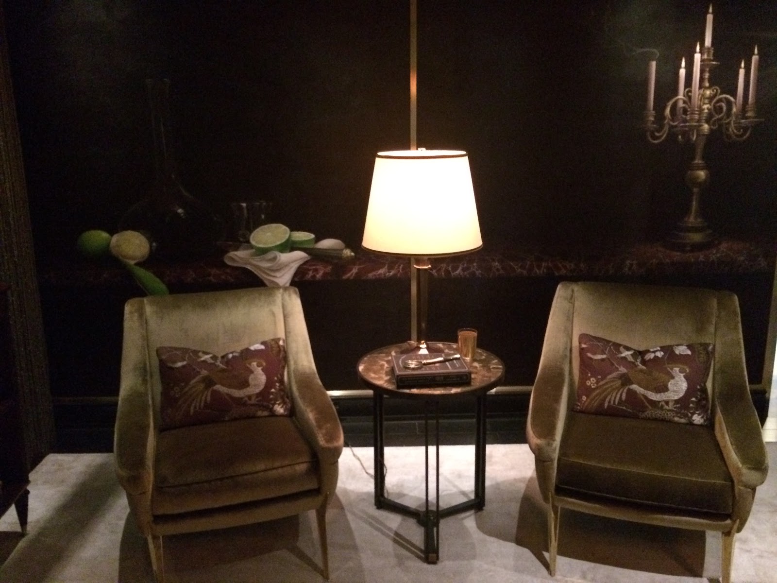
Look at this hand-painted mural by New York artist, Anne Harris Studio. Luxurious chairs by Charles Ramos by Bernd Goeckler, Inc. covered in Jim Thompson fabric.
The barware and accessories is by Kneen & Co. Can't have too much quality barware and cocktail accessories...
Just when you thought it couldn’t get better, you’re drawn to the powder room just off the bar and a small vanity hallway - marked by this exuberant black and white photo of an earlier era’s uninhibited, dancing on the tables cocktail culture. Jump for joy!
The formal yet modern armchairs by John Salibello showed off a kind of armchair jewelry - look at these sidebands. Don’t you love that extra touch?
One of The most outstanding spaces -- no backstory needed -- is the “Stairway to Savage.” That Nashville born designer Jonathan Savage’s crafted creation was the lead image in the New York Times’ coverage of the Kips Bay showhouse is no surprise.
What is a surprise, as I mentioned to Savage, is that warranted or not, most guests will walk through the space -- as they see hallways as transitions -- “just” a space to get you from one room to another.
However, this hallway and stairwell are heart-clutching show stoppers.
One has to acknowledge that this is a most challenging space to design. It’s a hallway and a stairwell, after all! But what a testament to a genius designer’s talent.
Savage took to the challenge. He added mirrors, Billy Baldwin sconces,
and worked to fulfill a concept - his vision. Aided by “a posse of people,” Savage noted.
If walls could talk...
Here they’d tell a story of hand-crafted, hand applied plaster -- like icing a cake! To create a relief or raised wall art.
Look close enough and you’ll discover some of Savage’s favorite Nashville native plants and animals: a red fox here, a turtle there, a hoot owl, snake, white-tailed deer, raccoon and a tiny mockingbird perched just so on the rail!
There is perfectly proportioned console from Brooklyn’s Stephen Antonson topped by artfully crafted floral design by L’Olivier Floral Atelier.
The diminutive sofa is by Michael Bagley - and slung with a big-time/big-ticket Fendi fur!
| Designer Jonathan Savage |
I can’t say enough about this thoughtful designer and his brilliant creation. Follow Savage on Instagram at Savage Interior Design.
This year the garden was on the lowest level of the townhouse. But before we even got to the little slice of Asian Eden, we alighted off the stairs to find ourselves in the darkened “Lounge and Bar” to discover a furtive place -- a glamorous speakeasy that at once gave rise to thoughts of canoodling; sultry, swanky parties.
To see the ragtag “before” images, I could only marvel at Litchen Craig Architecture + Interiors visionary talent to create such a cool space fueled by frisson and style.
This room will leave you swooning and shaking your head with respect for the wonders of design.
Look at this hand-painted mural by New York artist, Anne Harris Studio. Luxurious chairs by Charles Ramos by Bernd Goeckler, Inc. covered in Jim Thompson fabric.
The barware and accessories is by Kneen & Co. Can't have too much quality barware and cocktail accessories...
Just when you thought it couldn’t get better, you’re drawn to the powder room just off the bar and a small vanity hallway - marked by this exuberant black and white photo of an earlier era’s uninhibited, dancing on the tables cocktail culture. Jump for joy!
OK, truth be told, I skated right through the kitchen directly to the garden. But for continuity and for lofty kitchen design, I’ll proceed accordingly.
The Bakes and Kropp Kitchen design and their ongoing collaboration with Hamptons based Kate Singer Home for the Garden Family Room, was all the more impressive -- for its thoughtful, design details, on top of the lovely, livable look. This is not that high-brow European influenced design we see too often at home shows - rather it is serene, beautiful and moreover a workhorse. A woman designed this..
A few examples to prove the point: Blum soft-close hardware (I love mine!), drawers with metal tops to preserve integrity given all the heavy usage and indignity of constant use. How thoughtful is this? Lots of polished nickel. You’ll especially love this on the trash drawer and I for one wish I had this armor top. Plus this design includes that auto tap for the trash drawer - so right.
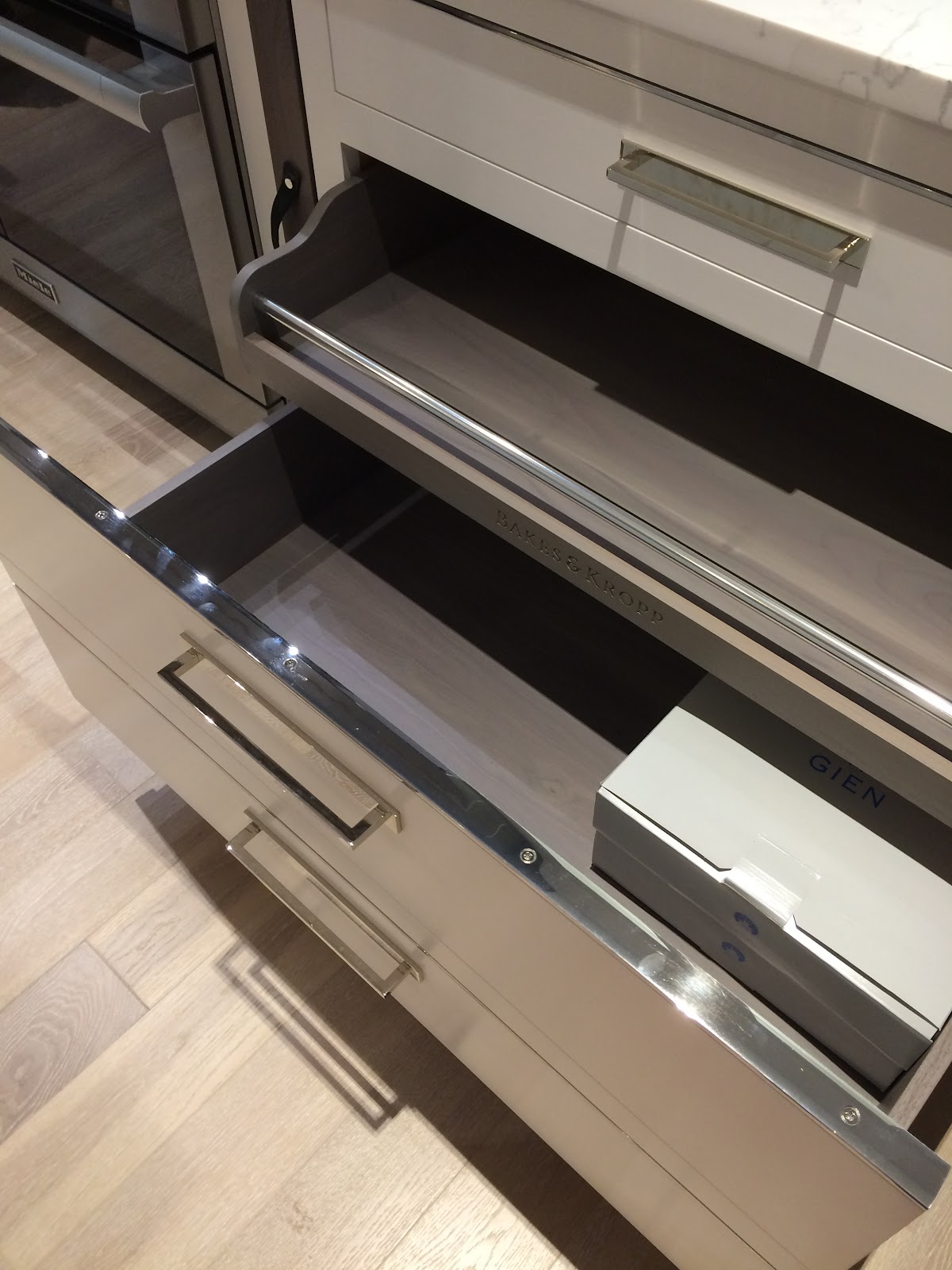
The doors to the Butlers Pantry and coffee station are flush -- then voila! It opens up to a discrete space. The drawers even accommodate the Tassimo style coffee packs if that’s your go-to Joe preference.


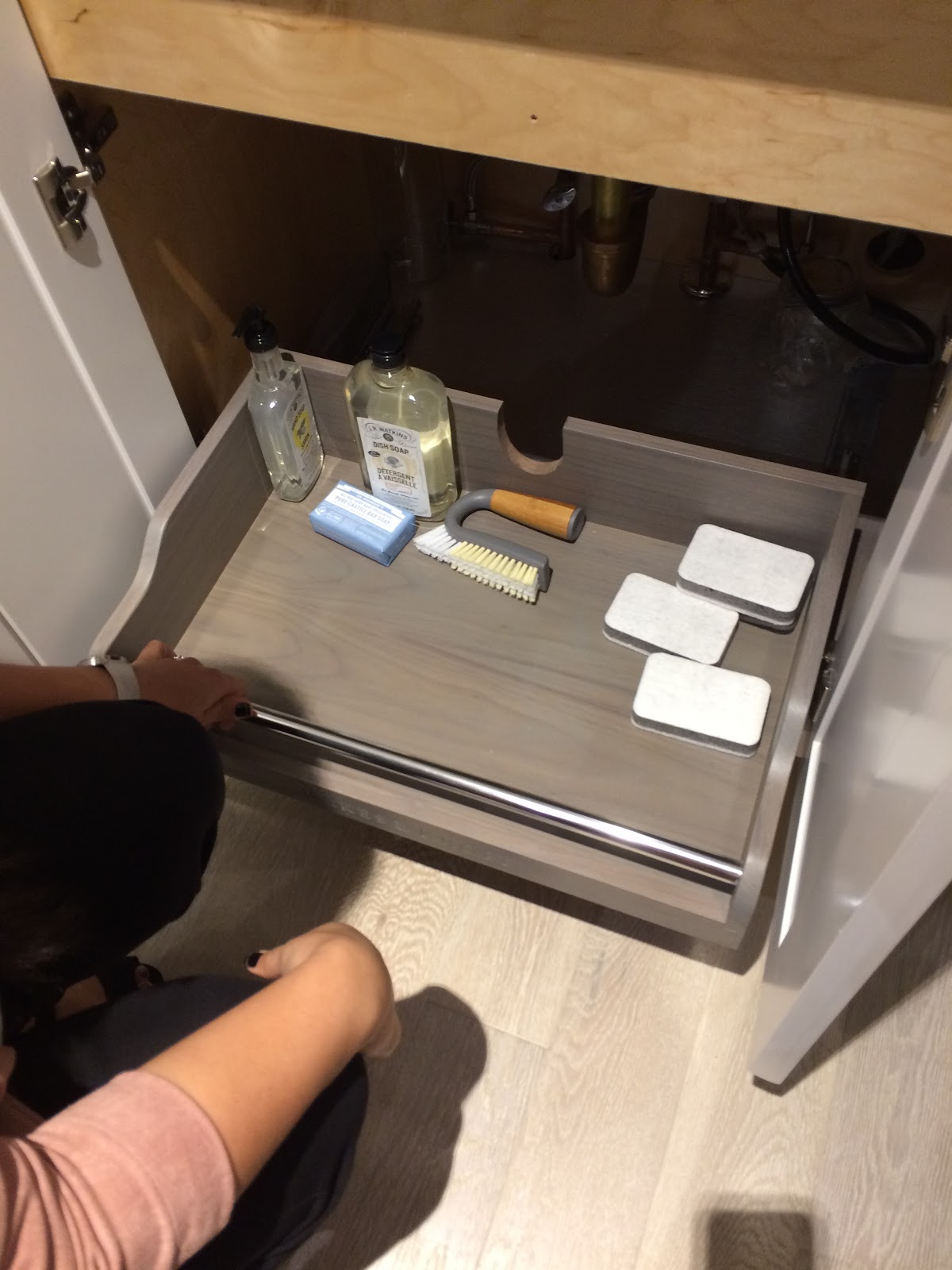
I so respected this attention to detail: you know how you might not always know what’s in the back of the cleaning supplies under the kitchen sink? Well, problem solved. Here is a pull out, under counter storage space -- with ta-dum - a groove to accommodate your sink pipes. And it’s pretty.
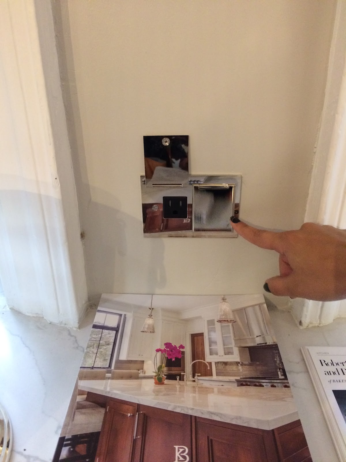
Yet another thoughtful lifestyle design feature you’ll want to check out is the under-counter lights and outlets - both electric and USB. You need this.

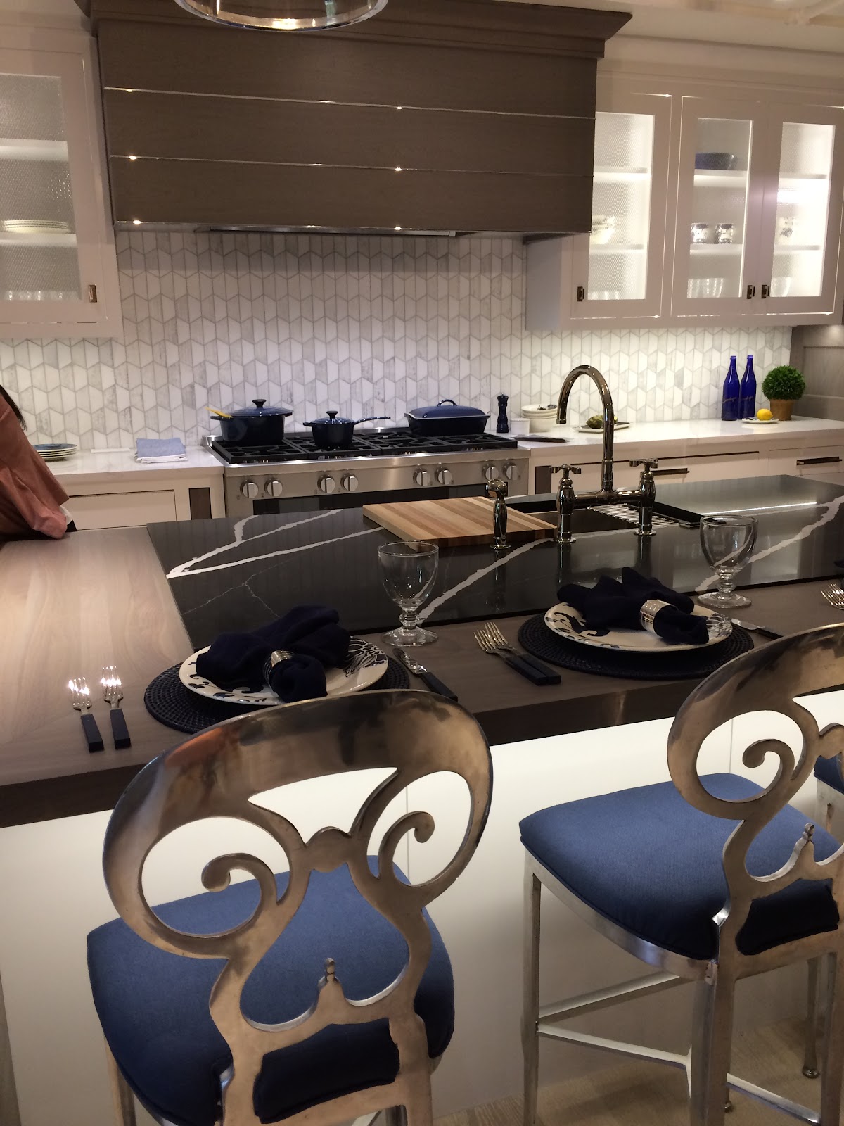
The kitchen features a waterfall island, a custom designed hood, designed hidden outlets (be still my heart! I dislike all things that show what's in the "engine room," if you will.) and a nod to the family room beyond.

And finally -- the garden… ahhh… The Bamboo Court

As soon as I stepped out - I recognized the same patio and path stones from my travels to China. (and don’t you love my kitten, bowed shoes?!)

This is a Janice Parker Landscape design. Greenwich and Southampton based landscape architects took a traditional Chinese garden space and according to senior landscape architect Ann Schmitt and their literature - and my tour - the firm took the space, cleaned it up, and created an exotic, tropical escape with low, lush planting elements. The garden honors the China Institute’s past glory, with the pebble mosaics and the Scholar’s Rocks and the wall details. Parker and team created a moonscape gate archetype made from bamboo as a Moon Gate garden art. The garden designers have created a way to travel through the garden space, featuring garden “rooms” with cultural design and style.


Plus, Parker has a new book on her garden designs. Hopefully, I’ll review and report on soon.
Don’t pass up the opportunity to view the Kips Bay showhouse. You’ll be inspired, delighted, and celebrate home design at its best while contributing to a very worthwhile cause.
“The Kips Bay Boys & Girls Club, a renowned local youth development center in the Bronx and flagship of the Boys & Girls Clubs of America has served the community’s youth for over 100 years. For the next month, an estimated 15,000 people are expected to tour the completed Show House, which serves as the organization’s premiere fundraiser. Each designer was given approximately six weeks to transform their assigned space in 125 East 65th Street, which is located in New York City’s iconic Lenox Hill neighborhood.”
Tickets are $40; tickets may be purchased at the door or online www.kipsbaydecoratorshowhouse.org
Here is a full list of Kips Bay contributing designers:
Bakes and Kropp
Neal Beckstedt Studio
Billy Cotton
Dineen Architecture + Design
Janice Parker
Kate Singer Home
Ken Fulk
Kirsten Kelli, LLC
Lichten Craig
Susan Ferrier of McAlpine
Nick Olsen Inc.
Powell & Bonnell
Richard Mishaan Design, LLC
Robert A.M. Stern Architects
Robert Stilin LLC
SAVAGE Interior Design
Scarpidis Design
Timothy Brown
Visitors of the Show House will also be able to shop a selection of must-have curated items including antiques, fine art, home furnishings, and vintage designer clothing at the sixth annual Kips Bay Show House Shop, located on the Garden Floor of the Show House space.
Cheers to artful design. It’s all so glamorous…
The doors to the Butlers Pantry and coffee station are flush -- then voila! It opens up to a discrete space. The drawers even accommodate the Tassimo style coffee packs if that’s your go-to Joe preference.
I so respected this attention to detail: you know how you might not always know what’s in the back of the cleaning supplies under the kitchen sink? Well, problem solved. Here is a pull out, under counter storage space -- with ta-dum - a groove to accommodate your sink pipes. And it’s pretty.
Yet another thoughtful lifestyle design feature you’ll want to check out is the under-counter lights and outlets - both electric and USB. You need this.
The kitchen features a waterfall island, a custom designed hood, designed hidden outlets (be still my heart! I dislike all things that show what's in the "engine room," if you will.) and a nod to the family room beyond.
And finally -- the garden… ahhh… The Bamboo Court
As soon as I stepped out - I recognized the same patio and path stones from my travels to China. (and don’t you love my kitten, bowed shoes?!)
This is a Janice Parker Landscape design. Greenwich and Southampton based landscape architects took a traditional Chinese garden space and according to senior landscape architect Ann Schmitt and their literature - and my tour - the firm took the space, cleaned it up, and created an exotic, tropical escape with low, lush planting elements. The garden honors the China Institute’s past glory, with the pebble mosaics and the Scholar’s Rocks and the wall details. Parker and team created a moonscape gate archetype made from bamboo as a Moon Gate garden art. The garden designers have created a way to travel through the garden space, featuring garden “rooms” with cultural design and style.
Plus, Parker has a new book on her garden designs. Hopefully, I’ll review and report on soon.
Don’t pass up the opportunity to view the Kips Bay showhouse. You’ll be inspired, delighted, and celebrate home design at its best while contributing to a very worthwhile cause.
“The Kips Bay Boys & Girls Club, a renowned local youth development center in the Bronx and flagship of the Boys & Girls Clubs of America has served the community’s youth for over 100 years. For the next month, an estimated 15,000 people are expected to tour the completed Show House, which serves as the organization’s premiere fundraiser. Each designer was given approximately six weeks to transform their assigned space in 125 East 65th Street, which is located in New York City’s iconic Lenox Hill neighborhood.”
Tickets are $40; tickets may be purchased at the door or online www.kipsbaydecoratorshowhouse.org
Here is a full list of Kips Bay contributing designers:
Bakes and Kropp
Neal Beckstedt Studio
Billy Cotton
Dineen Architecture + Design
Janice Parker
Kate Singer Home
Ken Fulk
Kirsten Kelli, LLC
Lichten Craig
Susan Ferrier of McAlpine
Nick Olsen Inc.
Powell & Bonnell
Richard Mishaan Design, LLC
Robert A.M. Stern Architects
Robert Stilin LLC
SAVAGE Interior Design
Scarpidis Design
Timothy Brown
Visitors of the Show House will also be able to shop a selection of must-have curated items including antiques, fine art, home furnishings, and vintage designer clothing at the sixth annual Kips Bay Show House Shop, located on the Garden Floor of the Show House space.
Cheers to artful design. It’s all so glamorous…
