How to Reimagine a Dated Fireplace - A Lesson in Interior Design
After the Paint and re-design but previously ----
This was the old fireplace "before" or the "mid-before" - after the first deconstruction |
Oh, if I’d had a dime for every minute I spent designing the interior decor around a dated piece of a pre-renovation, fixer-upper element of our country house home.
We inherited a fireplace that extends from floor to ceiling. The imposing structural piece sported what is commonly referenced as a 70’s harvest gold influence - even though the fireplace might’ve been there since the house was first built in the swinging 60’s.
First the paint: Gold? Terracotta? Putty? Beige?
I posted color swatches
I looked to color coordinate the gold stones with a complimentary wall color that would also work with the butter yellow of the kitchen, the dreamy blue quartz island and counter tops, and the dining space that are part of the area’s open floor plan.
We worked the furniture reupholstery swatches
We chose the French blue and yellow and gold tailored fabric to redo the two couches.
From the copper inserts in the new tile floor to the rich, jewel-toned coppery, nutty-colored fabrics…
I was coming around to be quite satisfied that the blue and gold and yellows and the brown wood of our new, antique table, were working together nicely.
Eventually, the colors, including the new putty or terracotta - or is it cinnabar? - of the new rug - all came together. That element, along with the textures was balanced and well, rewarding.
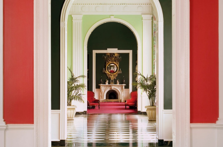
I very much subscribe to the Dorothy Draper style of orchestrating adjacent rooms that allow the flow for the eyes -- and the experience -- to gracefully unfold and moreover - move you through from one space to another.
I had managed to go from a soft blue in the entry hallway to the soft, butter yellow to gold - onto to that melon/terracotta/sunrise-inspired saturated “glow” color of the Garden Room beyond.

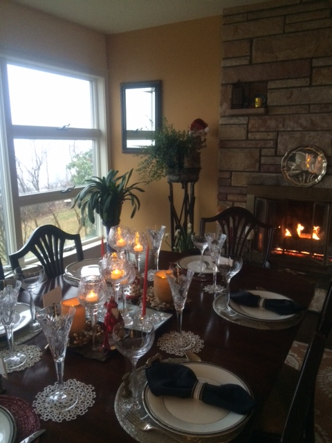
So life went on. Terrific tablescapes; divine dining…

But then, maybe four or so years later, while enjoying one of my “Ladies Who Lunch” with an award-winning interior designer, Mary Fran - who I was introduced to by another accomplished woman - seamstress and designer Aimee Humphreys (Love a good “Ladies Network”) - that the design look took a decided turn. For the better.
For those who don’t follow regularly - I am so committed to learning from great, accomplished, artful women that I schedule as many “Ladies Who Lunch” experiences as I can. I’m always open to learning and seeking the counsel and advice of experts - especially the best dames. I continually long for more…
I had managed to go from a soft blue in the entry hallway to the soft, butter yellow to gold - onto to that melon/terracotta/sunrise-inspired saturated “glow” color of the Garden Room beyond.
So life went on. Terrific tablescapes; divine dining…
But then, maybe four or so years later, while enjoying one of my “Ladies Who Lunch” with an award-winning interior designer, Mary Fran - who I was introduced to by another accomplished woman - seamstress and designer Aimee Humphreys (Love a good “Ladies Network”) - that the design look took a decided turn. For the better.
For those who don’t follow regularly - I am so committed to learning from great, accomplished, artful women that I schedule as many “Ladies Who Lunch” experiences as I can. I’m always open to learning and seeking the counsel and advice of experts - especially the best dames. I continually long for more…
Back to the design issue at hand.
While Mary Fran and I were touring my house and garden designs - the inspired design epiphany floated in.
Allow me to readily admit that Bill and my taste runs to the eclectic. Each and every element is hand-picked, artisanal, unique -- utterly charming and sophisticated and elegant and personal; over time, reviewed by media and friends and family alike - as top-tier… We so appreciate and are so grateful for the decor feedback… It’s been a true labor of love creating the look.
Yet, you can understand when I say there could’ve been some awkward moments showing a professional interior designer my own designs and compositions. But there wasn’t any of that. Just lots of mutual, simpatico, love of interior and exterior design.
Winding up the tour, I asked Mary Fran: “Anything you want to critique - feel free to suggest and share…”
And then, so gently and honestly and refreshingly, Mary Fran flicked her decor head, nodding towards the end of the room to answer my challenge. “I’d paint the fireplace.”
What?! I eagerly replied. Followed by a quick, “How can we do that?”
“Simple,” Mary Fran said. “ Just like you had your front-of-house bricks painted, here too you can paint the fireplace stones.”
The logic was embarrassingly overwhelming. A head-smacking epiphany.
Here it was. A timely design alternative.
Now that I learned I could readily paint those buggery gold harvest stones, I was design engerized.
Happy day! I was excited to change the room’s look to better enhance the elegance of the room; to coordinate the true decor and spirited ambience, with the open space kitchen and dining area that embraces the fireplace.
I eagerly headed to select a palette of blue-grey paint colors.
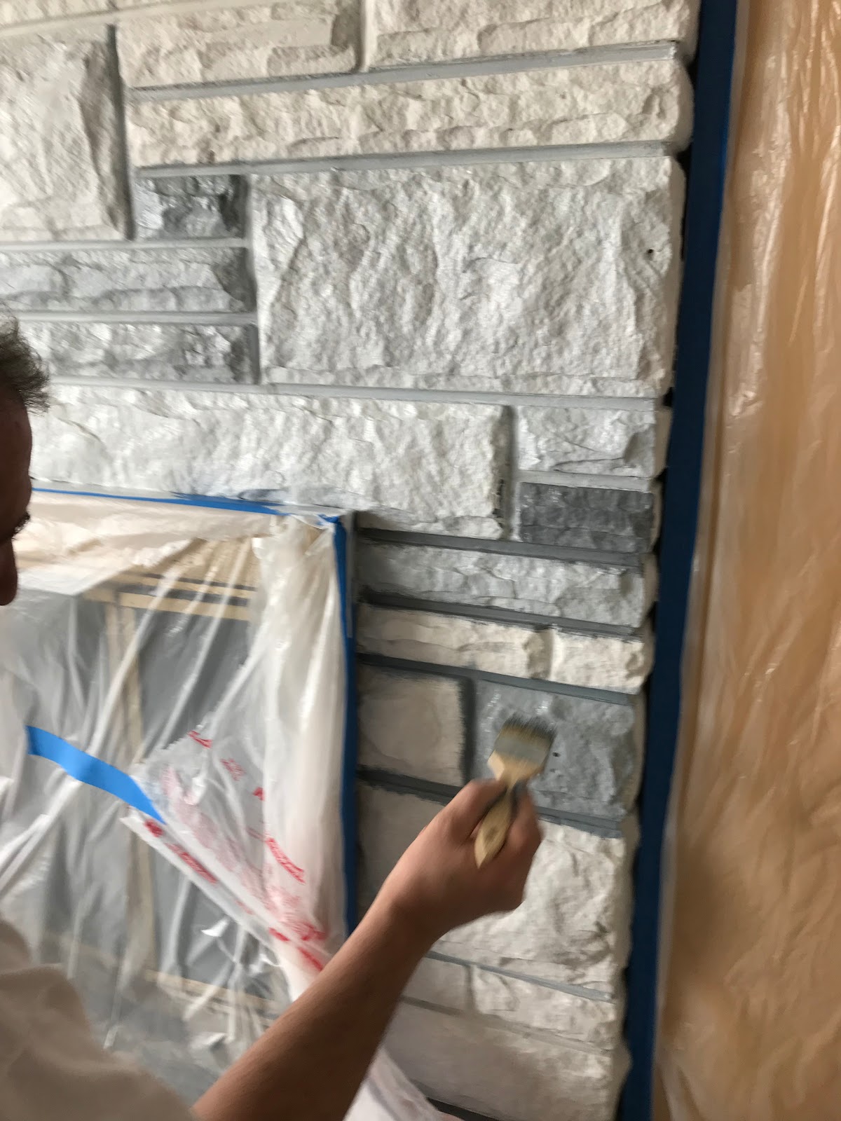
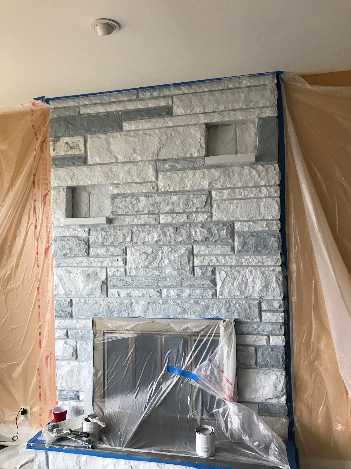
I monitored the painter and the application of the variety of the different paints to achieve the subtle hues and shades to achieve the natural grey/blue/slate look, including the hearth.

Bill painted the fireplace grill a basic, sophisticated matte black.
Now, the wall behind the fireplace could be completed -- and painted to compliment with the other kitchen and dining room’s pale sweet butter-colored walls. Voila!
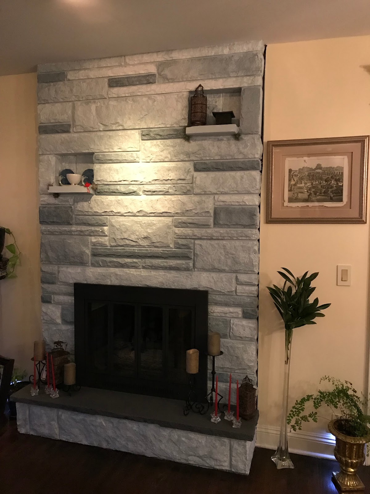
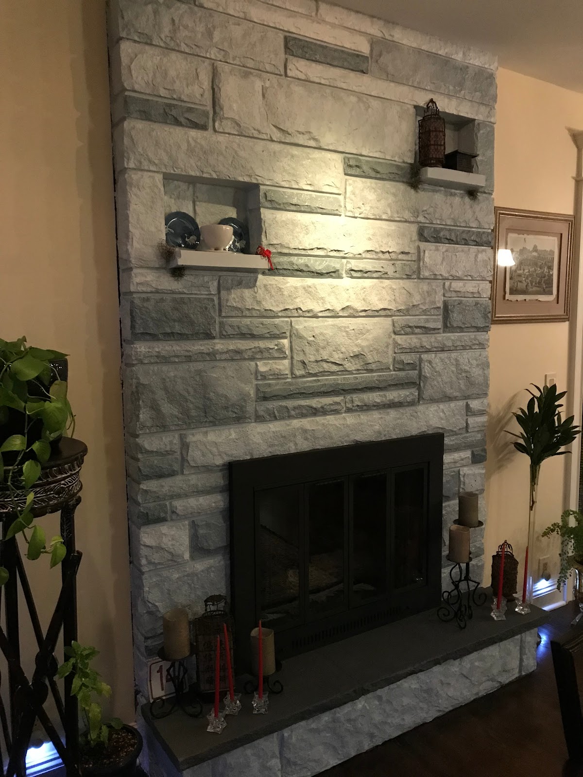
The change has most assuredly updated and changed the look of the entire space. We love it. And in fact, the change prompted me to reconsider the color palette of the furniture. I determined we could redo the couch that’s there - giving it a more tailored look and new fabric, along with the dining room seats.
I visited my go-to fabric emporium here in Gotham, Mood Fabrics --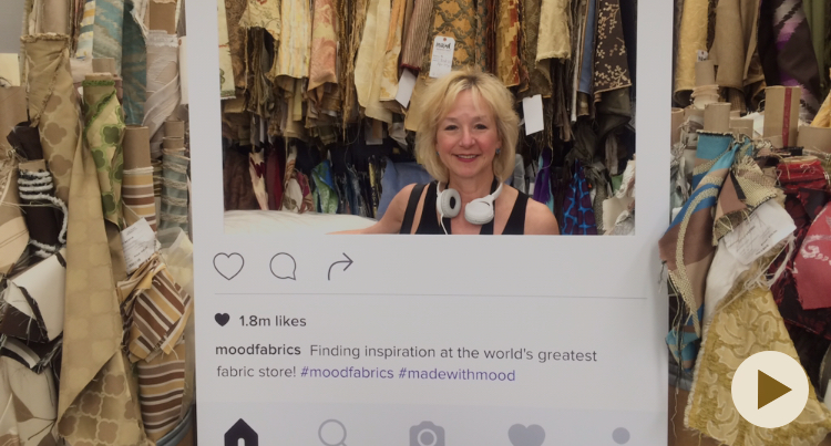
home of Project Runway - and the cutest, most revered pooch, “Swatches.”

I came away with a valise full of fabric swatches to consider and rifled through them in situ - and surprisingly came to choose the fabric for the seat and reconfigured couch rather quickly. Both are a kind of textured, almost ultrasuede, in two different soft shades of a blue-ish, grey-ish, green-ish celadon.
Now, the colors better capture the greys and blues and seafoam of the fireplace - and the persian rug under the dining table -- and ultimately to the water views just beyond the floor-to-ceiling windows that face the dining room and kitchen. Do you want to see?
Thank you, Mary Fran. I couldn’t have been more appreciative and honored.
Until -- until I saw Mary Fran featured in NJ Design Magazine! She’s a star.
And I was lucky she was in my constellation. I love the design community - so creative and giving.

So glamorous…
While Mary Fran and I were touring my house and garden designs - the inspired design epiphany floated in.
Allow me to readily admit that Bill and my taste runs to the eclectic. Each and every element is hand-picked, artisanal, unique -- utterly charming and sophisticated and elegant and personal; over time, reviewed by media and friends and family alike - as top-tier… We so appreciate and are so grateful for the decor feedback… It’s been a true labor of love creating the look.
Yet, you can understand when I say there could’ve been some awkward moments showing a professional interior designer my own designs and compositions. But there wasn’t any of that. Just lots of mutual, simpatico, love of interior and exterior design.
Winding up the tour, I asked Mary Fran: “Anything you want to critique - feel free to suggest and share…”
And then, so gently and honestly and refreshingly, Mary Fran flicked her decor head, nodding towards the end of the room to answer my challenge. “I’d paint the fireplace.”
What?! I eagerly replied. Followed by a quick, “How can we do that?”
“Simple,” Mary Fran said. “ Just like you had your front-of-house bricks painted, here too you can paint the fireplace stones.”
The logic was embarrassingly overwhelming. A head-smacking epiphany.
Here it was. A timely design alternative.
Now that I learned I could readily paint those buggery gold harvest stones, I was design engerized.
Happy day! I was excited to change the room’s look to better enhance the elegance of the room; to coordinate the true decor and spirited ambience, with the open space kitchen and dining area that embraces the fireplace.
I eagerly headed to select a palette of blue-grey paint colors.
I monitored the painter and the application of the variety of the different paints to achieve the subtle hues and shades to achieve the natural grey/blue/slate look, including the hearth.
Bill painted the fireplace grill a basic, sophisticated matte black.
Now, the wall behind the fireplace could be completed -- and painted to compliment with the other kitchen and dining room’s pale sweet butter-colored walls. Voila!
The change has most assuredly updated and changed the look of the entire space. We love it. And in fact, the change prompted me to reconsider the color palette of the furniture. I determined we could redo the couch that’s there - giving it a more tailored look and new fabric, along with the dining room seats.
I visited my go-to fabric emporium here in Gotham, Mood Fabrics --
home of Project Runway - and the cutest, most revered pooch, “Swatches.”
I came away with a valise full of fabric swatches to consider and rifled through them in situ - and surprisingly came to choose the fabric for the seat and reconfigured couch rather quickly. Both are a kind of textured, almost ultrasuede, in two different soft shades of a blue-ish, grey-ish, green-ish celadon.
Now, the colors better capture the greys and blues and seafoam of the fireplace - and the persian rug under the dining table -- and ultimately to the water views just beyond the floor-to-ceiling windows that face the dining room and kitchen. Do you want to see?
 |
| And we retained that iconic Dorothy Draper room flow that leads the eye |
Thank you, Mary Fran. I couldn’t have been more appreciative and honored.
Until -- until I saw Mary Fran featured in NJ Design Magazine! She’s a star.
And I was lucky she was in my constellation. I love the design community - so creative and giving.
So glamorous…


