My Curated Roadmap to the AD Design Show 2019
The AD Design Show can be both sport and art - it’s “miles of aisles” that embraces three piers that hug the Hudson River on Gotham’s West Side.
There is always a great vibe at the show: here trade professionals, makers, celebrities, influencers, and customers - aka - the public/You (!) - all come together to celebrate what’s new in terms of technology, art, and lifestyle. It’s truly one of the only shows that pulls back the proverbial curtain to offer consumers an inside look and the design industry.
The press preview was Thursday; we were given a sneak peek of more than a few brands’ product offerings and introductions, as well as a tour of the Diffa Dining by Design tablescapes.
Overall, the show is broken down by sections including FURNISH, REFRESH, MADE, and SHOPS.
And because the show is so vast - more than 400 exhibitors - it can be a bit overwhelming; follow my roadmap and tips for a most enjoyable experience:
- Wear your comfortable walking shoes or boots
- Check your coat upon arrival
- Bring plenty of portable battery power for your mobile phone as you will be taking a lot of photos & videos
- And/or - Bring a camera
We started our press tour with a lovely kind of chat with Conde Nast’s Mattie O’Malley and The Home Depot’s Director of Trend & Design and Industrial Design, Sarah Fishburne.
Sitting in a living room vignette (that of course I was partial to right off the design palette because it’s decorated in coral and blues which is what I used in our country house garden room area - inspired by the sunrise sky over the water just beyond our windows.)
The customized living room vignette at the booth is flanked by a kitchen and tabletop staging -- all furnished with products from the new Home Depot Collection.
The executives introduced us to the collaboration between At Home with Architectural Digest and The Home Depot. Working together, the two brands have curated a truly inspired home decor series of furnishings that make a house a home, as noted by Fishburne. It’s true that, for the most part, one thinks of The Home Depot in terms of construction - all those screws, lumber, paint, and safe to say, commoditized, low-style kind of “let’s just not” furniture. If one thought of Home Depot and furniture, at all.
Management must’ve really put their thinking caps on and wondered why they needed to leave their customers turning to other sources for good, quality home decor items. No more.
The retail giant is aiming not just for mid-level DIYers; The Home Depot is now offering upscale items including wallpaper, furniture, rugs, premium bath and bedding, cookware, appliances and accessories -- all designed in-house. So now it’s a full spectrum, all-in with Home Depot: you don’t need to source the next steps in a home design product once you complete the construction phase. They are aiming for a one-stop experience. I’m going to look into their tabletop offerings for my Tablescape designs..
Plus, The Home Depot has made it easier to shop with a curated online experience so that you can peruse any way you like: from color, size, project and any way you want to categorize.
And they’re offering free shipping for orders over $45. You can also shop online and pick up at the store. Home Depot’s Collection and easy-to-access designer products could be a huge game changer in the home design market...
Next on the preview tour we headed to True Residential - a luxury home refrigeration brand with commercial DNA, who introduced us to bold green new hues. (The rich emerald colors tempted me to include them in the “green” garden brands (see below). Never mind - True is well, true to its appliance roots. (Roots? Ha - more green "links." I’ll stop here)
The addition of True’s two salient colors—Emerald and Ultra Matte Black—showcases the brand’s commitment to offering homeowners and designers unparalleled style and design flexibility --along with exceptional performance.
True Residential Director of Sales and Marketing, Steve Proctor, said, “When it comes to choosing new hues to add to our collection, we focus on colors that offer designers and homeowners the most versatility. Emerald, aside from its harmonious, balanced properties, adds a sense of vibrancy to any space that can be played up or down.” And black is - well, as any sophisticated New Yorker will tell you - is just de rigueur - from that little black dress to kohl eyes to decor. Plus their ultra matte powder coated surfaces have a very cool textural element.
| Thank you fellow press person with nice ring - I didn't catch your name |
They offer elegant cabinets that house UL-rated for indoors/outdoors under counter units as well as a new 36” refrigerator and freezer. Steve assured me there is no problem with these products “left” out in the severe winter weather. “Just drain the unit,” he recommended.
The only “problem” was in telling us about this product, Steve noted that their brand ambassador “friend” JBF award-winning chef, Wylie Dufresne made some of his signature Du’s Donuts -- in green -- to celebrate the new Emerald line. Arrghh. If you’ve never had Wylie’s Donuts, you must -- I promise it’s a delicious addiction! Steve asked that the donuts be brought out and I had to eat not a half - but a whole donut. It was so worth it! Green with gold and lots of luxurious flavor. Now, if I could order an emerald outdoor refrigerador and more for a planned outdoor kitchen this year -- and have Wylie bring green donuts for the unveiling… sigh.
In terms of designing your own unique indoor or outdoor kitchen look, Steve says that one-third of the units sold are custom-colored. The new shades are very robust -- available in a wide array of available custom finishes—which also includes Stainless Steel, Cobalt, Gloss Black, Matte Black, Matte White, and Antique White.
True also offers 60” wide refrigerators - 30” on each side. That’s as big as me! (Albeit I have two and one-quarter inches on the fridge, truth be told. I got take all I can…)
These Gulliver-sized units are more for the office hospitality service - as well as those of you with big entertaining habits! The refrigerator and their big glass doors are clean-looking with lots of style.
Together with hardware options that include Chrome, Copper, Brass, Gold and Pewter—designers and homeowners can now choose from 48 unique combinations available in both full-size and undercounter units. And get this - they can customize anything you want. Do you want to match that sunrise? Your baby’s blueberry eyes? Or that rose that melts your heart? True Residential can do it.
Steve says that more than one-third of their units sold are custom. And with only six to eight week to create and ship -- that’s an understandable and welcome stat.
The muscular hardware options are particularly impressive on the big kitchen refrigerators. And their equally BIG glass doors!
Because of True Residential's commercial pedigree, Steve explained that so many of their customers want that big capacity - because of their culinary pursuits or because of their catering staff who can readily bring in their chef bins -- and not to be overlooked - culinary artists adore the True Residential brand they use in their restaurant’s and/or catering kitchen. It’s familiar and trusted.
Another artful element I love is their use of LED lighting. This is unparalleled home theater entertainment! I designed and installed a wall garden in my country house -- and key to the magic is the changing LED light colors. Therefore, you can’t blame me for being razzle-dazzled upon seeing the brand’s under counter lighting and 36” wide wine coolers with LED. Who wouldn’t toast to this?
In a Du’s Donut kind of green haze - we then moved on to Emotional Brands. Emotional is aptly named. The Portuguese-based brand offers incredibly unique creations: one is truly moved by their glamorous furniture and accessory designs.
The best part? Re-connecting with designer Vanessa Deleon.
I first met Vanessa last year at True Residential. This beauty hails from a Cuban design pedigree (I just knew she was something extraordinary!)
The dining table Vanesa designed in her collaboration with Emotional Brands is just sooo incredibly glamorous. It has a wood base with marble top and a center “stage” filled with crystal - lit from within -- and get this -- the crystals are on a battery-operated hydraulic so that you have the ability to lower it if you want full table access. But really, why would you ever lower this glittering, magical table look? Not me. Not ever.
Vanessa is a wonder. Her table design alone is a heart-clutching triumph.
You know how much I adore entertaining tablescape designs - so I can assure you this is a must-see. You too will swoon over Vanessa’s table creation. I’m sorry that my photos just don’t capture the full affect.
It must be noted that before I read the AD news release about the women in design “celebration,” I had shared my top picks from the tour on my Garden_Glamour Instagram post - and maybe not surprising -- all but one are a woman. Formally, the show notes: “Celebrating the women in design, the 2019 MADE section features more than 50 companies founded or co-founded by a woman, offering attendees an opportunity to discover new products and meet the makers behind them. As designers, ceramists, architects, designers, metal workers, artists, and more, these industry leaders are pushing boundaries and furthering their craft through creative exploration.
Known for blurring the lines between art and design, L.A.-based founder of BZippy & Co., Bari Ziperstein is showcasing her angular, architecturally-scaled vessels and planters.
Ceramist Lydia Johnson exhibits her cheerful, pattern-laden tabletop designs hand-crafted from double-sided color clay slabs.
Kathryn Faull, founder of Maresca Textiles, brings her luxurious fabrics and wallpapers printed with a mix of made marks and digital printing techniques to the show.
Newcomer Laine + Alliage, founded by French designer Tania Leipold, showcases her beautiful textiles and soft goods.
Co-founded by former set decorator Marcia Zia with her husband Paul Priven, Zia Priven will debut HALO, its latest line of dramatic and bespoke lighting.
Architect Rachel Robinson, co-founder of durodeco treats show attendees to an array of contemporary furniture and objects that evoke a timeless warmth and highlight the interplay between new and old.
You cannot miss Dagmar Weinberg photographic art.
| The beautiful Dagmar Weinberg & her art - I am blessed to have purchased her cherry blossom art - seen in foreground |
At the show, Dagmar has a new piece - that was inspired by a ferry ride in the Hudson.
You see here how the churning waves she captured in a photo she “snapped” then led her to create a green art rendering that Hudson Valley residents -- and those Hudson Valley wannabees - surely can’t live without.
| Hudson Water waiting to be hung |
Back to the tour -- and the green element. I’m thrilled that more of the outdoor garden room designers and their products are becoming ever more essential to the luxury decor lifestyle the show embodies.
At last year’s show, I met Ed Glenn, the unassuming talent and CEO behind his New Growth Designs.
I admired his story of being a floral designer and how he came around to designing and creating faux interior plants. In 2018 I explained to Ed that as a garden designer I find it challenging to think of faux - but nevertheless, I was evolving. Why? As I wrote last year in Garden Glamour:
“Now, as a garden designer, I'm not bullish on artificial "plant material." However, I'm open-minded and can appreciate the need to use in certain applications. Think rooftops, too shady, and now with climate chaos: too much deer or too much salt water and well, the concept is ahem, growing on me. I discovered New Growth Designs who are showing some very impressive faux plant looks. I learned the company has been in business for more than 70 years, still does fresh flowers, and as the principle Ed Glenn told me, they were doing so well with their silk floral designs that many landscape architects and designers asked them to make garden products in the faux material. The booth has topiaries, faux turf…”
I asked Ed if he could create topiaries that would withstand winter and the bloody deer. He wisely advised me to wait a bit, saying they were working on that kind of thing.
Patience has its rewards!
This year - New Growth has achieved success. Despite what some folks turn a blind eye to - science and the overwhelming news of weather disasters tells us - that aggressive climate is a reality.
The fact that the New Growth products are of such quality - they can be used to augment a garden design - whether at a country estate, a suburban yard - where presumably land and water are readily available - or city rooftop garden which is more challenging.
The products are UV-stable greenery that don’t need water - which is no small consideration. Ed acknowledged the counsel of Sunbrella in bringing his design to fruition. I’ve long admired Sunbrella and their quality offerings. It was over-the-top to learn they assist other brand’s creations to foster and outdoor luxury lifestyle. Hashtag Sustainable teamwork!
Now, this year, Ed and his team are quite bullish on their creations to withstand accelerated weathering - in most every zone. Their hedges, screens, topiaries, shrubs, boxwoods, green wall panels, and more are a high quality solution and garden accent. The products are guaranteed for 10 years! And fully recyclable. The company uses a bioresin material to produce the faux plants.
There are catalog products available now for landscape designers and consumers.
And New Growth will also create custom work.
Ed noted that design/build firms are their ideal customers as they readily see the ease of installation and maintenance.
I look forward to trialing some of their products and have full confidence of their performance and look.
Stay tuned.
Not on the tour - but as I have posted to Instagram - Opiary stopped me dead in my tracks. I learned today that they earned a Best in Show -- not a surprise when you see not only the booth layout but the products.
A Brooklyn-based design firm, they create glass fiber, reinforced concrete (GFRC) from recyclable and natural materials. Opiary fabricates hand-crafted planters, fencing, cocktail-style Eero tables (be still my heart!),
water saucer gardens,
sculpture, furniture, fire pits, wallscapes, and god-knows what - Hoodoo Stacks!
Maybe I can work with Opiary to complete the design of my rill table concept? Fingers crossed.
David Harber is back at the show for the third time (my first to see him and his work, surprisingly) - which just goes to prove the point that there’s always something “new” at the AD Show.
This year, David brings a stunning new sculpture called The Alveare Wall,
along with a curated selection of his finest works.
David explained and demonstrated how the Wall - a prototype here - pixelates the environment - the sun and sky -- and you -- are reflected in the mirror-like design. He says he enjoys playing with the light and shadow in all his art designs.
Other works on display include Torus, a luminous mirrored disc with a water-like textured surface;
Armillary Sphere, a timeless celestial-inspired sundial that he claims is therapeutic for telling time; there’s no sense of urgency!
Dark Planet, a sphere of black stones, capable of interior illumination (see above in the Torus photo); Quiver, an assortment of metal leaves on thin poles that quiver in the breeze; and Mantle, a semi-opaque metal orb comprised of organic leaf-like forms.
David is an irrepressible Englishman. While he’s just about complete with his Oxfordshire home renovation, he claims his wife is ready to move across the pond because he is opening a showroom in the D&D Building in Gotham. Cute story/ our gain.
He gave us his condensed life story that led up to him becoming a world-class garden sculpture designer. Quite a varied resume, proving it takes a resume to be a true artist. He will also provide a talk every day of the show.
We’ll enjoy seeing David yet again at The New York Botanical Garden’s annual Garden & Antique Fair and Collector’s Plant Sale, April 11th.
Tilebar mosaics and tiles are incredible. The marble, porcelain, glass, stone, and clay in myriad finishes and patterns will have you jumping for joy. There’s no doubt there’s an unlimited world of possibilities here.
The introduction of The Arc Collection by Elizabeth Sutton is truly remarkable.
Tilebar describes the collection as “endless styling: moving lines, patterns, and a bit of whimsy.
I love the rich green colors, and of course - the butterflies in the Wing Collection - especially the swoonworthy Thassos, Mother of Pearl.
| Design Celebs - Tilebar's John Tudisco & Designer/KBIS President Toni Sabatino |
Kalamazoo’s top-of-the-line grills, pizza ovens, and more, create an outdoor kitchen that is pure luxury for folks who care about their food.
Russ Faulk, Chief Designer, Head of Product, was kind enough to walk me through the finer points of grilling temperatures, use of wood/coal/gas, new surfaces - in more than 200 different colors, along with their Arcadia line of epay wood finishes.
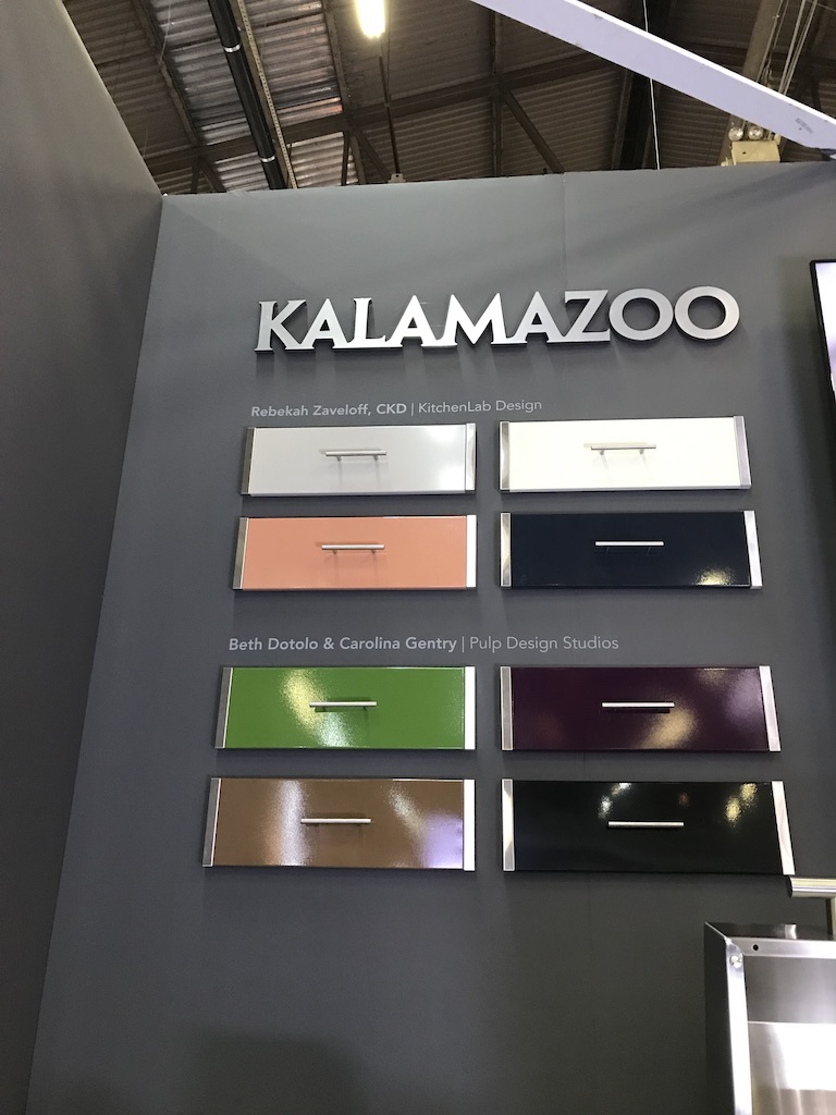
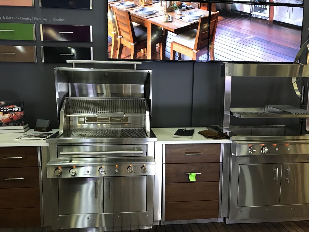
Boy, would I love to design an outdoor kitchen dining garden room for me and clients with these products…
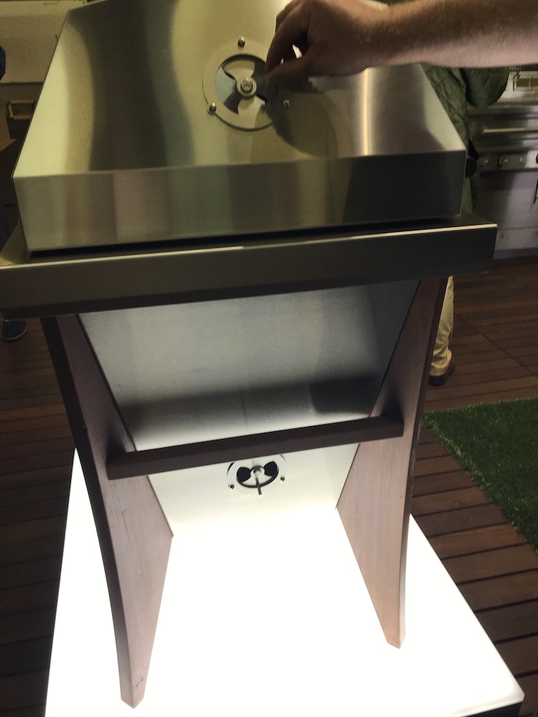
In prototype at the show is the company’s first kamado grill.
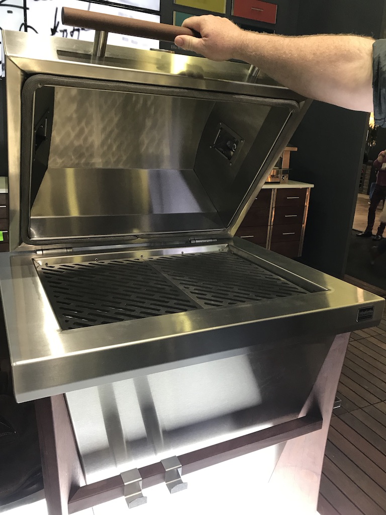
This is a very muscular grill - and it’s almost as tall as me! The Kalamazoo kamado is so tall because it can amplify the “food to fire” benefit. That’s why it’s taller than it is wide. The unit has two inches of insulation so “it’s super efficient,” explains Russ.
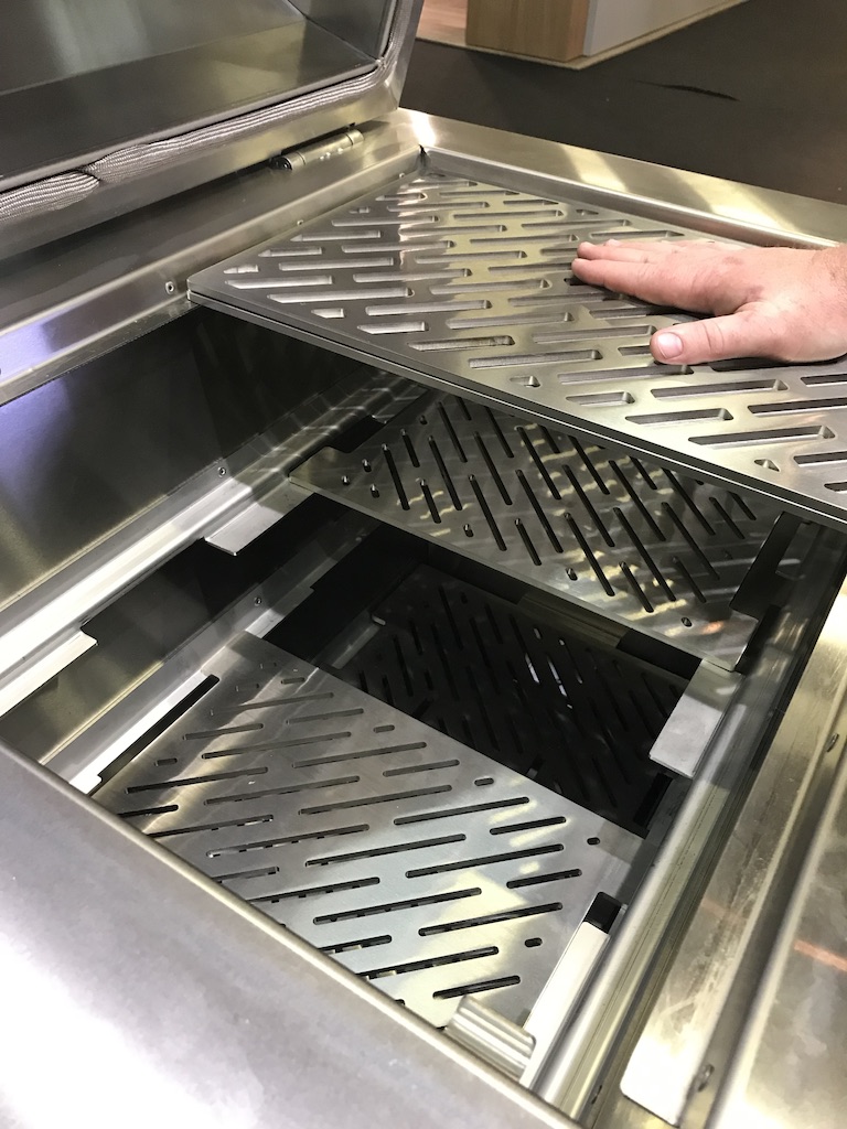
It features three different levels for a multi-zone fire so that you can cook according to the needs of whatever is on the menu: steaks or burgers? Close to the fire. Chicken, not so close.
To allow more venting control, Kalamazoo placed the vents on the side vs. the top of the hood (which weighs about 70 pounds! They are working on a spring asset to make opening and closing easy/sneazy).
This way, you can “draw” the smoke across the food.
As noted, I’ll have a feature piece shortly - in time for Father’s Day and grilling season with more of the grills and outdoor kitchen designs.
Love this! In the meantime, check out the prototype at the show.
MADE IN THE USA
While the show is based in New York, MADE features the works of artisans from around the country, combining craftsmanship with local cultural and geographical influences for a rich and unique offering. This year, attendees can expect to see a strong showing of exhibitors from Pennsylvania, including Wren & Cooper and Ovuud; California, including Siemon & Salazar, Krane Home and Küdd:krig HOME; as well as Michigan, Connecticut, Rhode Island, and New York. Indo-made, a design studio in Providence, Rhode Island will introduce Mooda, a table inspired by a traditional Indian stool combined with a glass surface. Utharaa L Zacharias and Palaash Chaudhary of the the San-Jose based Soft-Geometry will showcase works inspired in part by a shared aesthetic for pure geometries and their own personalities. Brooklyn-based NOTHING, a collective of RISD designers founded by Caroline Kable, Peter Lokken,
In this year's MADE section, we are welcoming over 70 new makers from across the globe,” said Julia Haney Montanez, Architectural Digest Design Show producer for MADE & Designer Focus. “From emerging artists to international studios, attendees will be able to peruse handcrafted, limited-edition, and one-of-a-kind furnishings, textiles, decorative pieces, and accessories from over 170 artists and designers who are making waves in their respective fields.”
I very much enjoy researching these aisles for the new and the inspirational
Here’s what I spotted and recommend:
Pandemic Design Studio
The patented Node Collection is very arresting; the modular ceramic, wall-mounted planter system could be the solution to this “green” design unicorn, at last.
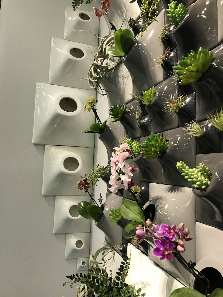
So many desire a green wall - but I have yet to see one that could readily sustain a healthy look that didn’t require a ton of maintenance. This could be the holy grail!
Boy, would I love to design an outdoor kitchen dining garden room for me and clients with these products…
In prototype at the show is the company’s first kamado grill.
This is a very muscular grill - and it’s almost as tall as me! The Kalamazoo kamado is so tall because it can amplify the “food to fire” benefit. That’s why it’s taller than it is wide. The unit has two inches of insulation so “it’s super efficient,” explains Russ.
It features three different levels for a multi-zone fire so that you can cook according to the needs of whatever is on the menu: steaks or burgers? Close to the fire. Chicken, not so close.
To allow more venting control, Kalamazoo placed the vents on the side vs. the top of the hood (which weighs about 70 pounds! They are working on a spring asset to make opening and closing easy/sneazy).
This way, you can “draw” the smoke across the food.
As noted, I’ll have a feature piece shortly - in time for Father’s Day and grilling season with more of the grills and outdoor kitchen designs.
Love this! In the meantime, check out the prototype at the show.
MADE IN THE USA
While the show is based in New York, MADE features the works of artisans from around the country, combining craftsmanship with local cultural and geographical influences for a rich and unique offering. This year, attendees can expect to see a strong showing of exhibitors from Pennsylvania, including Wren & Cooper and Ovuud; California, including Siemon & Salazar, Krane Home and Küdd:krig HOME; as well as Michigan, Connecticut, Rhode Island, and New York. Indo-made, a design studio in Providence, Rhode Island will introduce Mooda, a table inspired by a traditional Indian stool combined with a glass surface. Utharaa L Zacharias and Palaash Chaudhary of the the San-Jose based Soft-Geometry will showcase works inspired in part by a shared aesthetic for pure geometries and their own personalities. Brooklyn-based NOTHING, a collective of RISD designers founded by Caroline Kable, Peter Lokken,
In this year's MADE section, we are welcoming over 70 new makers from across the globe,” said Julia Haney Montanez, Architectural Digest Design Show producer for MADE & Designer Focus. “From emerging artists to international studios, attendees will be able to peruse handcrafted, limited-edition, and one-of-a-kind furnishings, textiles, decorative pieces, and accessories from over 170 artists and designers who are making waves in their respective fields.”
I very much enjoy researching these aisles for the new and the inspirational
Here’s what I spotted and recommend:
Pandemic Design Studio
The patented Node Collection is very arresting; the modular ceramic, wall-mounted planter system could be the solution to this “green” design unicorn, at last.
So many desire a green wall - but I have yet to see one that could readily sustain a healthy look that didn’t require a ton of maintenance. This could be the holy grail!
Elizabeth Lyons Vessels
I saw such extraordinary, ethereal glass works - in a rainbow of colors - in vases of many shapes and sizes. I especially was smitten with the flower petals. Shown as bottle tops, wall art, chandelier, and floral design. The look takes your breath away. I can see a custom design gracing a wall; making a dramatic yet peaceful statement.
The Todd Merrill & Associates display was a bit disconcerting -- in a good way! You almost don’t know what you’re looking at.
The Rubble Huddle is rather Dr. Seuss-ish with its organic form, bright colors and hidden LED lights.
The concrete-cast walls are captivating. They are sandblasted and colored. Best of all, they can be used outside as well as in doors. I’d really enjoy using this look in a garden “room.”
LePage New York has walls of colorful, architectural flowers and plants -- rendered in colored lucite. I could see these in a multitude of design compositions: in a vase of course; on a wall, as stand-alone sculpture, in a recessed wall as lit art, and in a variety of Tablescapes. Eyecandy, indeed.
KristofGalas features a dramatic thrust of color and design. Bold fuschia, red, and gold seemingly reach out and grab you. There is one wall-hanging piece that is moving, changing. Kristof Galas is a Polish-born designer and artist who, I later learned, won Best in Show Art at this year’s show. I can readily concur. Check out this radically exuberant art.
While I didn’t catch this maker at the show, I can’t help but include for you to check out:
From Cabinet + Leaf, it’s the world’s first, elegant high-end horticulture cabinet for the home growing enthusiast.
For legal markets that allow home grow cannabis, The Cabinet by Leaf + Wood is the first all-in-one grow cabinet built for display in a modern home: perfect for any horticulturist or enthusiast seeking a sustainable, easy to use, growing environment for a wide range of plants. Created by woodworker Robert Pettit in his Boerum Hill, Brooklyn woodshop, the unique all-in-one horticultural cabinet marries smart craftsman design with unique finishes and the warmth of real wood, suitable to any home decor.
Hayoung Lee and Irene Wei, makes its official debut at the show. Together they combine their unique interests to create sculptural, functional, and decorative and one-of-a-kind objects that celebrate biophilia.
DIFFA by Design
This is one of my most favorite show elements because of the incredible the design talent and brands execute in their Tablescape. Dining by Design, asks designers to :transform a raw space into a showcase of over-the-top dining environments.”
Some of my favorites are:
Benjamin Moore - A Confection
Sweet shades of pinks inspired designer Patrick Mele to create a vignette with some sassy glamour. The colors of Pink Petals, Taste of Berry, and Gypsy Love - along with those big paper mache flowers, and the fanciful trompe l’oeil art and the new Benjamin Moore and Alpha Workshops Wallpaper Capsule Collection make a frothy dining display.
The Rockwell Group’s Peacock Dining Design features more than six thousand feathers in that tablecloth! We were reassured the feathers come from the birds molting - no harm to beautiful peacocks. Did you know the plural or collective of a peacock is a “party?” How fitting!
The Lutron lighting changes the room color - by dining course and/or to amplify the rich, royal colors of the peacock. (see the video here)
The peacock wallpaper is digitally printed from a scan.
I love this - as you know - I adore all things peacock and flamingo. Could be my favorite.
Or, perhaps this is my most favorite!
McKenzie Liautaud - a jewelry designer - collaborated with Robert Verdi
This opulent tablescape was inspired by McKenzie’s love of pearls and creatures of the sea. The story the two described is that of an oyster fisherman (or woman, right?) who comes ashore to this luminescent dining experience.
The table features lots of twinkly lights in the backdrop drapes and the fish netting draped over the table - so they stole my heart right off. The dishes, flatware, napkins, glasses, and tabletop candles are all sourced from Pier 1
The bowls at the place settings are brimming with seashells as is the centerpiece. This reminded me that I used a not too dissimilar look when styling a cocktail composition for my soon-to-be-published Art of the Garnish book. Love that we have a thimble-full of something in common… ha.
Back to McKenzie’s tablescape - even the chairs are pearl-like in their design, as pointed out by Robert. (And thank you for the pearl candy swag, too. Kudos on your stylish tablescape - and your fashion.
Stanley Felderman & Nancy Keating created a “No Dream is Too High” dreamscape, inspired by Buzz Aldrin’s walk on the moon as a symbol of achievement. The energizing art on the two walls and the plates is Stanley’s original designs. The napkins are moonscapes - cute touch. The centerpiece is a glittery, silver painted beads on stems in a cake stand looking vase. Silver chopsticks are the dining utensils.
It’s all very ethereal. I like it.
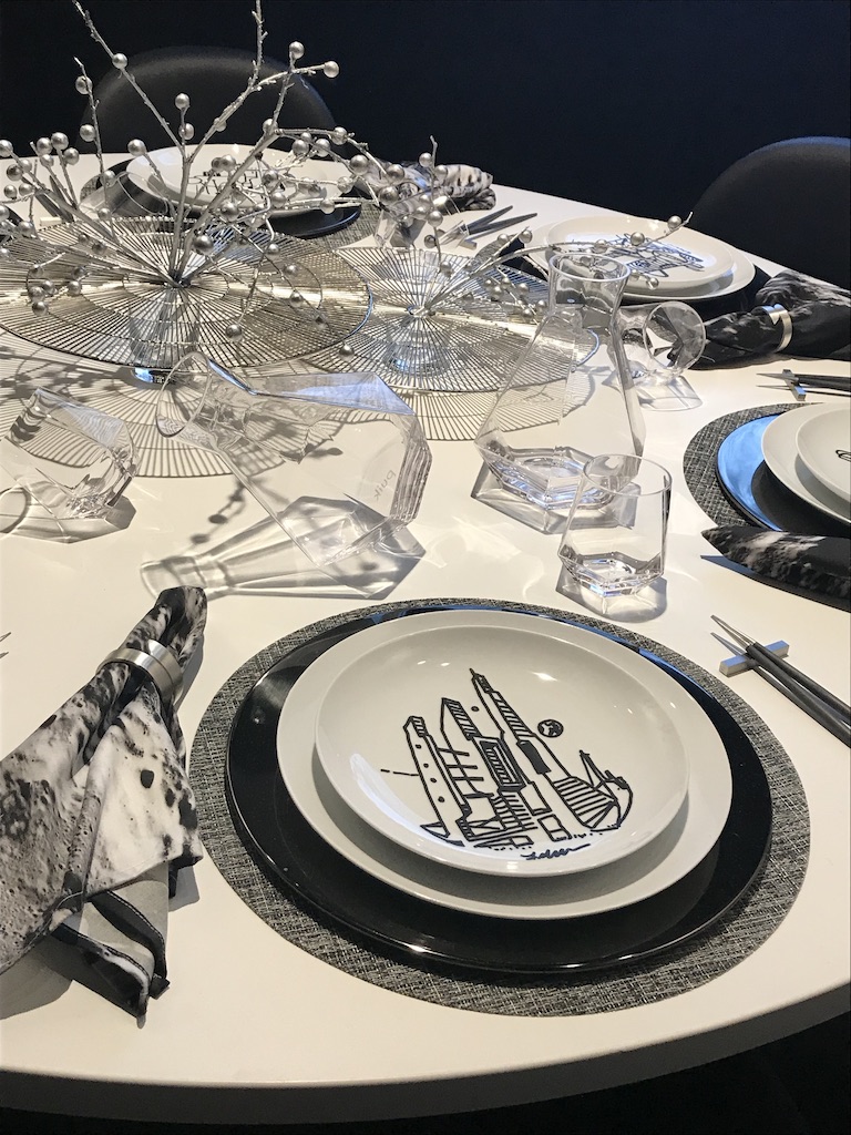
All the art, including the moonscape in the background and a signed Aldrin book are available to bid on in the online auction.
It’s all very ethereal. I like it.
All the art, including the moonscape in the background and a signed Aldrin book are available to bid on in the online auction.
A beautiful floral chandelier lit from within is the star of the Stacy Garcia designed table. Stacy described her use of Crypton fabric for the drapes and the custom tablecloth. I admire the piping on the tablecloth with its smart contrasting color.
Olivier Florals Atelier designed the chandelier and the centerpiece. The dinnerware and glasses are Lenox (one of my favorite tablescape sources) and the flaware is Crate & Barrel.
Outstanding submissions by local design schools, including Pratt and Parsons are deeply thoughtful - and beautiful.
Roric Tobin for Modern Luxury created a visual fantasy with his “A Night in Korakuen.”
The tables and origami-shaped samurai chairs are custom or semi-custom with millwork done in his Bronx workshop by local craftsmen. The table bases and the three-tiered green cocktail tales Textiles by Gaston y Daniela for Kravet for the incredibly authentic kimonos Tobin had made for wall decor.
The “ghost” dining chairs echo the clarity of the glass vases, Christofle candlesticks and flatware in silver -- nestled in its own flatware egg-shaped holder -- a curiosity and conversation starter. And the piece de resistsnce is the handmade origami cherry blossom paper chandelier, infused with tiny, LED lights.
This is a table design you’d want to savor and enjoy - there’s delight in every detail.
The annual signature event, cocktail gala and the auction is the only revenue source for the organization that is dedicated to fighting HIV AIDS. There is no other source of funding and all the monies goes toward the effort. “Working towards an AIDS-Free Generation - Design Industries Foundation (DIFFA) Fighting AIDS raises awareness and grants funds to organizations that provide treatment, direct care services, preventive education programs and advocacy for individuals impacted by HIV/AIDS.
Even if you don’t get to the showcase, you can “browse, bid, and buy” here:
https://e.givesmart.com/events/bZg/
I'm partial to these offerings but please browse through and make a bid for a good cause.
- Peacock Feather Table Covering - Yes, that one!
- Copper Governor Pool House Lanterns
A portion of the proceeds from all ticket sales benefits Design Industries Foundation Fighting AIDS (DIFFA). To learn more about DIFFA, visit DIFFA.org.
About the Architectural Digest Design ShowThe 18th annual Architectural Digest Design Show, held from March 21–24 at Piers 92 & 94 in New York City, showcases the best in the design and luxury market. The four-day fair features more than 400 premium brands and covers a range of categories, including: accessories, appliances, art, beds, building products, carpets & rugs, children’s furniture, closet systems, connected home, design services, electronics, fireplaces, flooring, furniture, hardware, lighting, metalwork & stairs, outdoor furnishings, paint, prefab homes, safes, spas, stone & tile, tabletop, wall coverings, windows & doors, and window treatments. From product launches to special events to panel discussions with top design leaders on a variety of topics, the show is a must-attend for the industry’s professionals and discerning consumers. The Architectural Digest Design Show is produced by The Mart, a Vornado Property and hosted by Architectural Digest. For more about the show, visit ADDesignShow.com.
About Architectural Digest
Architectural Digest (AD) is the international authority on design and architecture. AD provides exclusive access to the world’s most beautiful homes and the fascinating people who live in them, bringing its audience a wealth of information on architecture and interior design, art and antiques, travel destinations, and extraordinary products; its AD100 list of top architects and designers is one of the industry’s most relied-upon indexes of talent. AD's digital channel, AD PRO, features authoritative, opinionated coverage and breaking news for design-world insiders, and vertical Clever, takes on the unique challenges of designing a smaller space; offering design advice for real life and the brand’s website: archdigest.com.
About DIFFA
From the resurgence of Judd-esque minimalism, to the return of ash and light woods, and the abundance of glass in all forms, MADE is a showcase for top interior trends.
This talented group of makers serves as the perfect complement to the show's rich and extensive exhibitor line-up.
DIFFA Design Industries Foundation Fighting AIDS raises awareness and grants funds to organizations that fight HIV/AIDS by providing treatment and direct-care services for people living with or impacted by the disease, offering preventative education programs targeted to populations at risk of infection, or supporting public policy initiatives. DIFFA is one of the largest funders of HIV/AIDS service and education programs in the U.S., mobilizing the immense resources and creativity of the design community.
