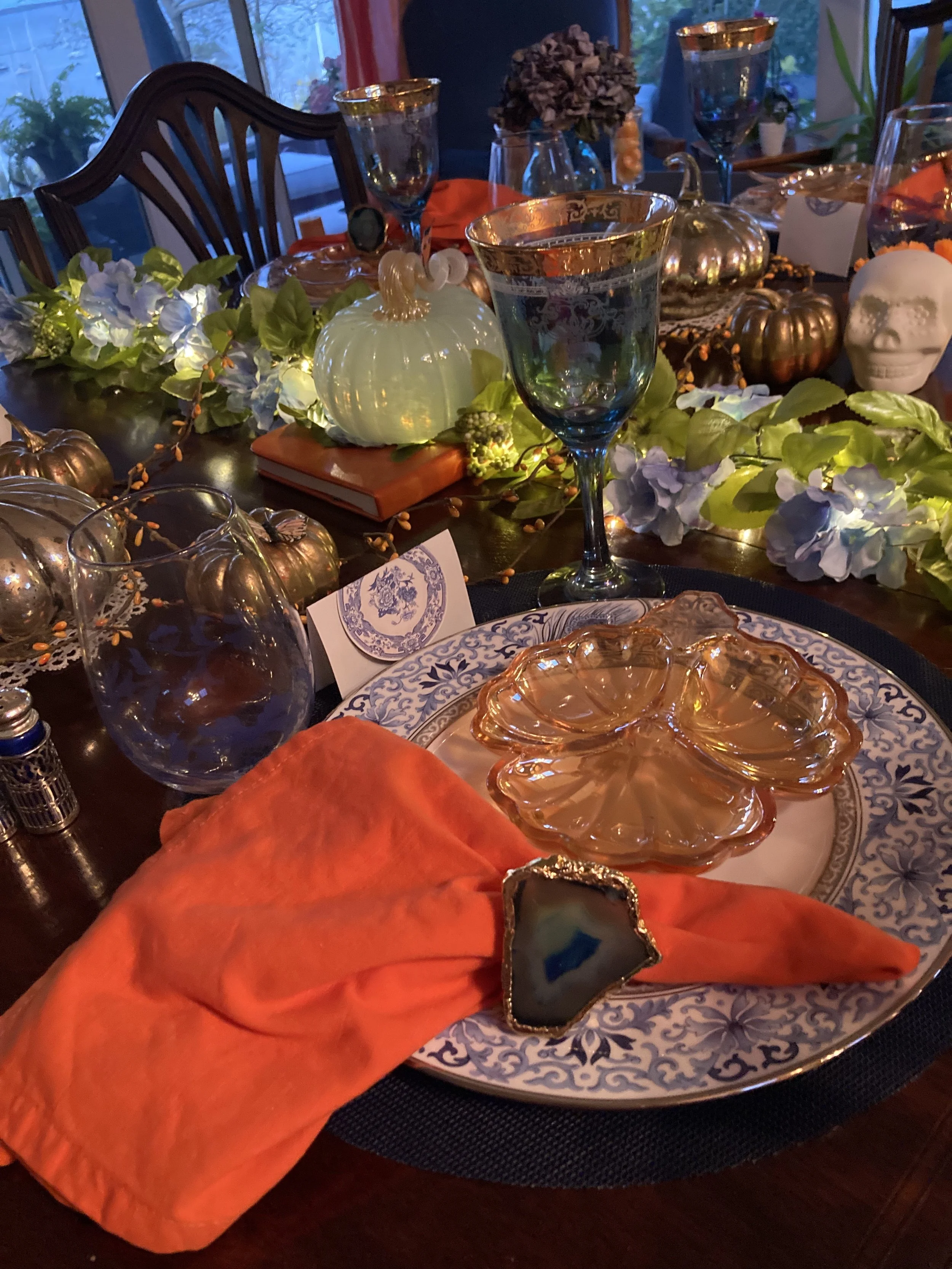
Coloring Outside the Lines? How to Design an Unexpected Autumn Tablescape
Feeling more than just the change in the weather, I wanted something fresh and unexpected when dreaming of our Fall Tablescape design this year.
Adding a rich, azure blue to the traditional fall color scheme of falling leaves ~ ablaze with deep orange, warm gold, and earthy brown, stoked the spirit of the fall table style.
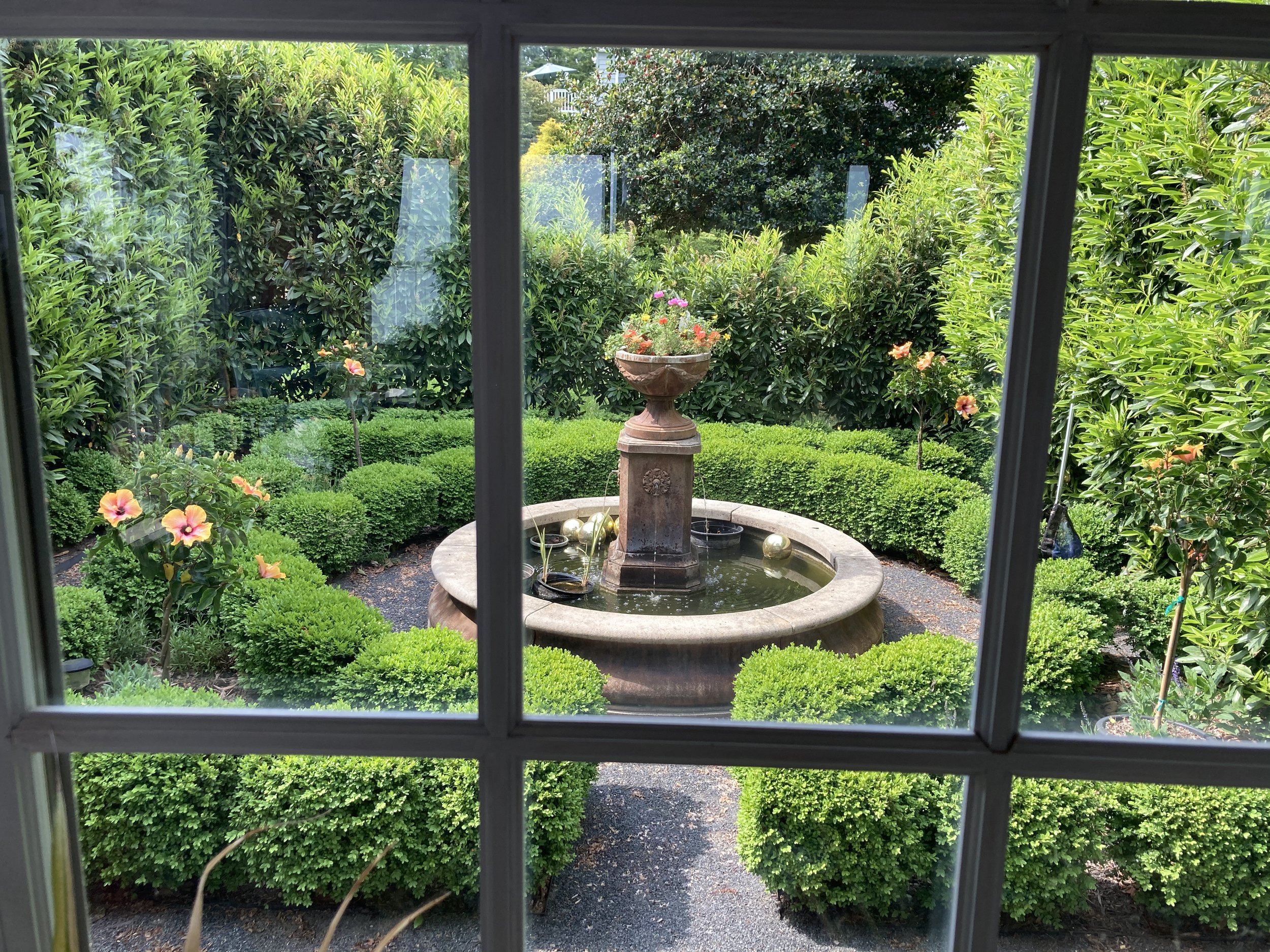
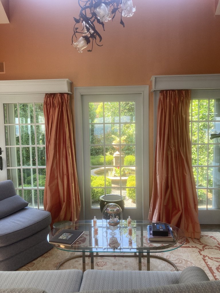
Our garden room now embraces our dining room ~ as of last spring we moved the dining table there. I wanted to take advantage of the “shoulder season” allowing us to entertain in the warm, sensual space, with its French doors on three sides, and the various gardens and cityscape view that beckon just beyond.
The light-filled room 's colors are blue and saffron orange.
The monochromatic color scheme may seem too outré for many folks ~ I’ve had folks tell me that they would just love to do something bold like this in a room of theirs but were afraid they’d get tired of it, or it wouldn’t do for resale. The latter I don’t consider (why live with something that doesn’t bring you joy just so the next homeowner ~ in how many years? ~ wouldn’t care for a color. Don’t roll the dice.
I tell them when they whisper their color confidence that we’ve loved it every single day for more than a dozen years ~ basking in the sun rays and shadows that amplify a gold or terracotta or tangerine hue depending on the season and the time of day.
The colors also provide a terrific design muse.
I designed the billowy, silk dupioni drapes to lend a kind of ball-gown elegance to French doors and that are so enchanting when the breeze can kick up their skirts…
I chose the room colors inspired by the heart-clutching sunrise and sunsets we get to admire so intimately here on the water, so it was only natural that when I saw a Joanne Buchanan ad for an autumn tablescape, I was in turn, inspired to go for colors that radiate our happy place.
Here I can bring in the natural elements of the seasonal foliage plus that autumnal “borrowed landscape” just beyond, especially the gold/orange leaves of the Red, Coral Bark Maple (Acer palmatum 'Sango-kaku') of the arbor peeking out over the laurels.
See the Arbor’s golden maple leaves just beyond in the “borrowed landscape” and the sun-rays that make the table just Glow.
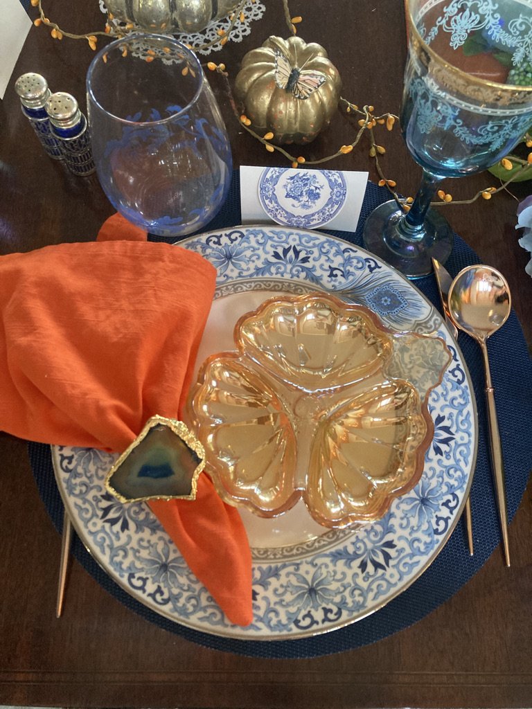
It was fun to change up the "usual" Fall Tablescape; opting for a complementary color approach that embraced blue and warm golds, along with more traditional, spicy amber, orange & brown.
I hope you'll agree that the table style just glows.
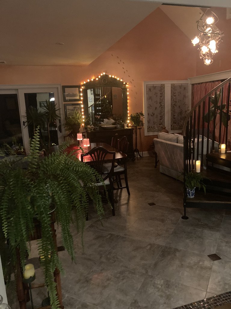
Night and Day...
Using rose gold cutlery to echo the copper in the room and the glow, along with the faux blue hydrangea garland that I added twinkly lights to, and placed along the middle (rather than the length of the table, add texture & a playful change.
The charming blue glass pumpkin, gifted to us by Mother is a classy nod to the season. I Love it! 💙 & of course, Mom!
I always like to use "found" or repurposed table accessories; enjoying how the diversity creates new table setting discoveries. And rediscovered delights for us and our guests.
I especially love the blue and gold agate quartz napkin holders I found at Home Goods ~ they add a very elegant, bejeweled touch.
The rich, warm colors play so well with one another and capture the fall light with seasonal sensualness...
I hope that my inspirations will inspire you as you Gather this season to celebrate your harvest.
Tablescape Ingredients (see Duchess Picks)
☀ Dishes: Marchesa by @lenox
🍂 Amber glass appetizer plate: Vintage
🐚 Amber Shell jars: @kinka_nyc
🍷 Blue & Gold Wine glasses: Venezia
🌀 Blue Italian Stemless Glasses: @spodeus
And Love…

