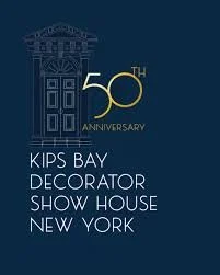
The Kips Bay Showhouse Celebrates Its Golden Jubilee
There is no arguing that turning 50 symbolizes a victory lap for all past achievements while also looking ahead to the next chapter of possibility and experiences.
This year’s Kips Bay Designer Showhouse was not a fusty mid-life crisis by any stretch of the imagination. Rather, as Alexa Hampton explicitly defined the event, it is "taking the temperature of the design zeitgeist" ~ lest there be any doubt about the relevance and future of one of New York’s most cherished design-centric traditions. Even this year’s location was a new beginning. The first downtown Showhouse ever ~ and practically right across the street from moi!
I had a good feeling about this year’s landmark celebration.
First off, I have to suggest to you to grab a cup of good coffee, tea, or a glass of wine and get ready to nest for this recap of the Designer Showhouse. It is truly a remarkable event; pulsing with innovative home design ideas. But it is a bear to write about! (How to capture so much in a snapshot overview?) And therefore, a wee bit of an extended read. Yet, if you’re like me ~ someone who just loves home design ~ you’ll be enthralled and inspired.
Here’s my take:
That Was Then…

I did my research and learned that this year’s Showhouse almost didn’t make it to 50. Egads.
In March, the organizers behind the New York tradition announced that the townhouse secured for this year’s event turned out to not be so secure, and a new location was needed.
Further, according to Kips Bay, “It wasn’t the first time that the showhouse had hit a bumpy patch. In 2010, Kips Bay was postponed until the fall when the original Upper West Side venue was sold out from under it. A decade later, the pandemic shuttered the New York edition from 2020 to 2022. Along the way, there have been countless setbacks: leaky plumbing, dropped mirrors, spilled merlot—and an infamous 1988 robbery in which burglars made off with gilded sconces and a silver fox throw. Despite it all, the show has gone on.”
Lucky us.
Just in time, the organizers were able to clinch a townhouse in the West Village for a late September opening. The site was novel—the first downtown Kips Bay—but the experience was a familiar delight for longtime attendees: a dazzling variety of styles, a contemporary spirit, designer war stories about frantic installations (and jokes about the opening night party).
Kips Bay is sometimes referred to as the first event of its kind. It’s not. The Junior League of Boston’s Designer Show House beat it by two years. Yeah for us Junior Leaguers.
“When it launched in 1973, a notice in The New York Times society pages promised three floors of an 1880s Park Avenue mansion reimagined by “New York’s most distinguished decorators”—an inaugural class that included Mario Buatta, Thomas Britt and McMillen. Some of the rooms had originally been conceived by interior design’s founding mother, Elsie de Wolfe. The ad seemed to acknowledge the degree of difficulty, enticing would-be attendees to “see these challenging contrasts at a champagne preview for $25.” During normal visiting hours, the general public could attend for a mere $3. 🤭
The event was a fundraiser for what was then the Kips Bay Boys Club (it became co-ed in the 1980s), a nonprofit that offers academic, sports and arts programs for disadvantaged Bronx youth.”
This is Now…
As I wheeled my weekend bag from the subway to my apartment on Fifth, I walked past the entrance to the Showhouse where the designer glitterati were starting to gather.
Exciting.
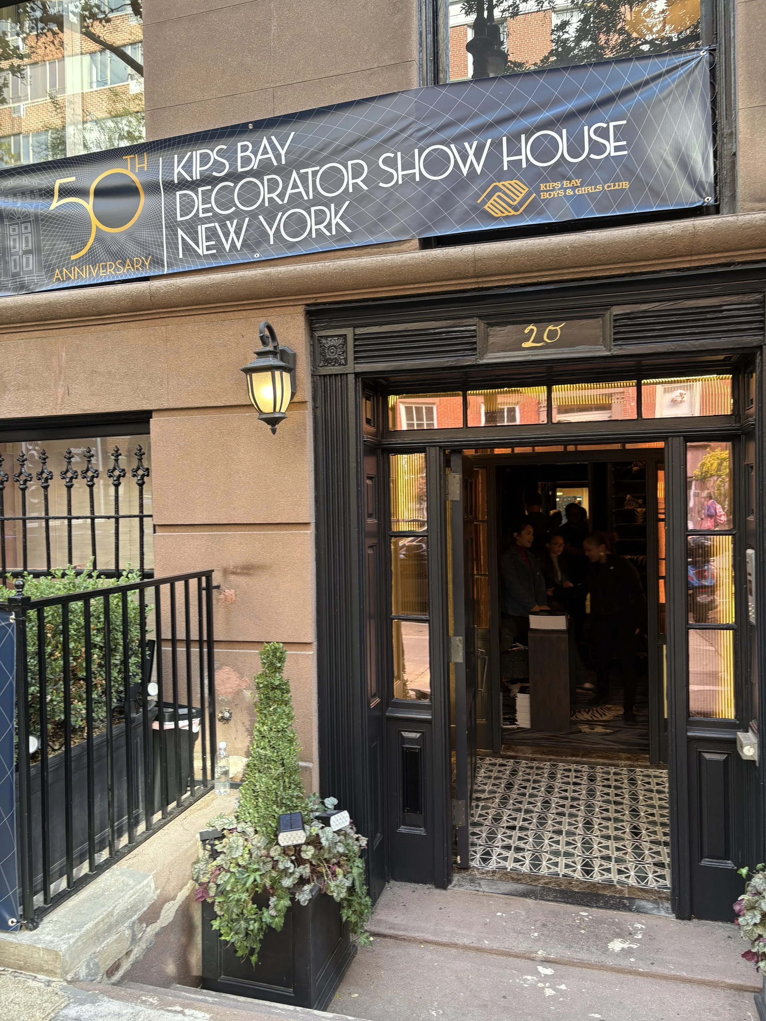
And I still couldn't believe that it was the first time the Show House moved downtown, to a 9,000-square-foot, six-level brownstone $16.5 million townhouse in the heart of Greenwich Village. My neighborhood. I thought surely, I must have missed some years when the show was below 14th Street.
Bill often jokes that anything above 14th is Connecticut!
I learned that the 125-year-old building ~ almost right behind the FIrst Presbyterian Church, has a long history behind it, a century’s worth of “insensitive alterations” cut up its once-grand spaces and left them nearly devoid of any original details, or charm.
As a result, the 21 designers participating in the 2025 showhouse — open through October 19 — had to do double duty: first, restore each room to at least some of the building’s original gravitas, and then, give it the glow up of its life.
The 21 designers had just eight weeks to create the spaces. Talented designers possess vision.
The reimagined spaces established the Show’s theme Iconic Rooms.
And indeed, every room leaves a lasting, inspiring impression.
So while I can’t show or tell you everything ~ I even had to rely on the Kip’s Bay press materials for a lot of the text so that I made sure I got all the designers’ names and the makers' products correct ~ I will highlight a few of my (Duchess) picks up front.
Let’s kick off the showhouse with My favorites:
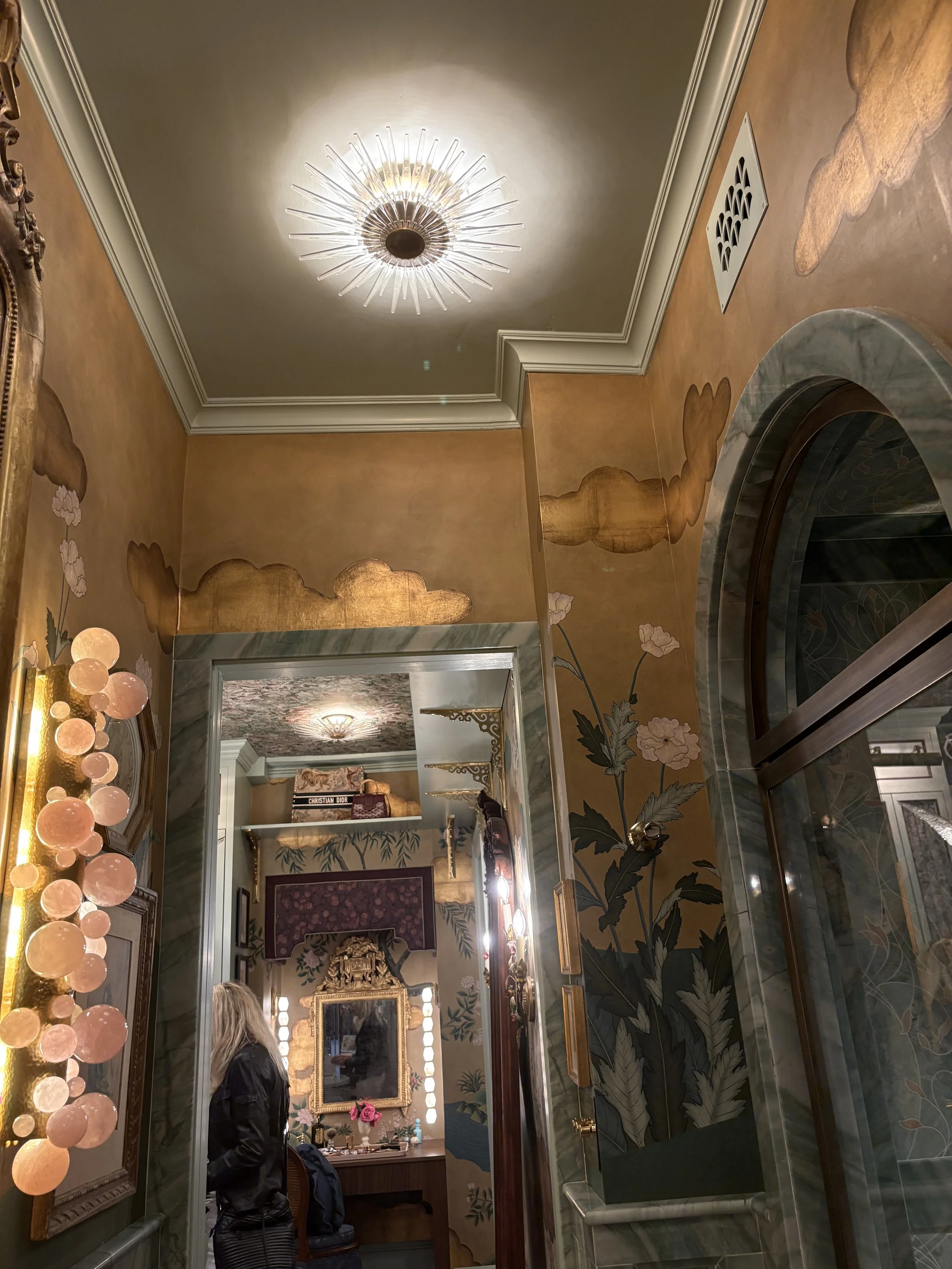
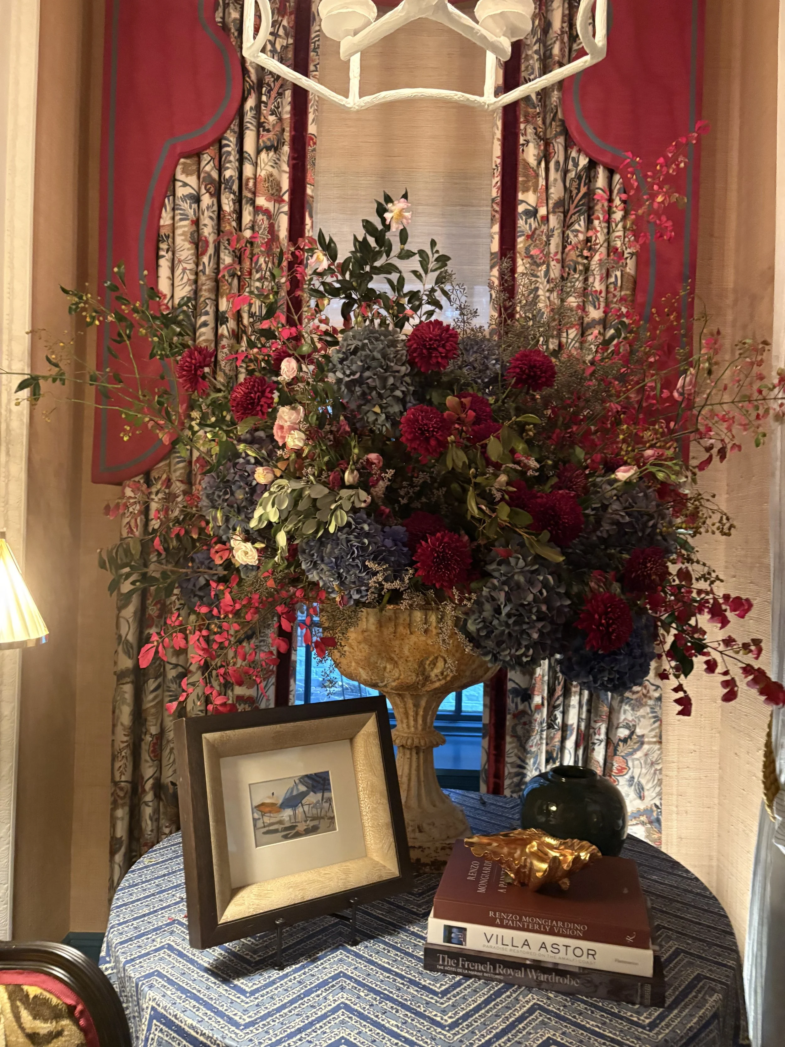
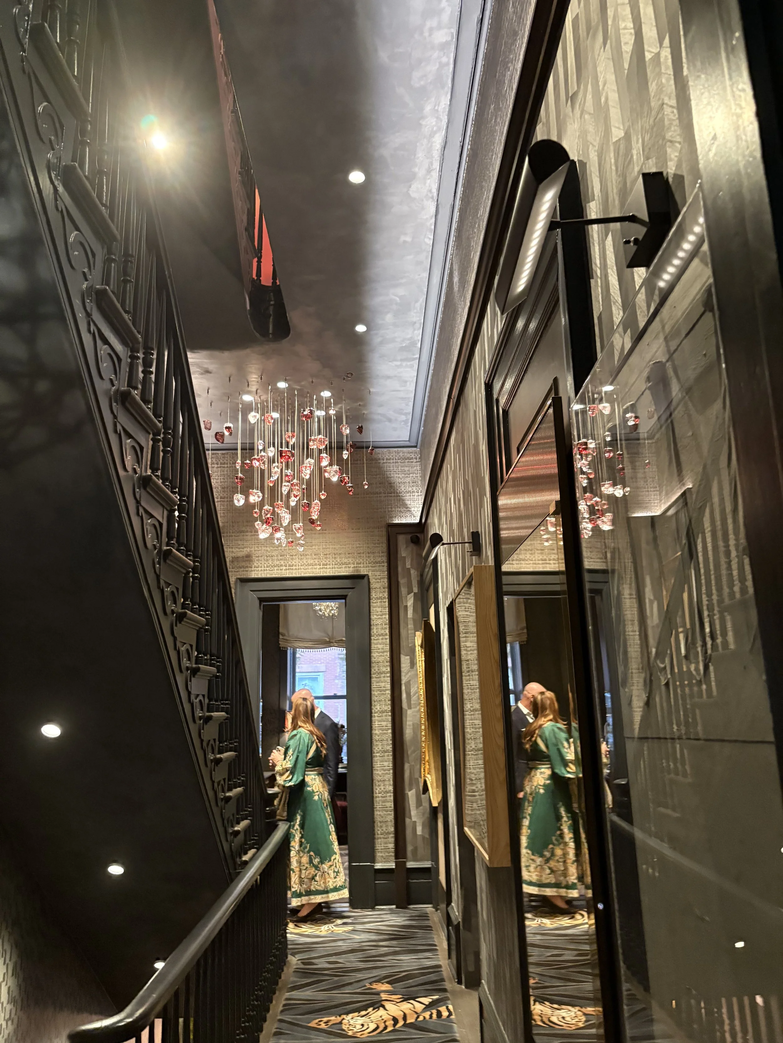
Entry
A Midnight Check In
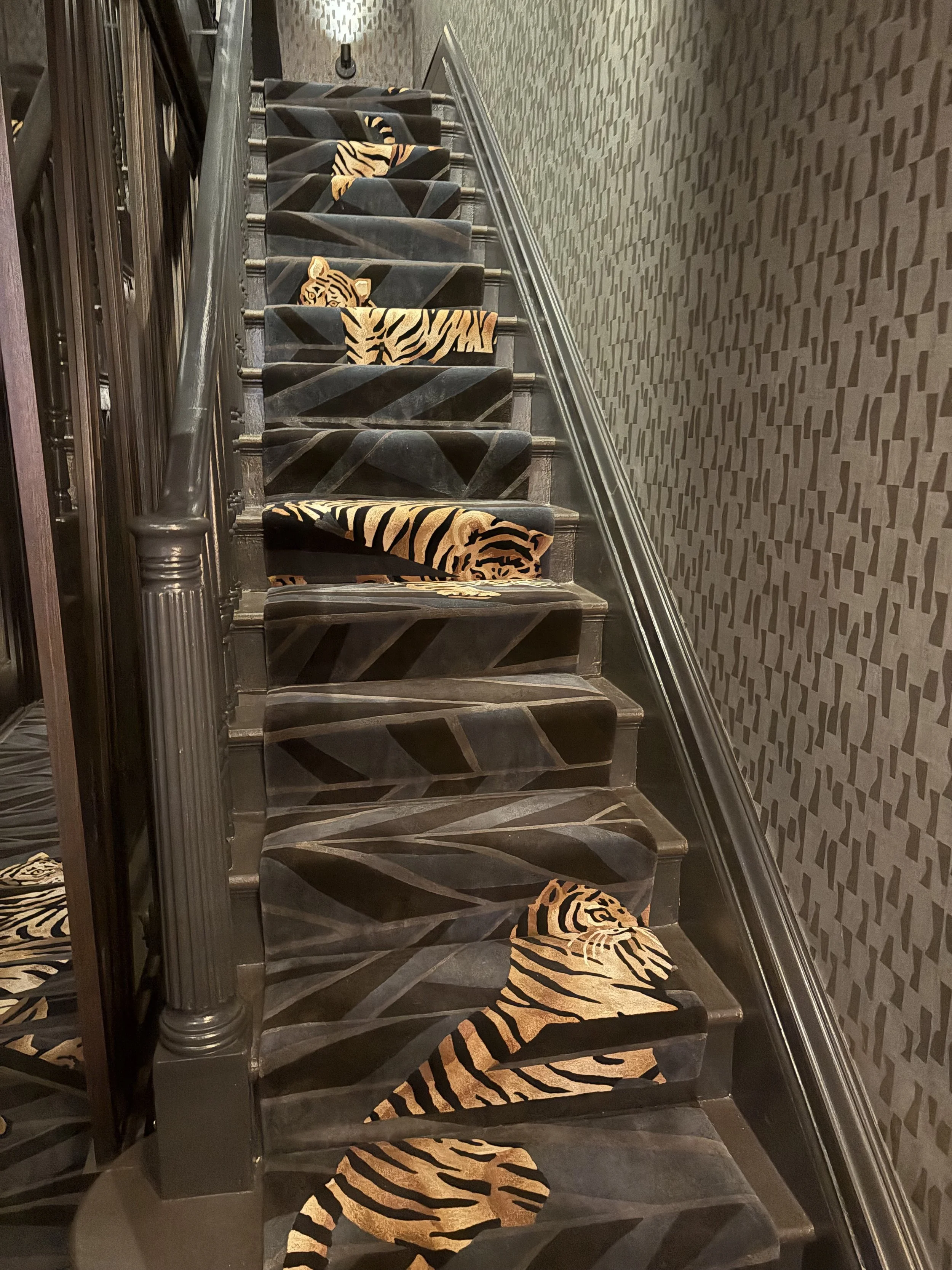
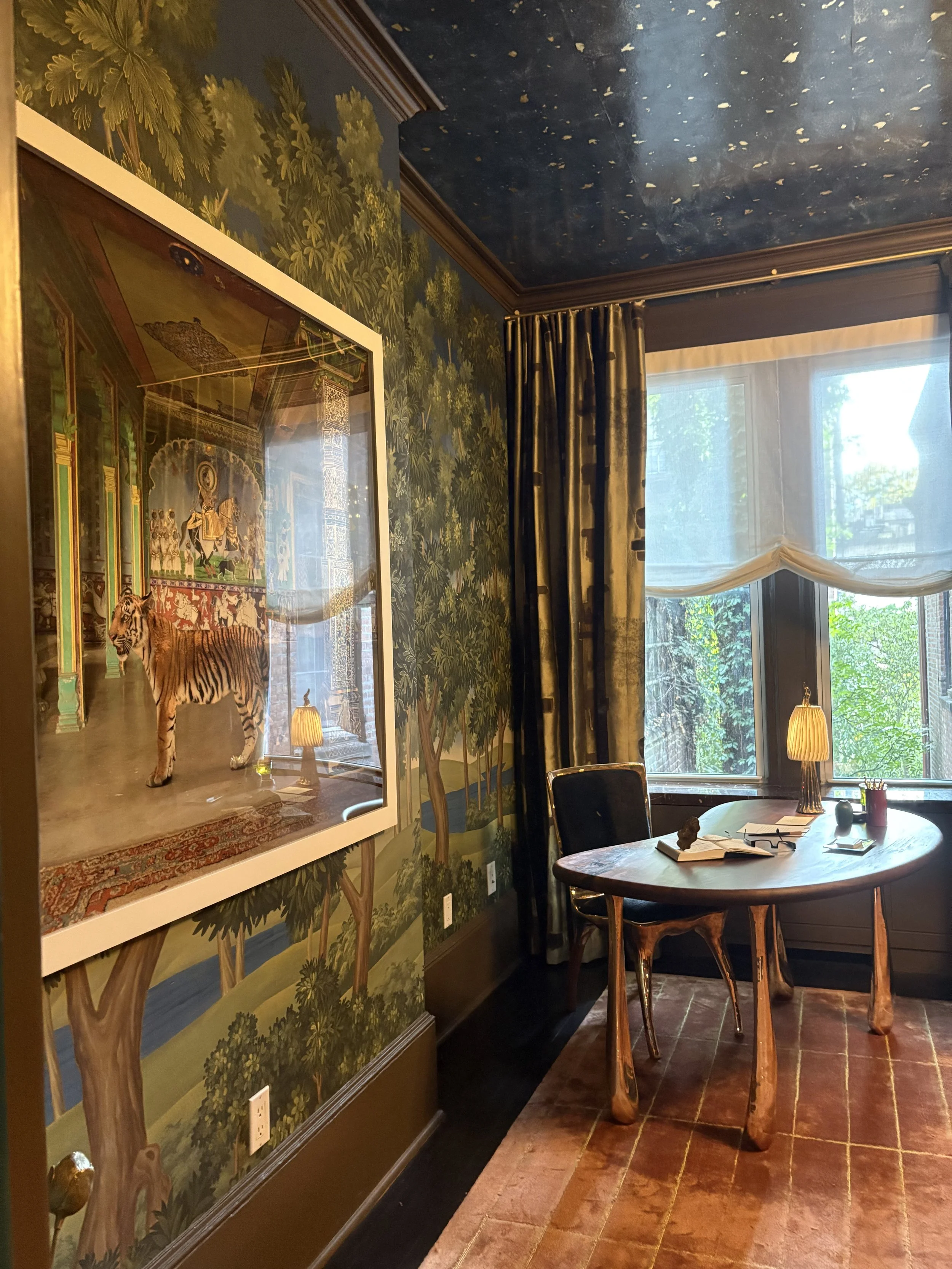
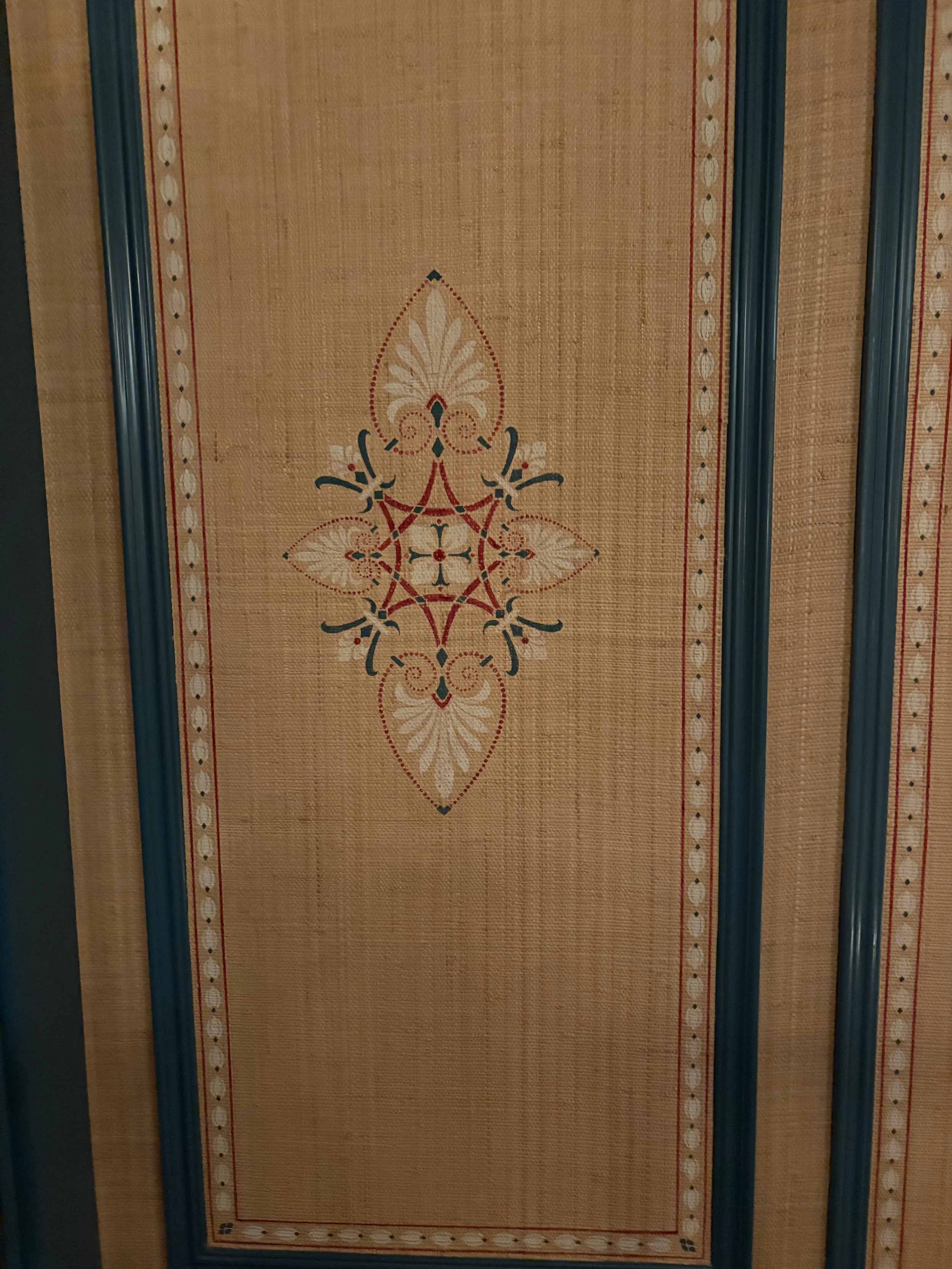
Ovadia Design Group’s stair hall and landing is a grrrr-eat passage, featuring the Tiger carpet by Tai Ping
And the inside of the front door that’s hand-painted ~ and that I / no one ~ would ever have seen unless the docent pointed it out, as she did for me when she admired my animal print fashions. (I posted this lucky find on Instagram to much delight from Followers.” Fun.
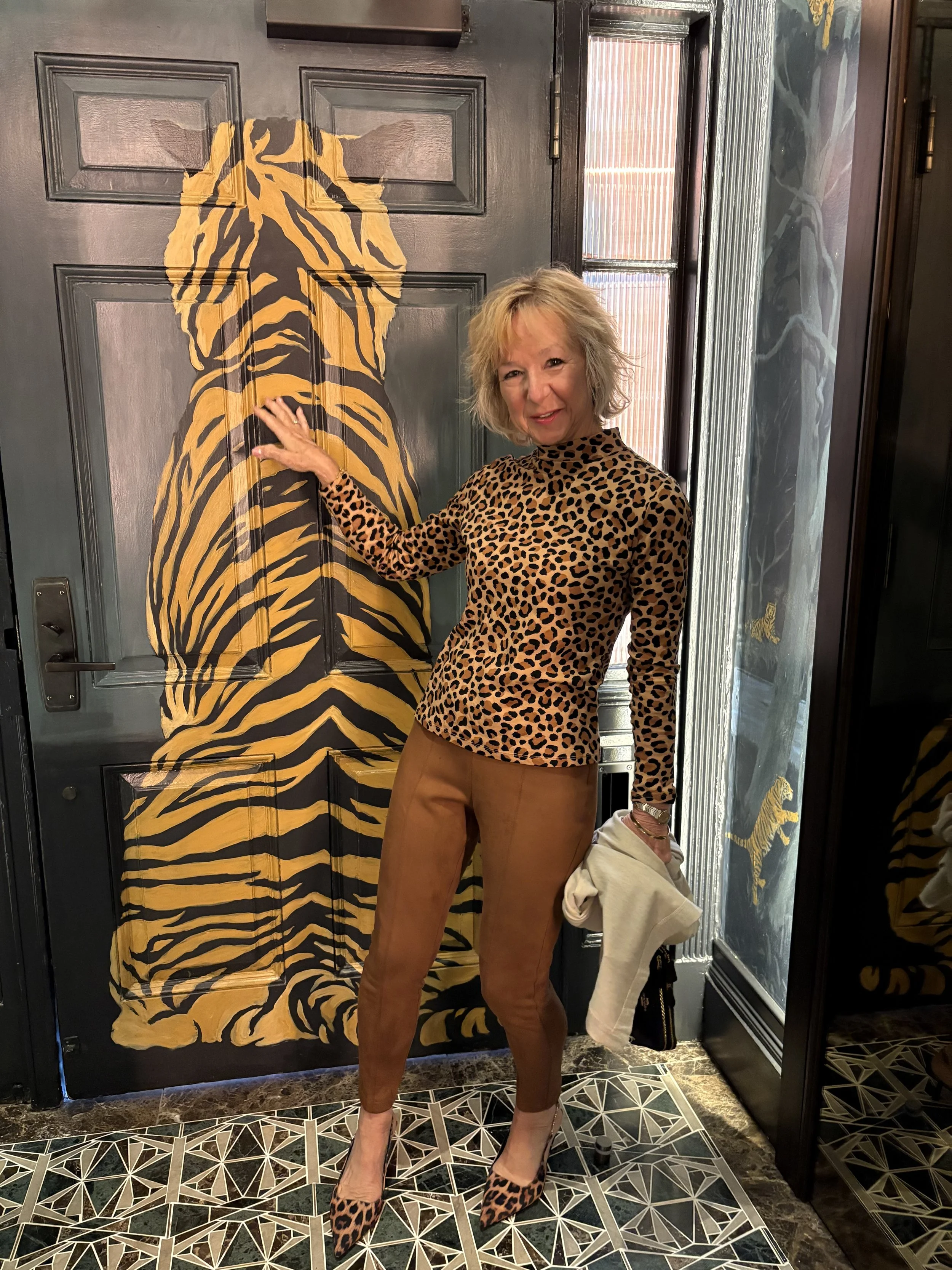
The entrance sets the tone and immediately steals the show. Designed to evoke a dreamscape in midnight blues and muted metallics, the space stuns with sculptural and textural detail: an S-Helix woven-reed sculpture by August Lehrecke for Ralph Pucci, a custom Shakúff rock crystal chandelier, and the pièce de résistance—a tiger motif runner, created in collaboration between Tai Ping and Jack Ovadia of Ovadia Design Group.
“Symbolising strength, courage and protection, the tiger appears throughout the entry in murals, passageways and on the staircase, hand-tufted in gradients of midnight, sapphire, and grey. ‘You can see the tiger peeping through the landscape,’ “Ovadia noted.
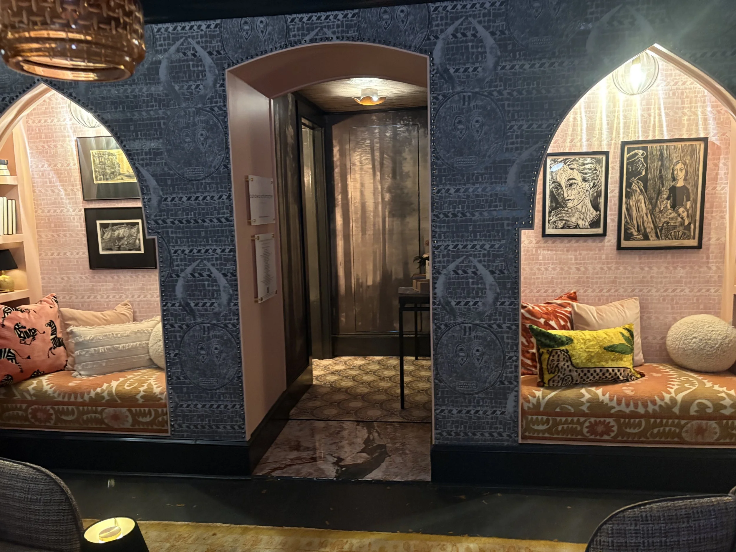
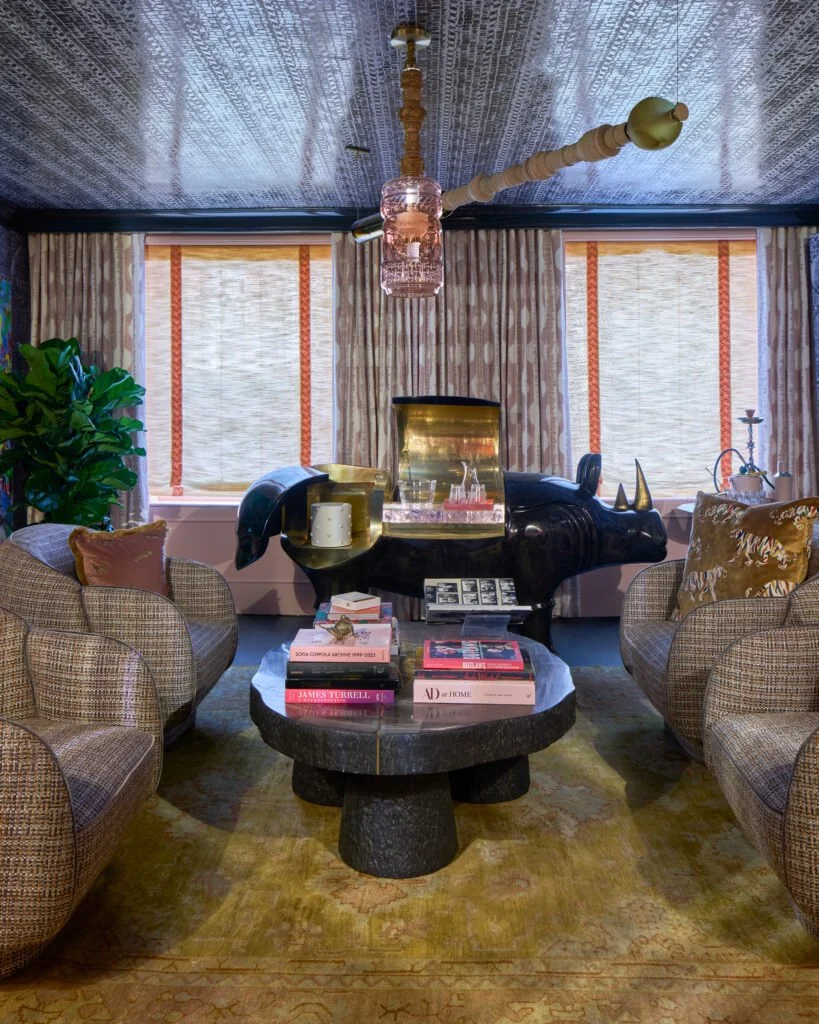
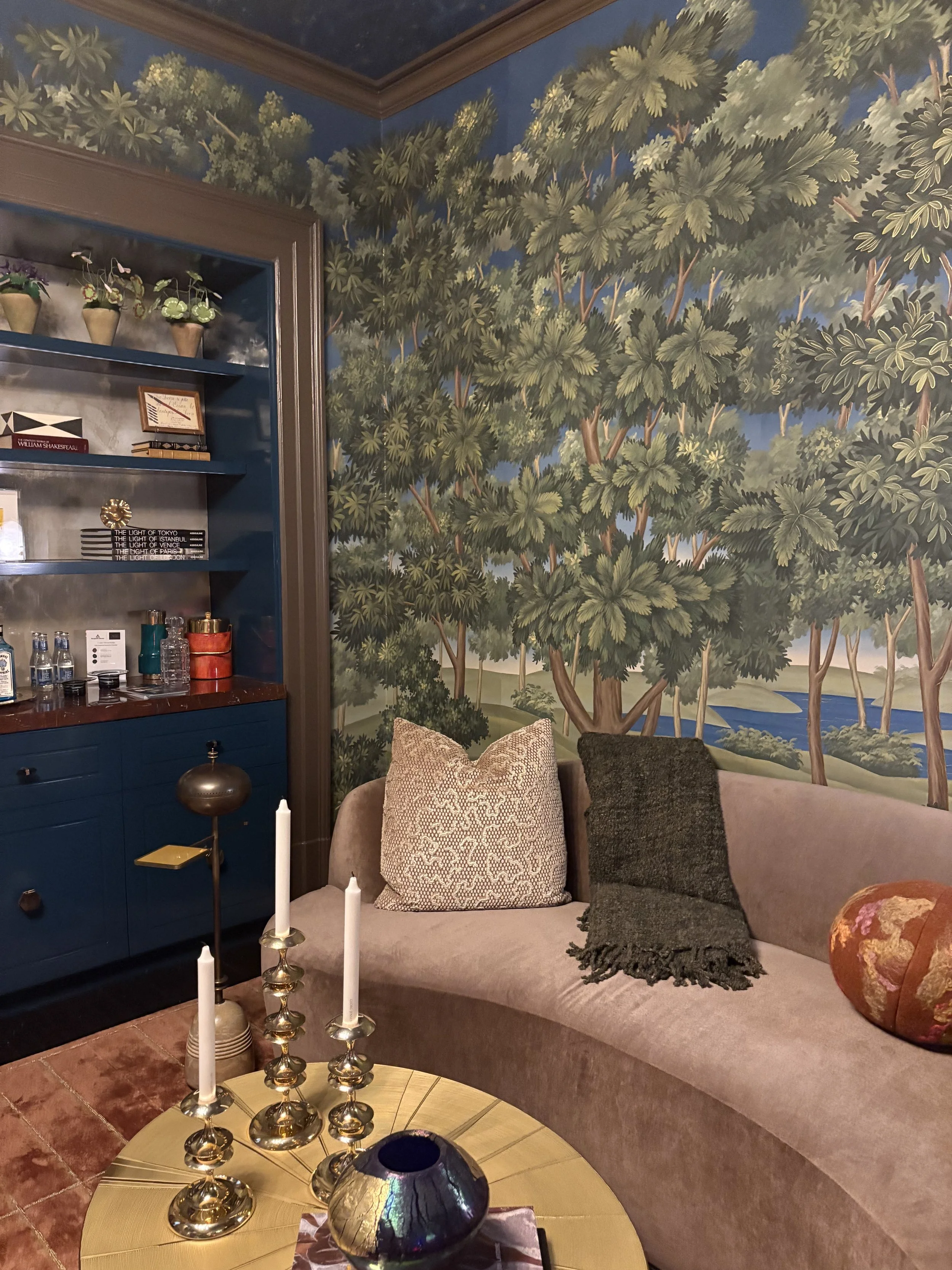
The animal narrative continues in Andrea Schumacher’s mischievous Front Parlour~Pink Rhino Club Room where Sylvan’s charcoal resin rhino—a nod to the iconic Lalanne—perches atop a Rug & Kilim antique coral-toned Ushak. Schumacher carried the midnight blue theme forward with custom wallpaper adapted from scanned African-inspired emblems created by her grandmother. The effect is both personal and powerfully atmospheric.
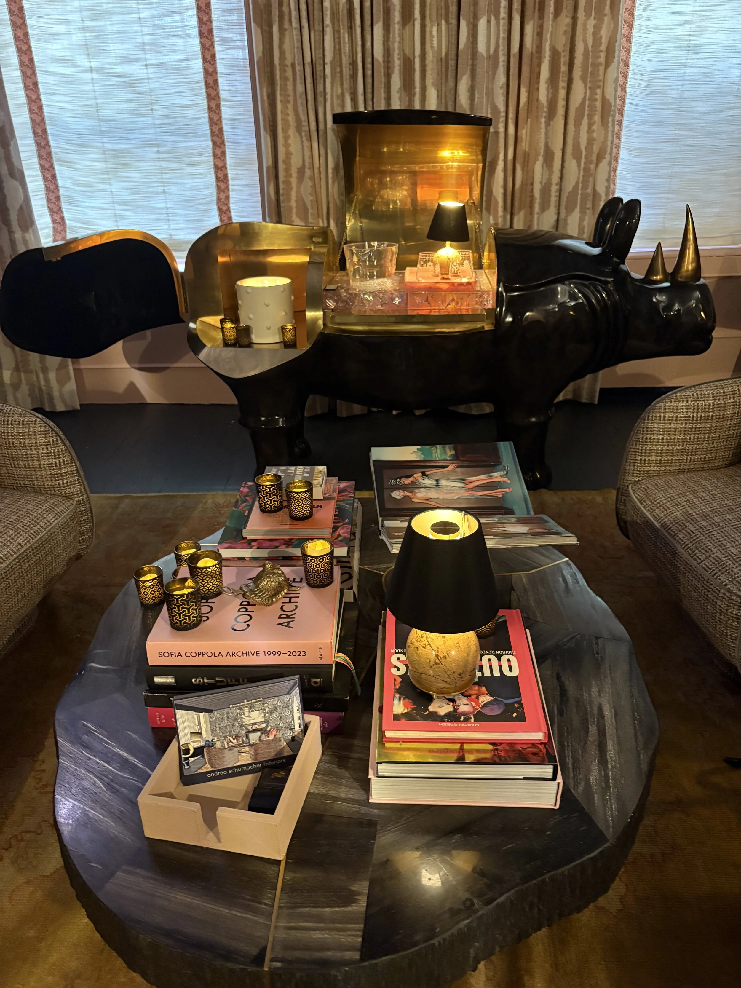
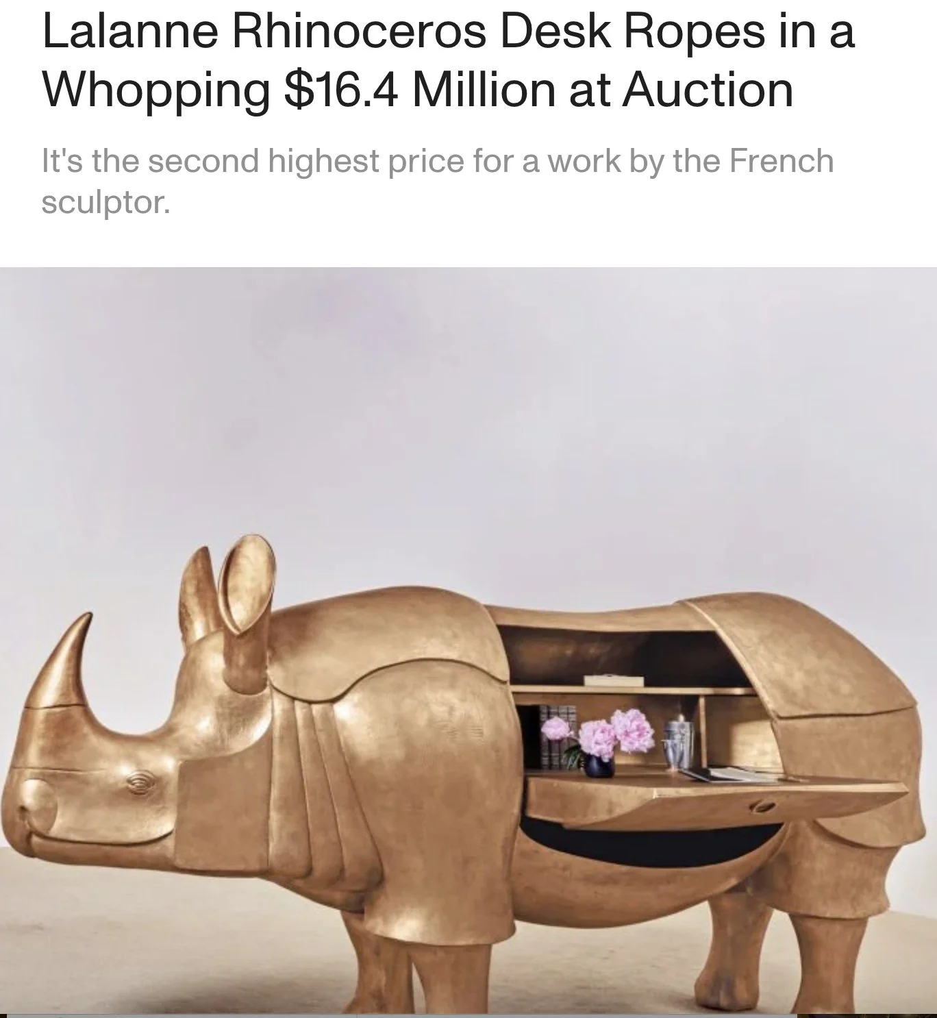
I then remembered reading that Sotheby’s sold a Lalanne rhino sculpture desk ~ not unlike the bar rhino featured in Schumacher’s parlour ~ for a whopping $16.4 million. Almost the same price as the entire Showhouse! At the time of the auction, the industry press noted, “Both François-Xavier and Claude Lalanne believed art should be a part of everyday life.” Well, la ti da. I want that everyday life. 😝
Drawing on her childhood in Nigeria and subsequent travels in Morocco, Schumacher created a cocktail-ready lounge she affectionately dubbed the Pink Rhino Club. Sitting just off the brownstone’s foyer, “it’s designed to feel like a secret hideaway,” she says. “Part bar, part salon — a place that instantly transports you, glamorous and a little untamed.”
Whimsical accessories and accents abound: velvet pillows emblazoned with animals, pink-leather cocktail accoutrements.
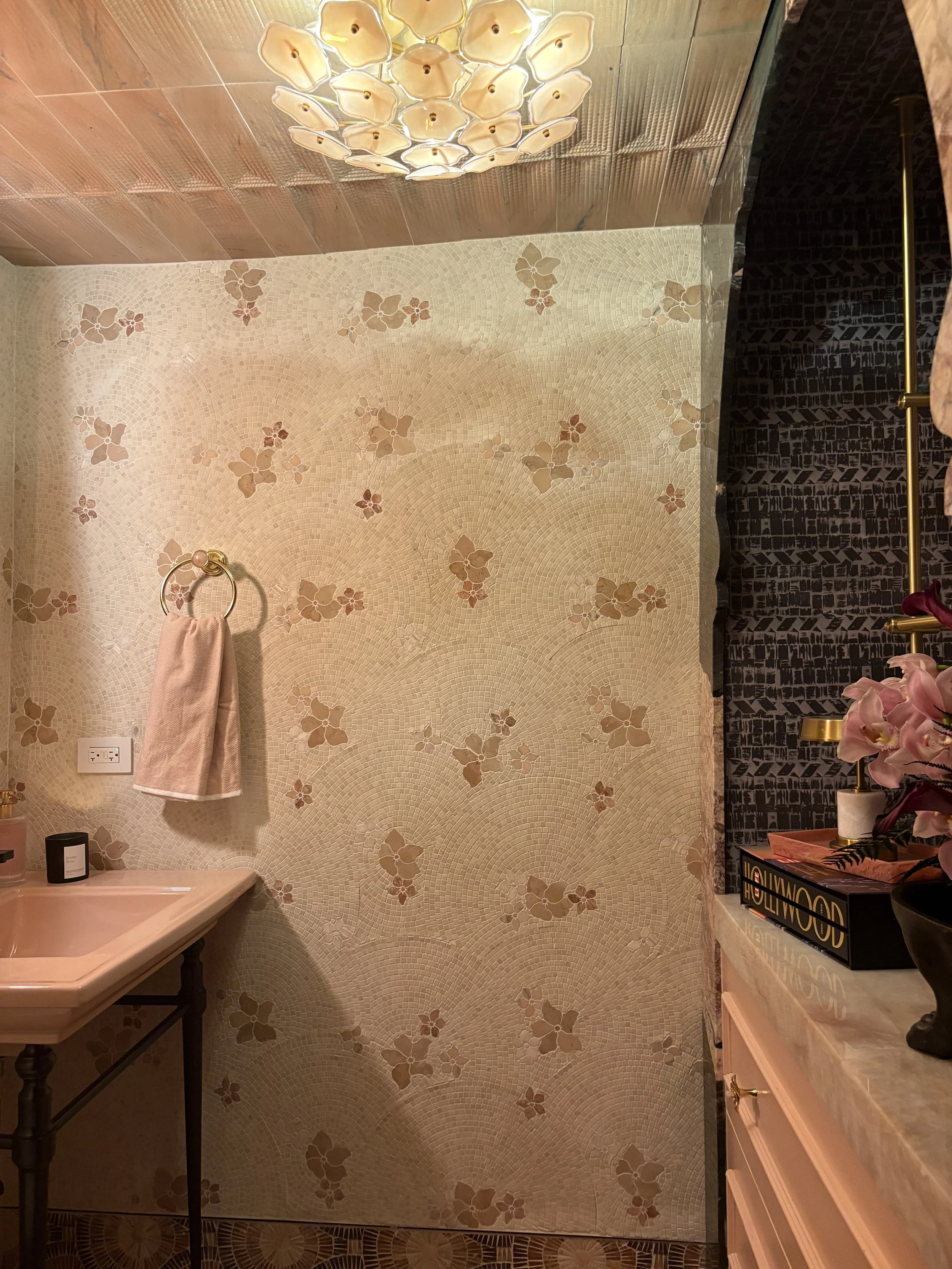
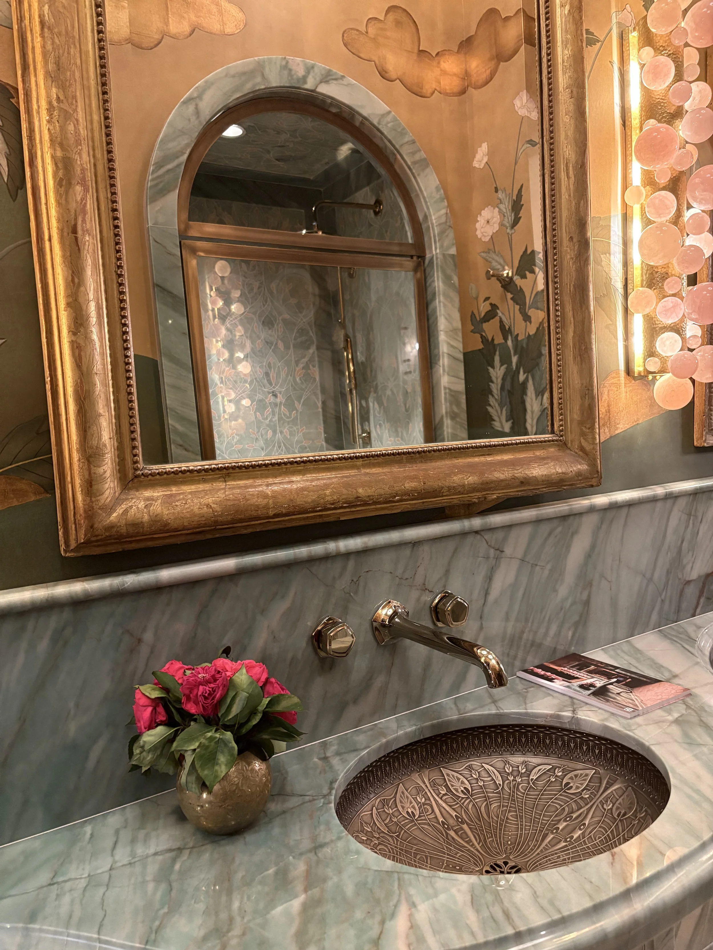
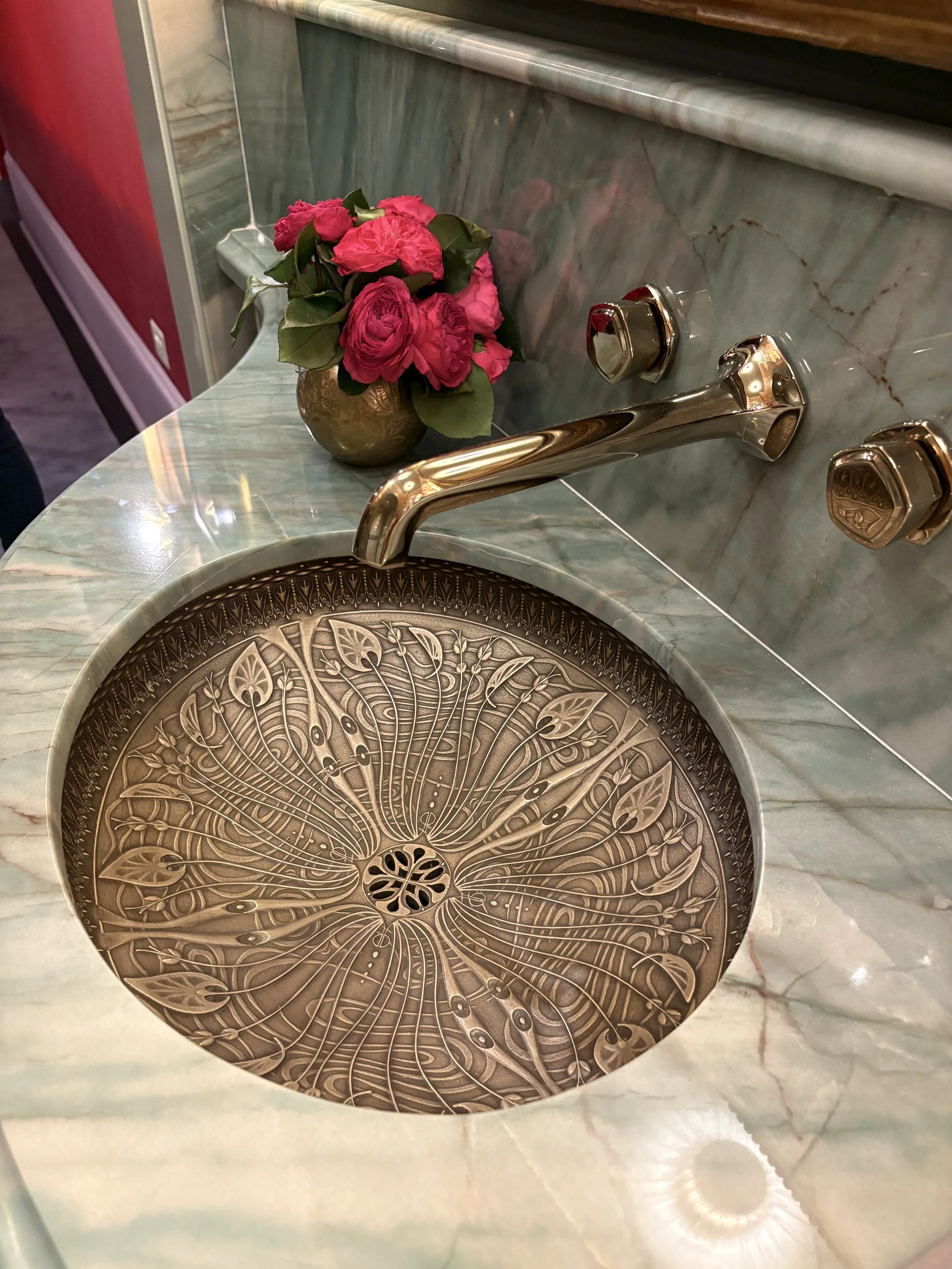
Another favorite Iconic Room is the The Dressing Story by Tiffany Skiling Interiors along with the marble clad bathroom, featuring Artistic Tile.
It is a dreamy, transporting jewel box of a space.
Skilling reimagined this Kips Bay space into a richly layered dressing room inspired by the romantic elegance of Paris.
I’ll say.
Infused with the spirit of Art Nouveau and filtered through a modern, editorial lens, the room balances old-world charm with intimate, personal luxury.
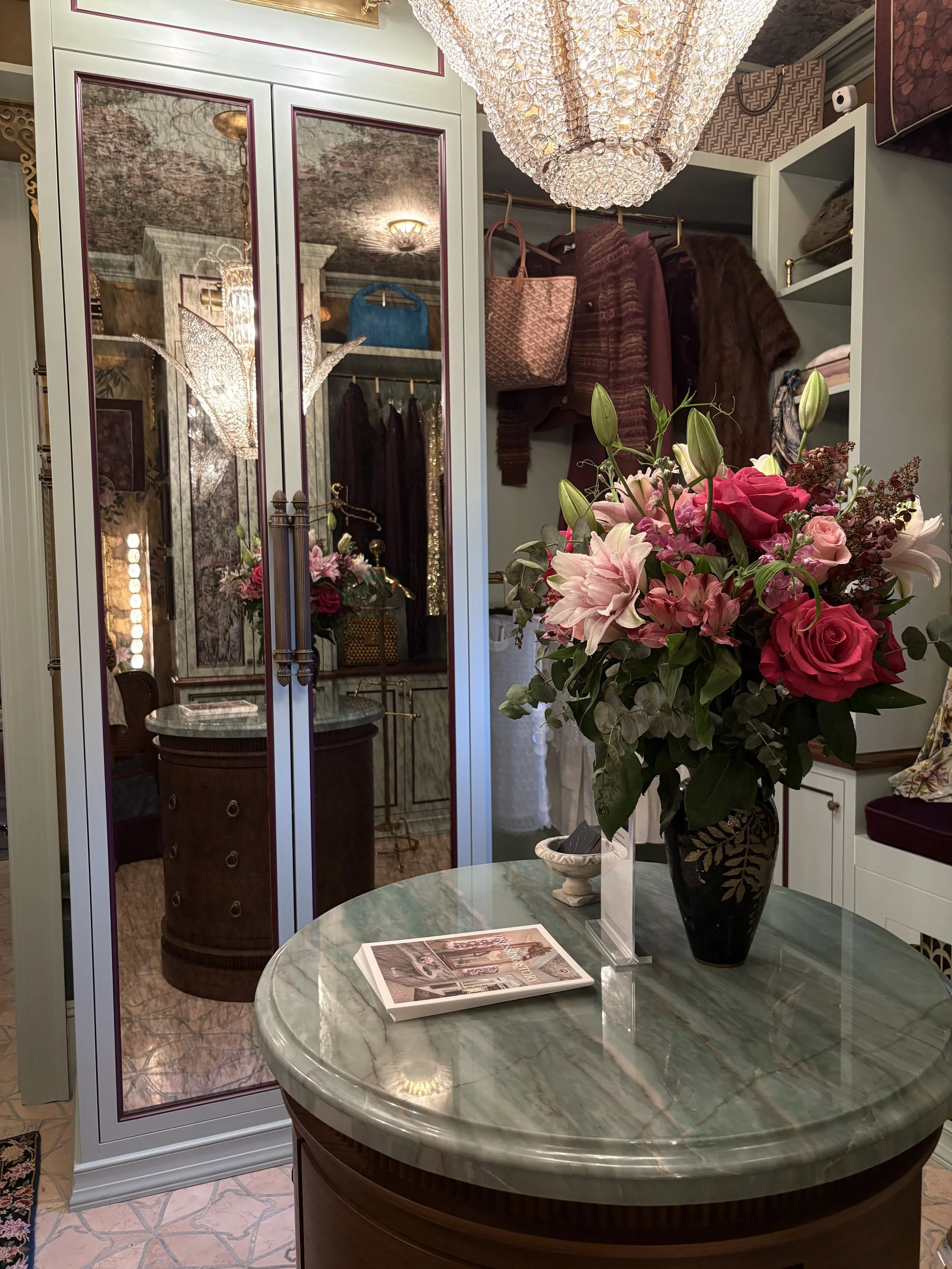
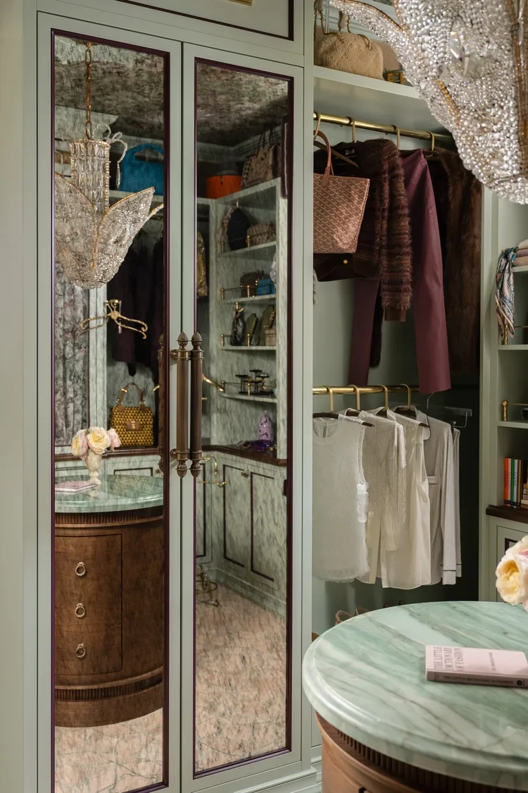
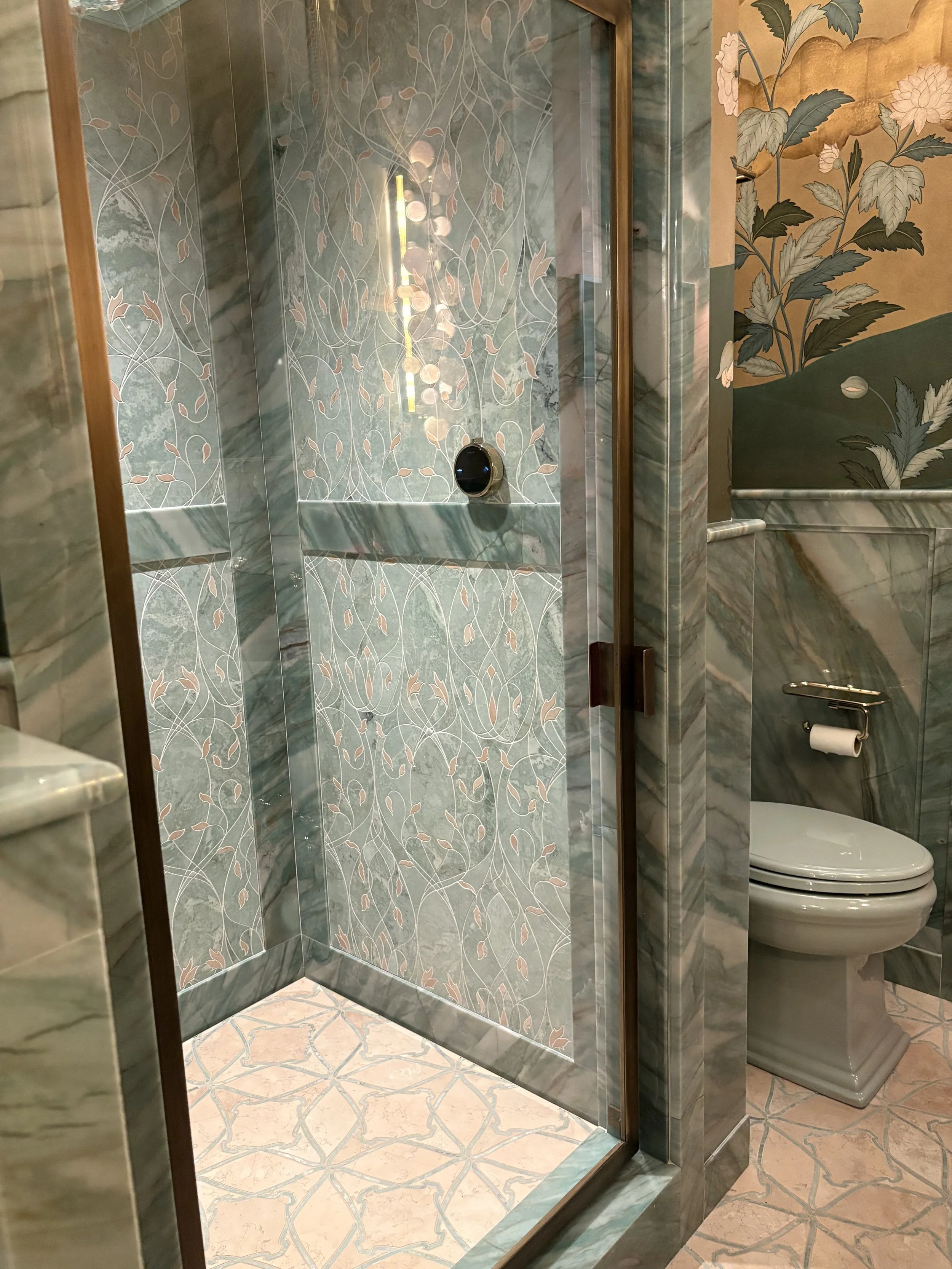
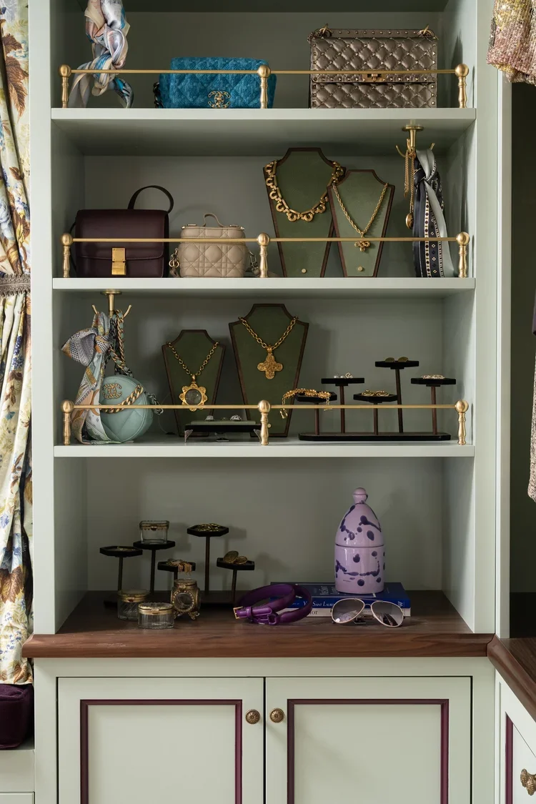
I am so fond of the pistachio and brown color combination and adding in botanicals only made me more tingly for this elegant design experience.
The hand-painted Gracie murals wrap the walls in dreamy botanicals. Their painterly presence is enhanced by the warm glow of antique decorative lighting from Carlos de la Puente and modern lighting from Visual Comfort & Co. Intricate moldings and stylish surfaces like the Botanic Green quartzite countertop by Artistic Tile add intrigue and depth. Even the ceiling is magnificent, covered in a swirling, ethereal wallpaper by Cat Alexander.
The green tile in the loo is so calming; organic and especially swanky in the swervy vanity and sink design.
I can’t help but feel prescient because when I stepped into the dressing room, I remarked to the docent there that this room could tell a lot of good stories! She nodded mischievously.
Subsequent to the tour, I researched Skilling and learned she has a retail shop, with the moniker ~ wait for it ~ Story. (Maybe it’s my affinity for storytelling as an author/writer?) 😉
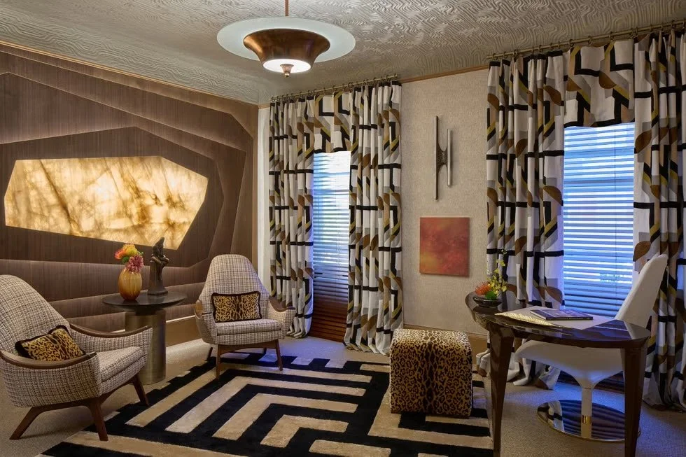
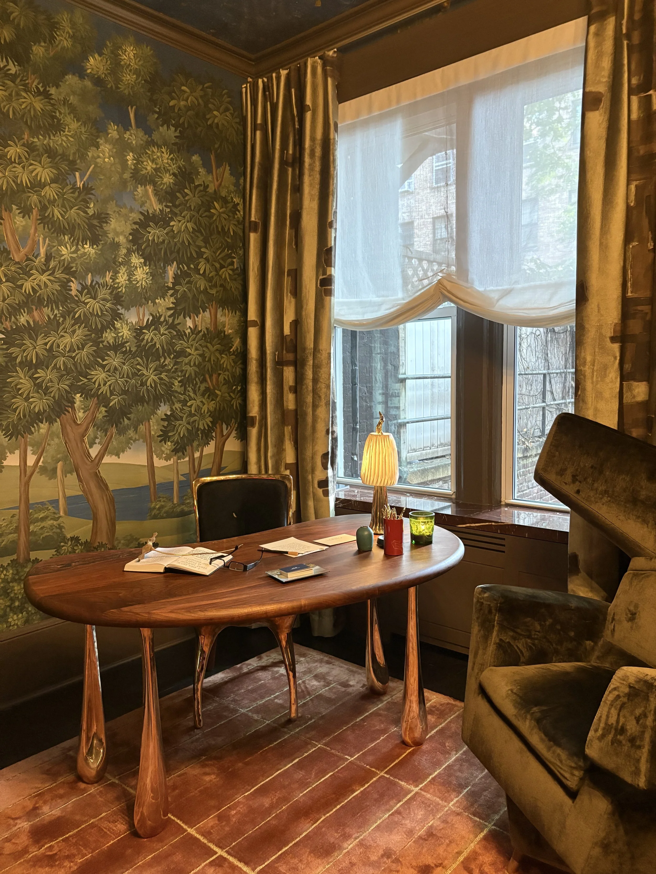
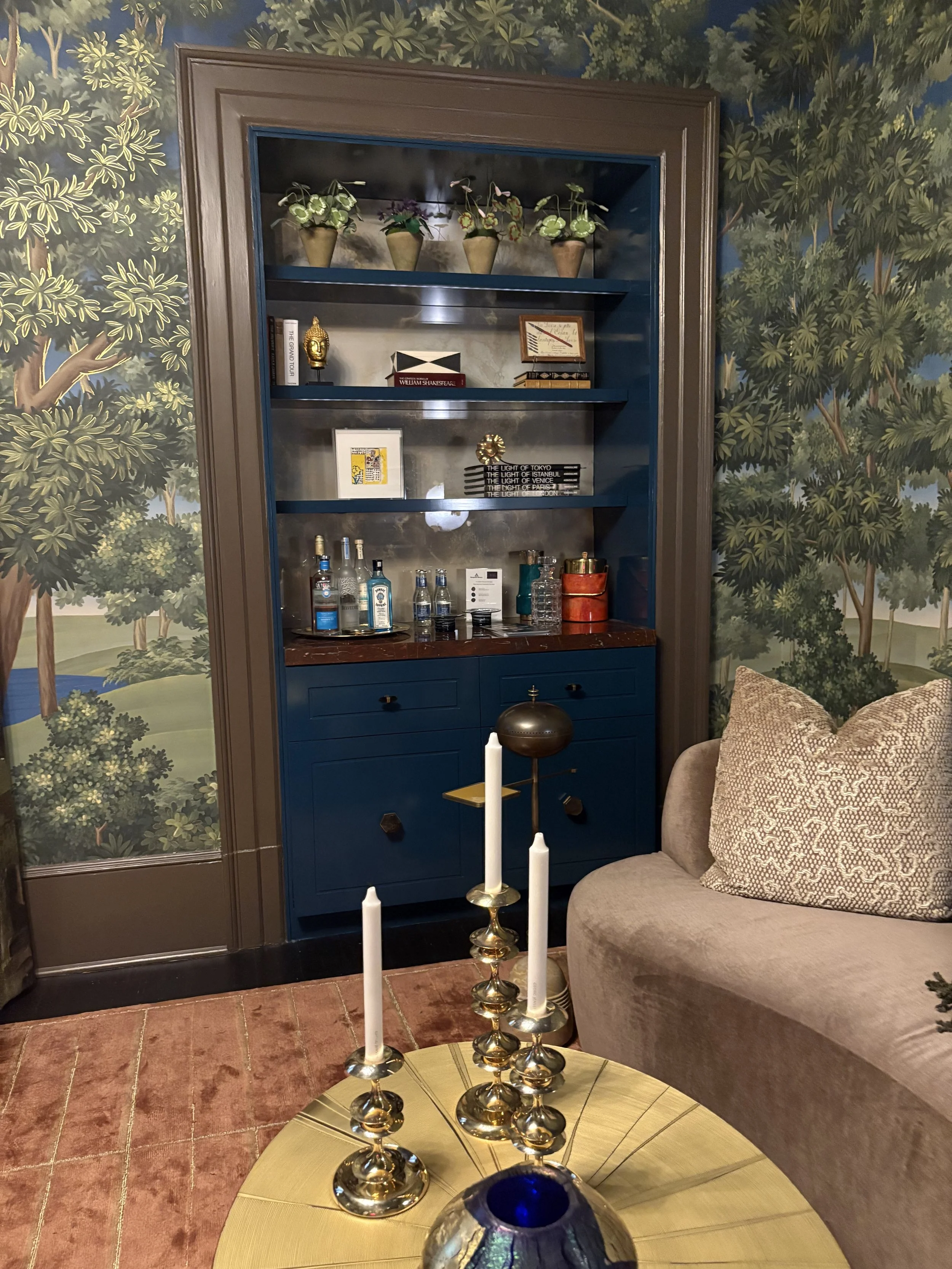
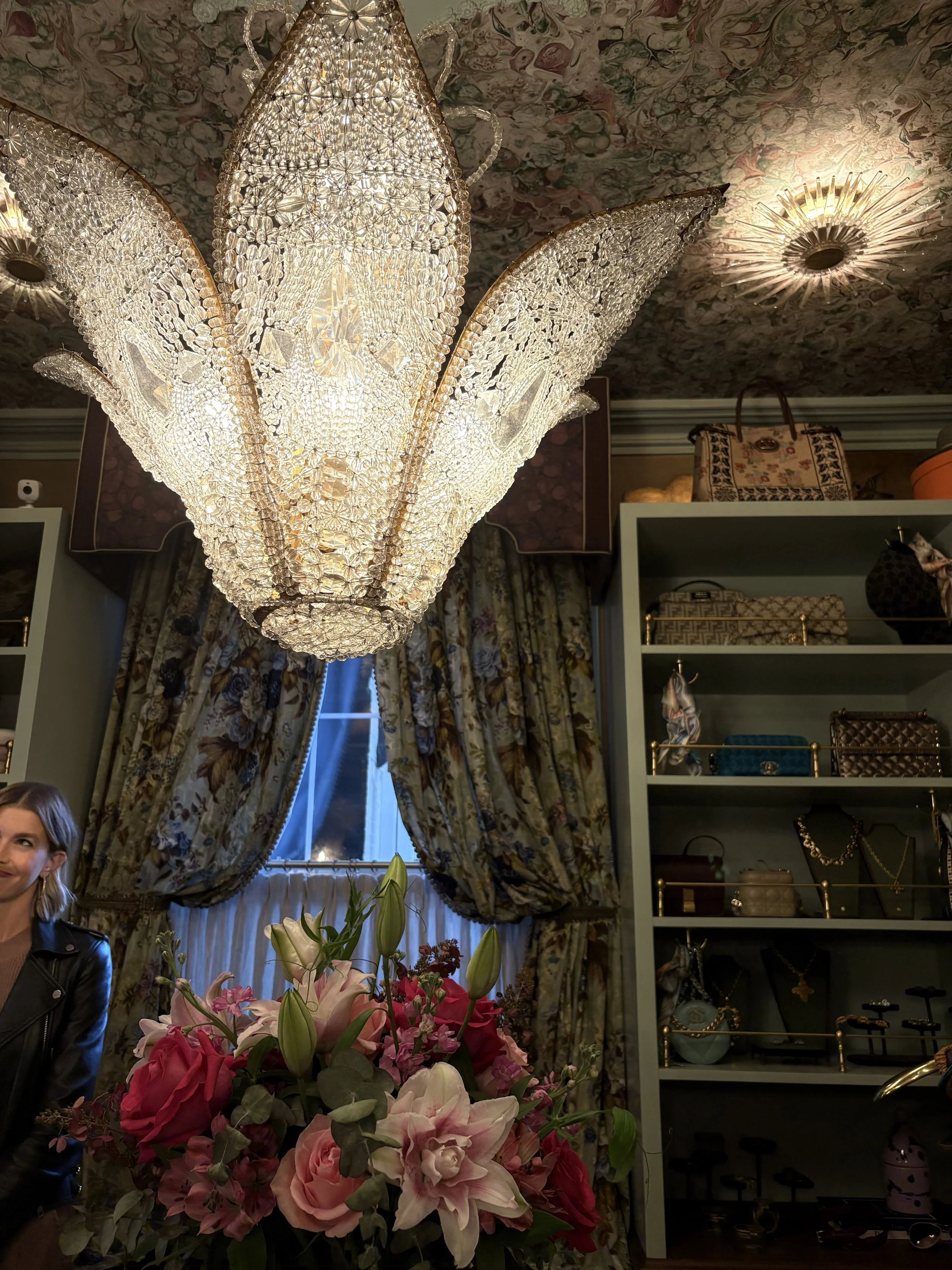
That said, I couldn’t help but have a predilection for Jay Kohler Mason Design’s for The Writing Room ~ of course.
But it wasn’t just me. Other showgoers were oohing and ahhing when entering this iconic room.
The Rousseau inspired walls wrap you in an artful, dreamy forest. Organic shapes of the sitting area and desk. Oh, those gold pedestal legs, “brick” rug, animals, a bar (!), and shimmery window treatments! The composition gave me a feeling of being in nature that was both opulent and spare at the same time. I yearned to sit down and start writing in this very luxurious room.
Yet another jewel box of a space.
So maybe, in my fantasy world, after I’ve completed my manuscript in the Writing Room, my novel ~ my best-selling novel that is ~ I am now, subsequently, on the interview circuit, so I may need the next room:
The Zoom Room
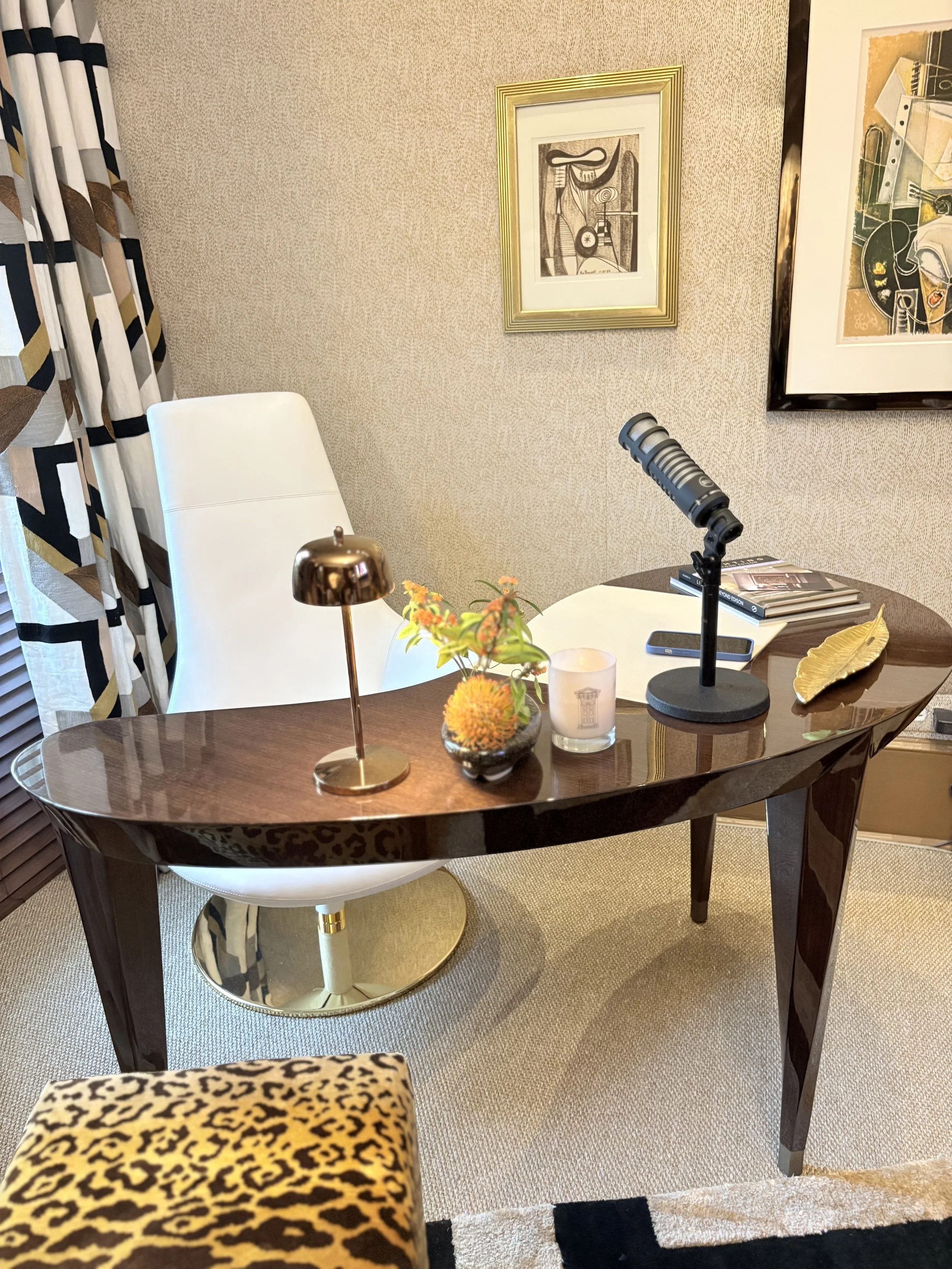
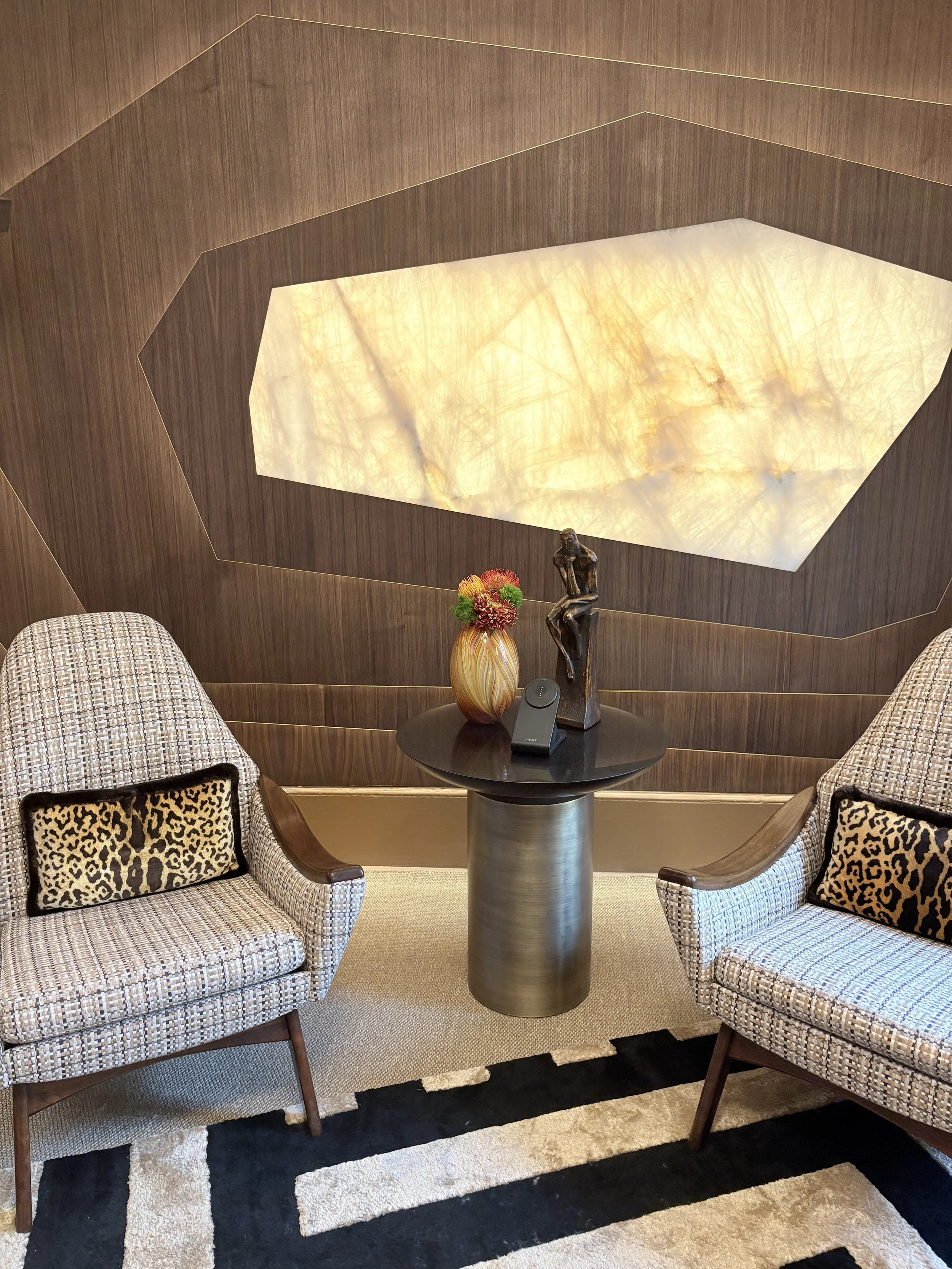
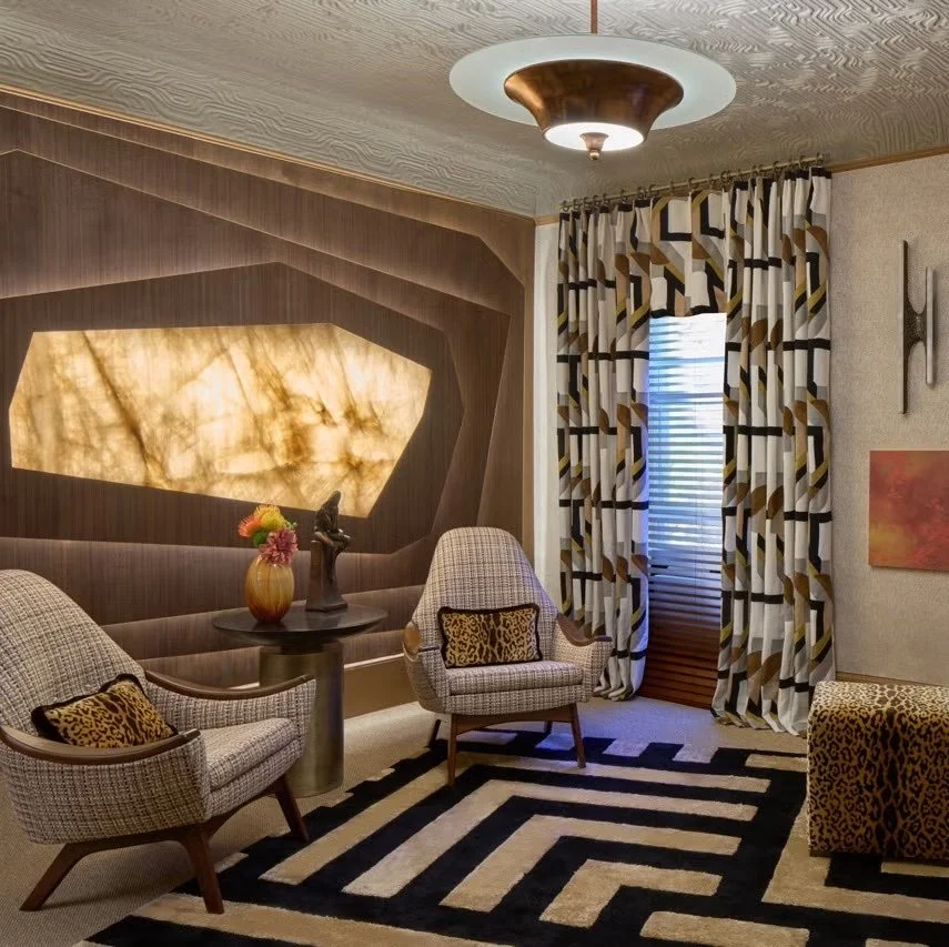
This space was a total surprise. Initially, I admit, I wasn’t quite sure what I was looking at.
It was gorgeous to be sure, but it took me a mad minute to realize the beautiful design was in fact, a kind of Trojan Horse, concealing the utility of a room meant for business; specifically for high tech meetings, including Zoom and Podcasts, with luxury video conferencing solutions.
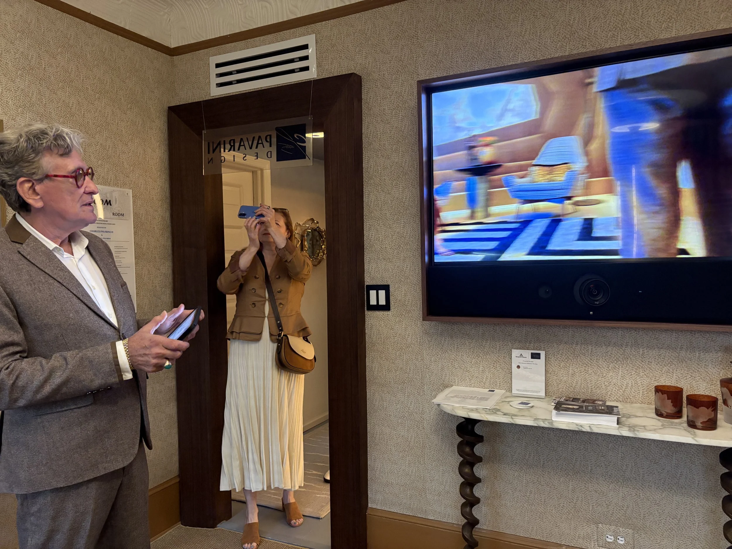
Designer Charles Pavarini III of Pavarini Design put a bespoke spin on a “Zoom Room” office by creating a custom wall work envisioned as an ideal background for video-conferencing. The striking piece combines walnut and backlit Cosentino stone, which together provide an ultra-flattering glow.
A tablet, connected to a high-resolution wall-mounted monitor and several cameras that follow you around the room, brings technology into the show house. It is fabulous. Bill Charney of Advanced Home Audio is the tech guru.
The space has been outfitted to dampen sound in subtle ways, including Scalamandré upholstery that softens the surrounding walls, a graphic area rug from Stark Carpet, and the beautiful yet effective Arte trapunto wallcovering that wraps the ceiling to further deaden noise reverberation.
The Shade Store blinds control the Cosma patterned-textile with white, black and gold and shimmering bronze drapery panels.
While not a big room, this space was simply superlative and offers a glimpse of how to make technology work within scale and style.
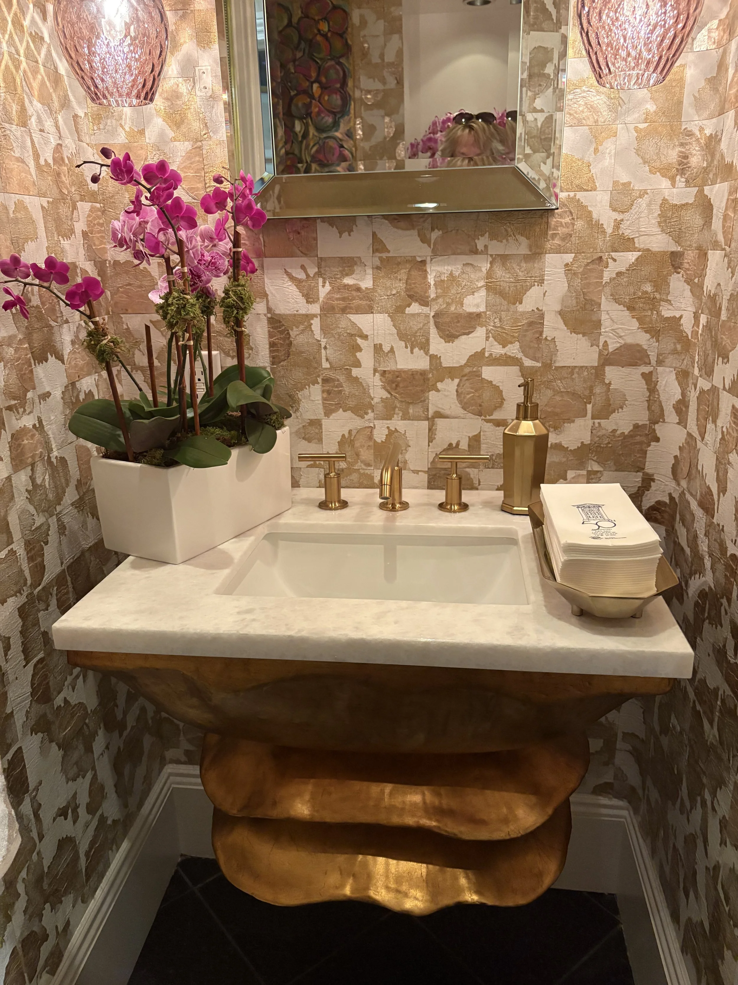
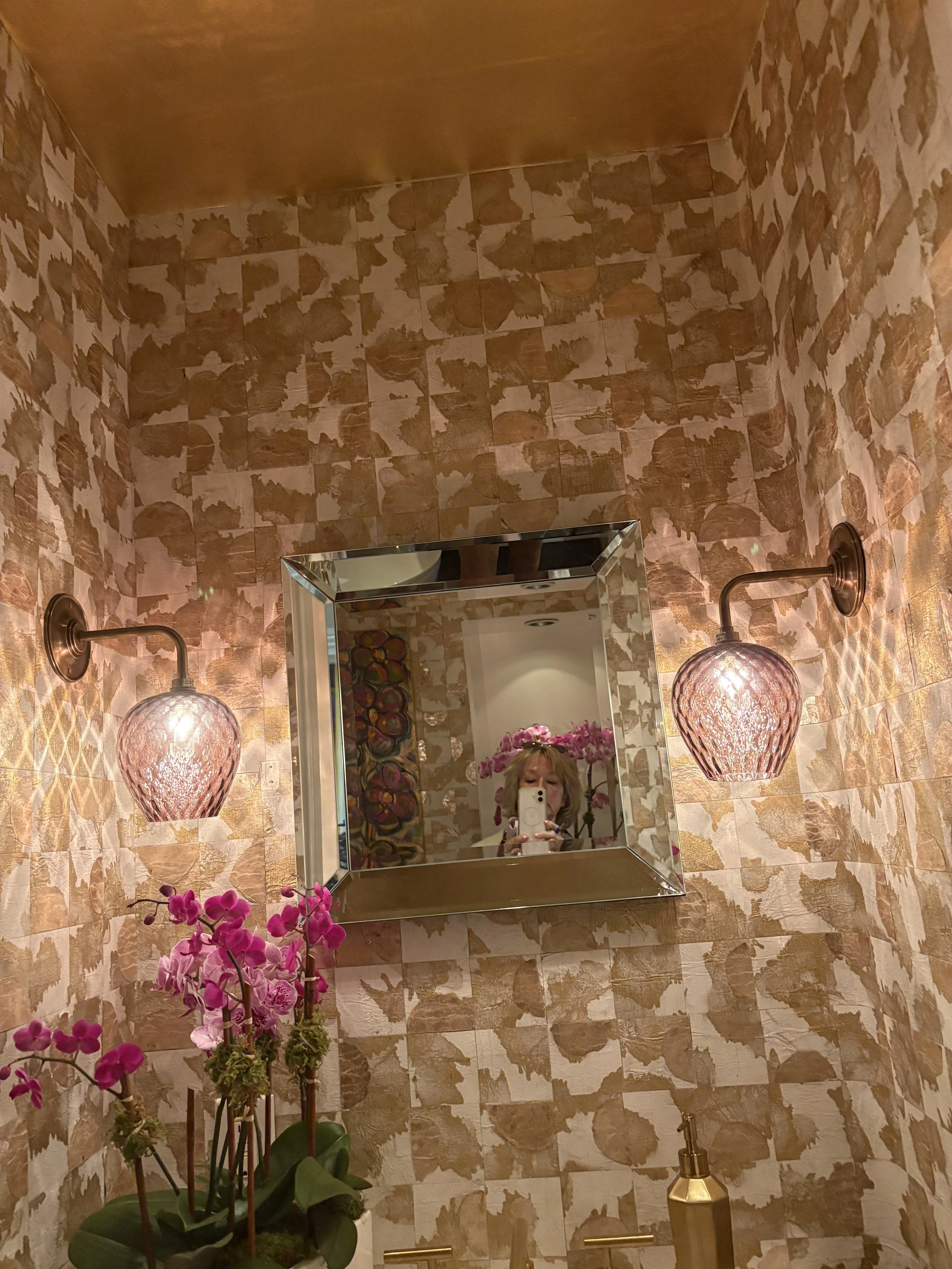
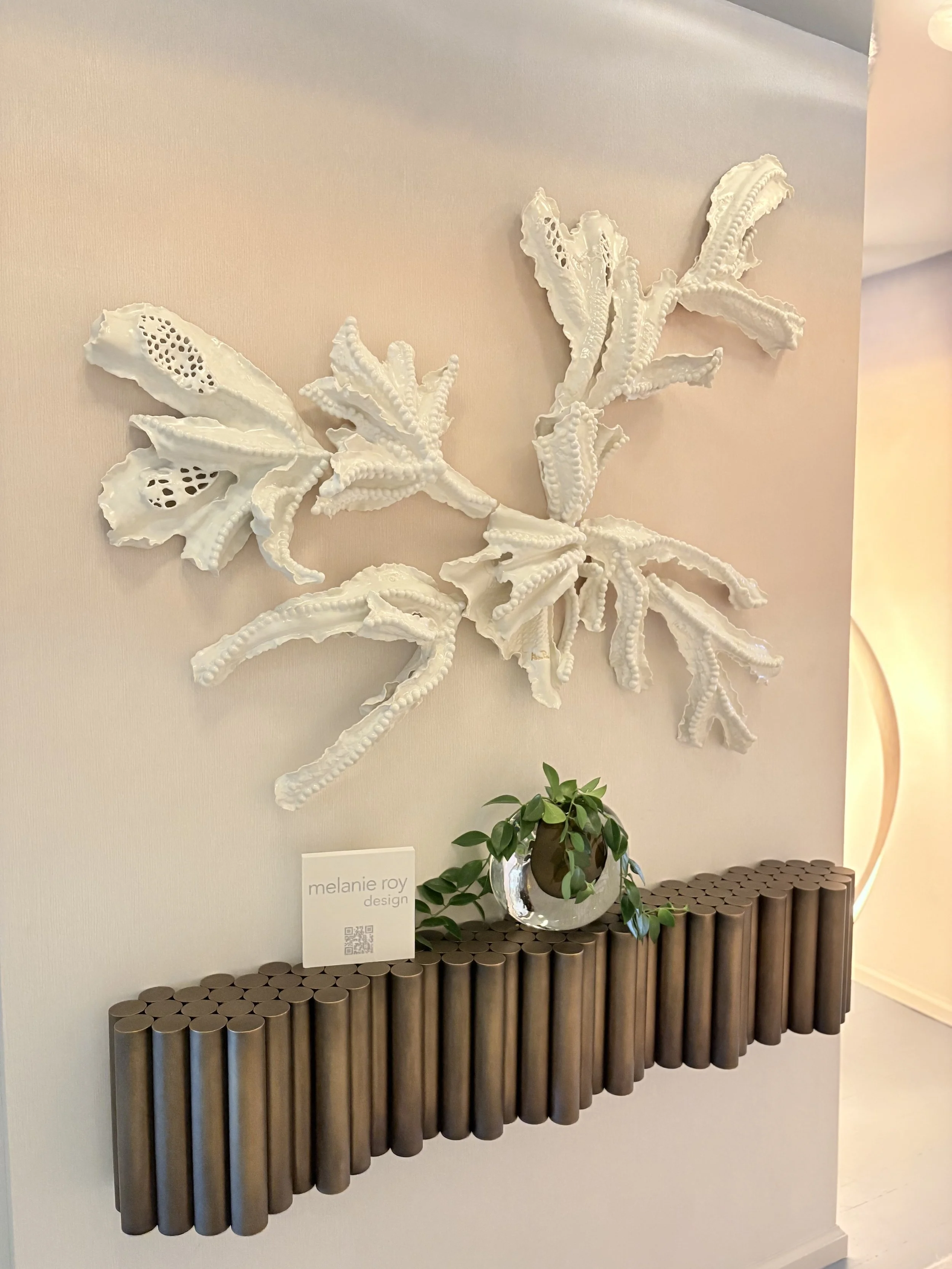
A Sparkling, Organic Retreat
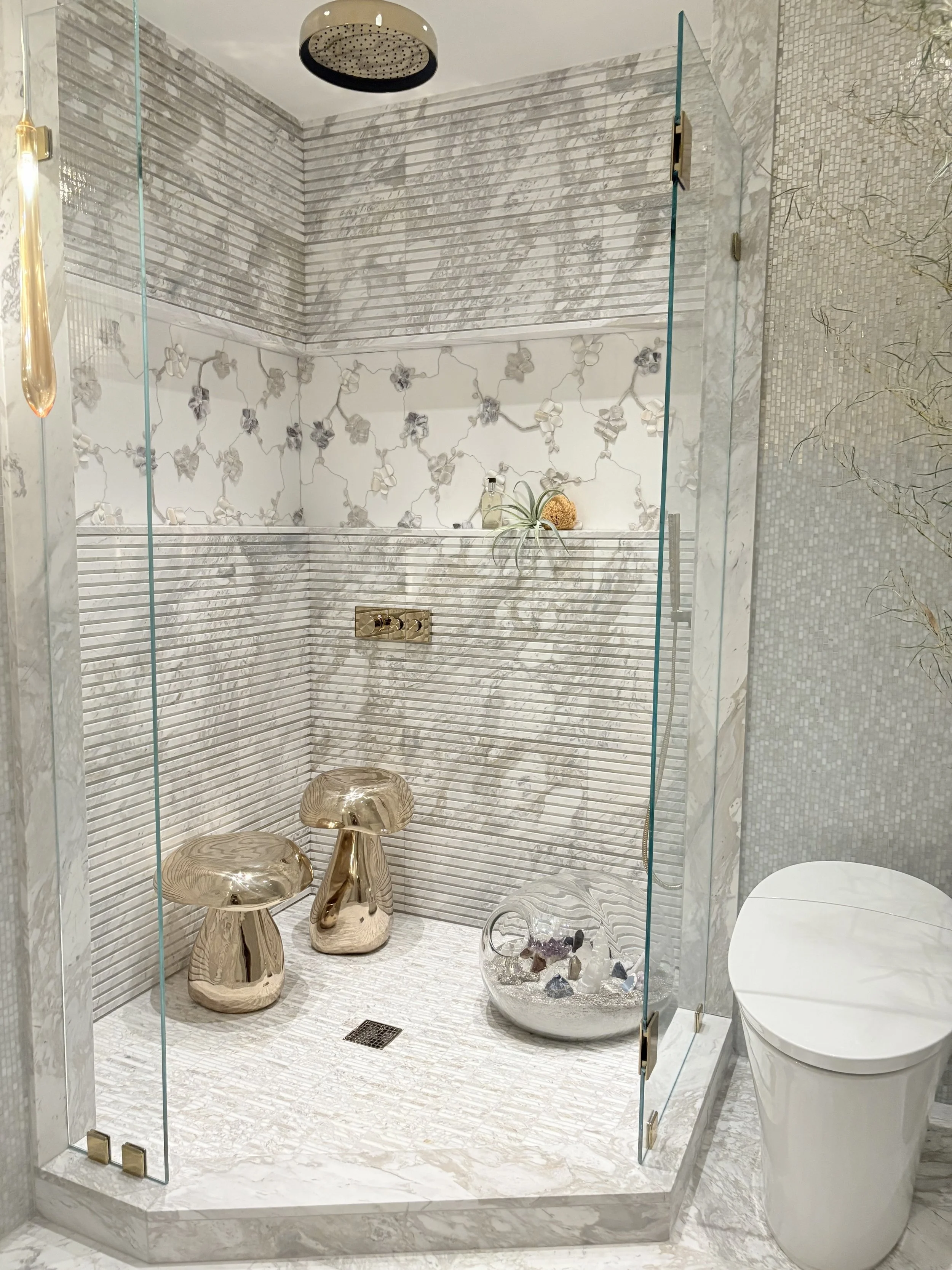
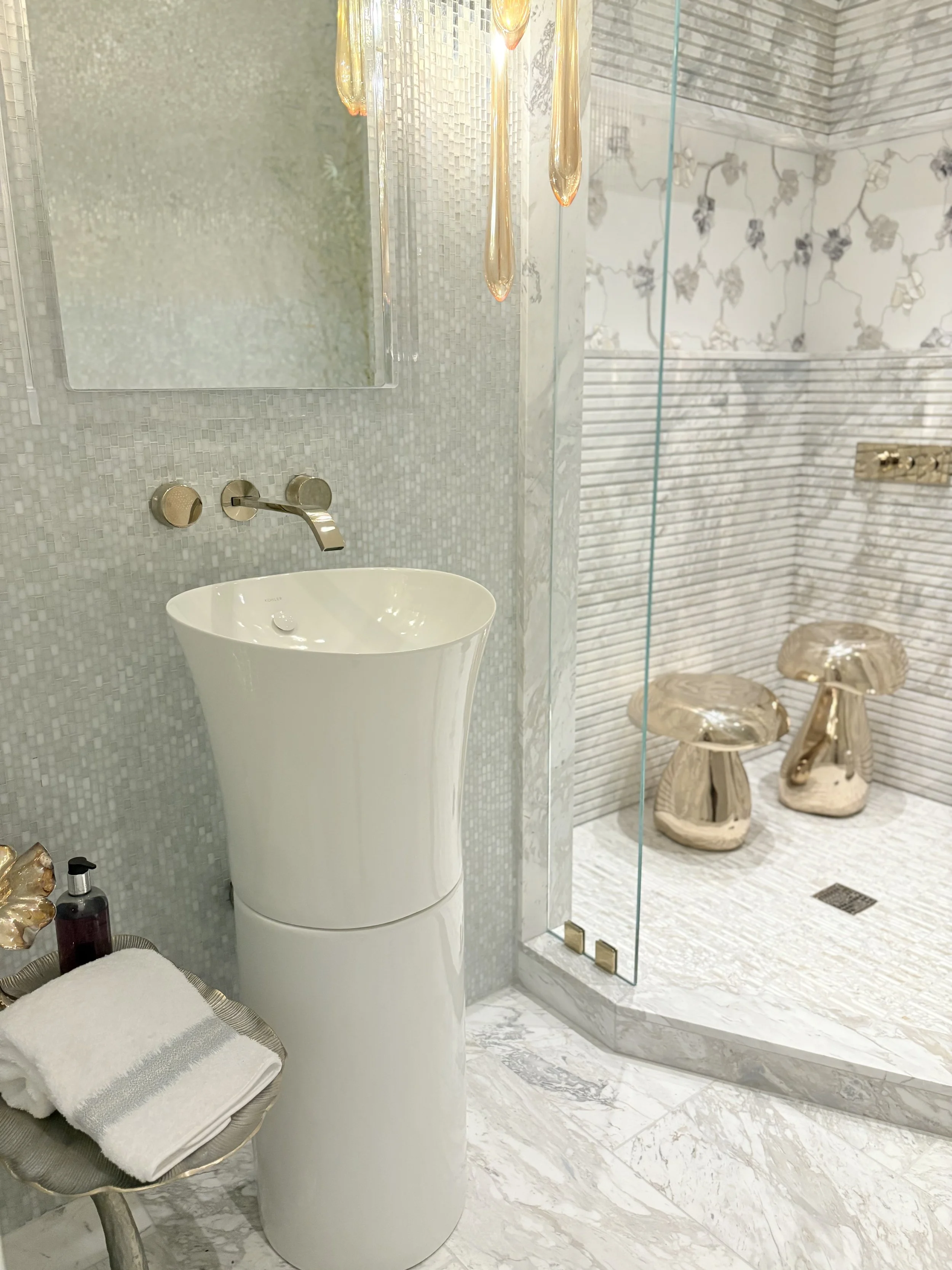
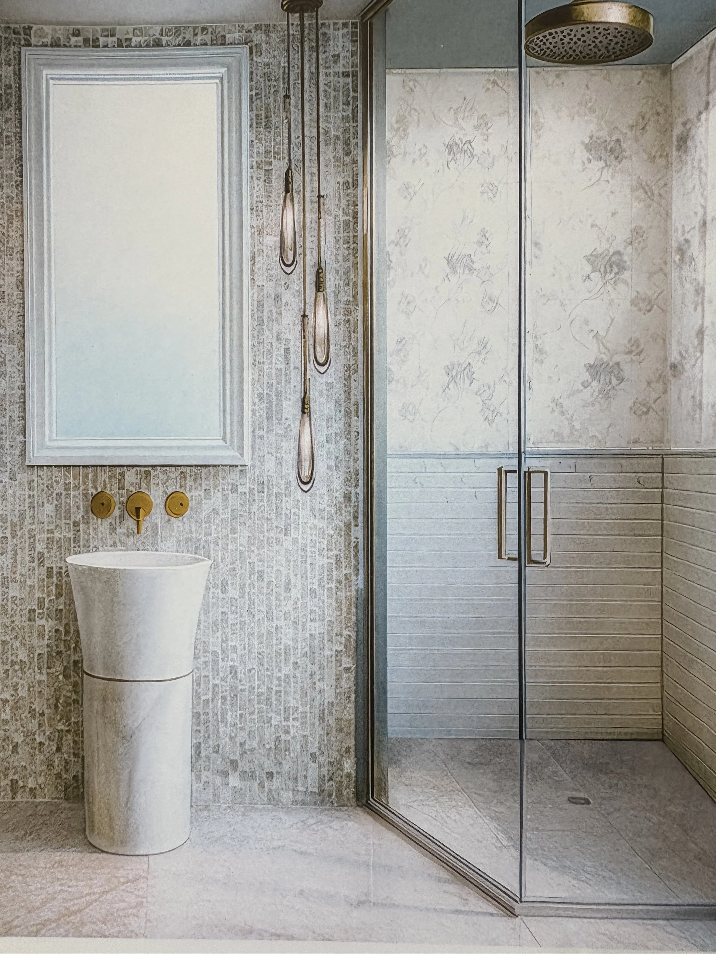
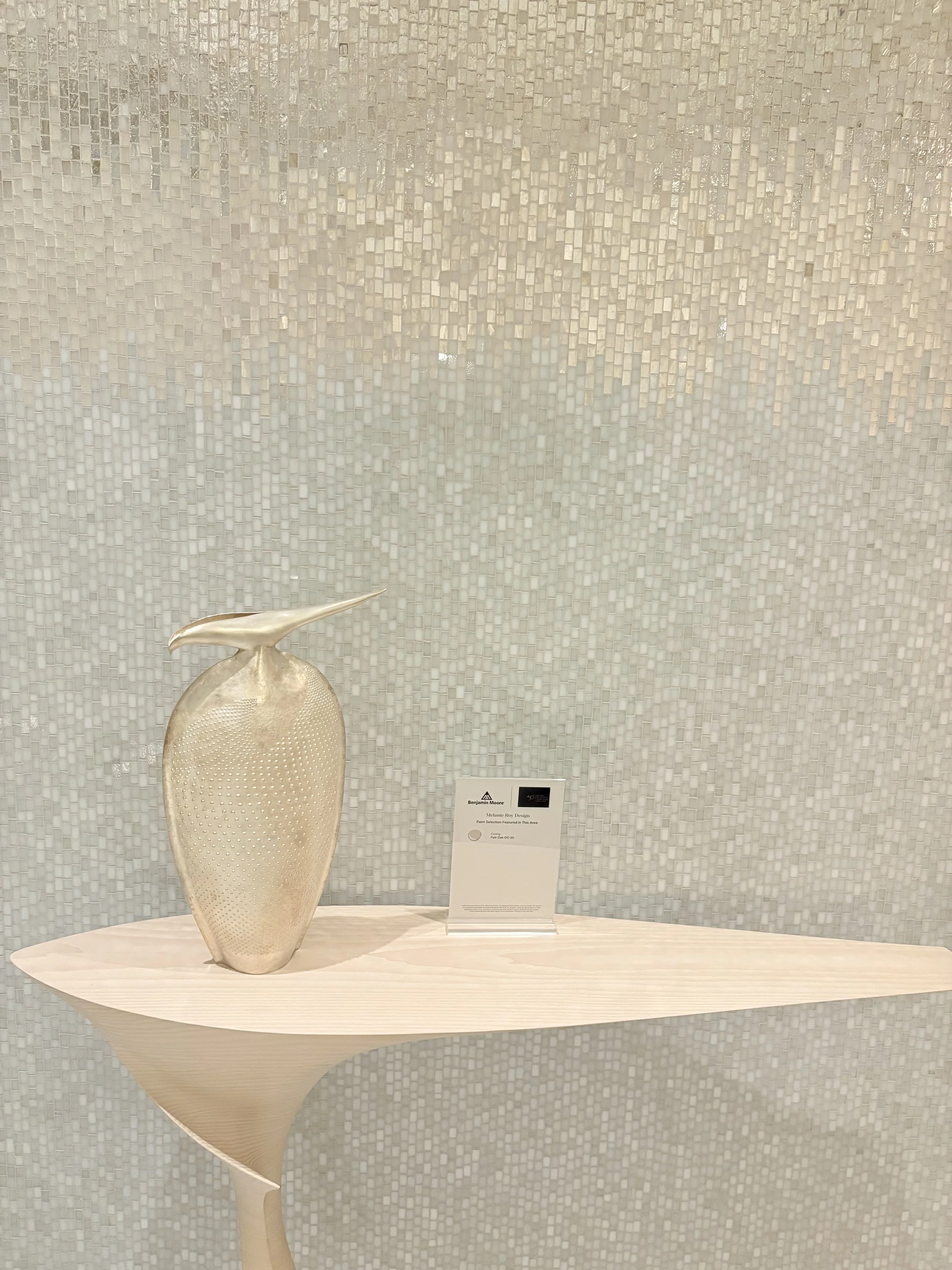
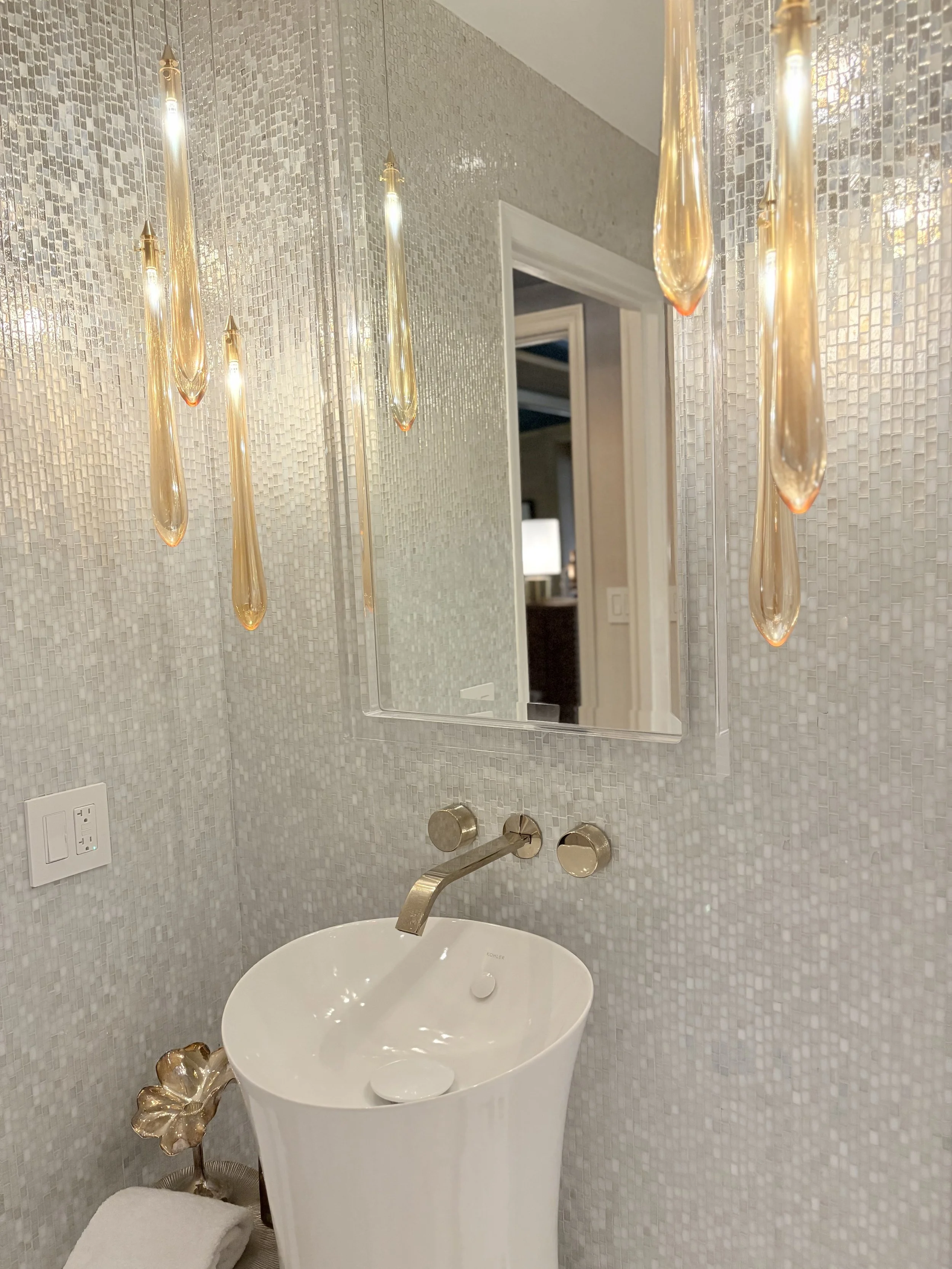
Melanie Roy goes avant-garde for her Kips Bay Decorator Show House bathroom design. The space is a play on the intersection of light and nature and was inspired by Michael Aram’s three-dimensional orchid tile for Artistic Tile.
Organic forms are topped with sparkling accents (see: the whimsical mushroom-shaped shower stools).
French gold plumbing fixtures by Kohler add another dazzling layer to the space. Throughout, soft neutrals let metallic accents shine.
How much do you love the shimmery tiles and the cascading lights?
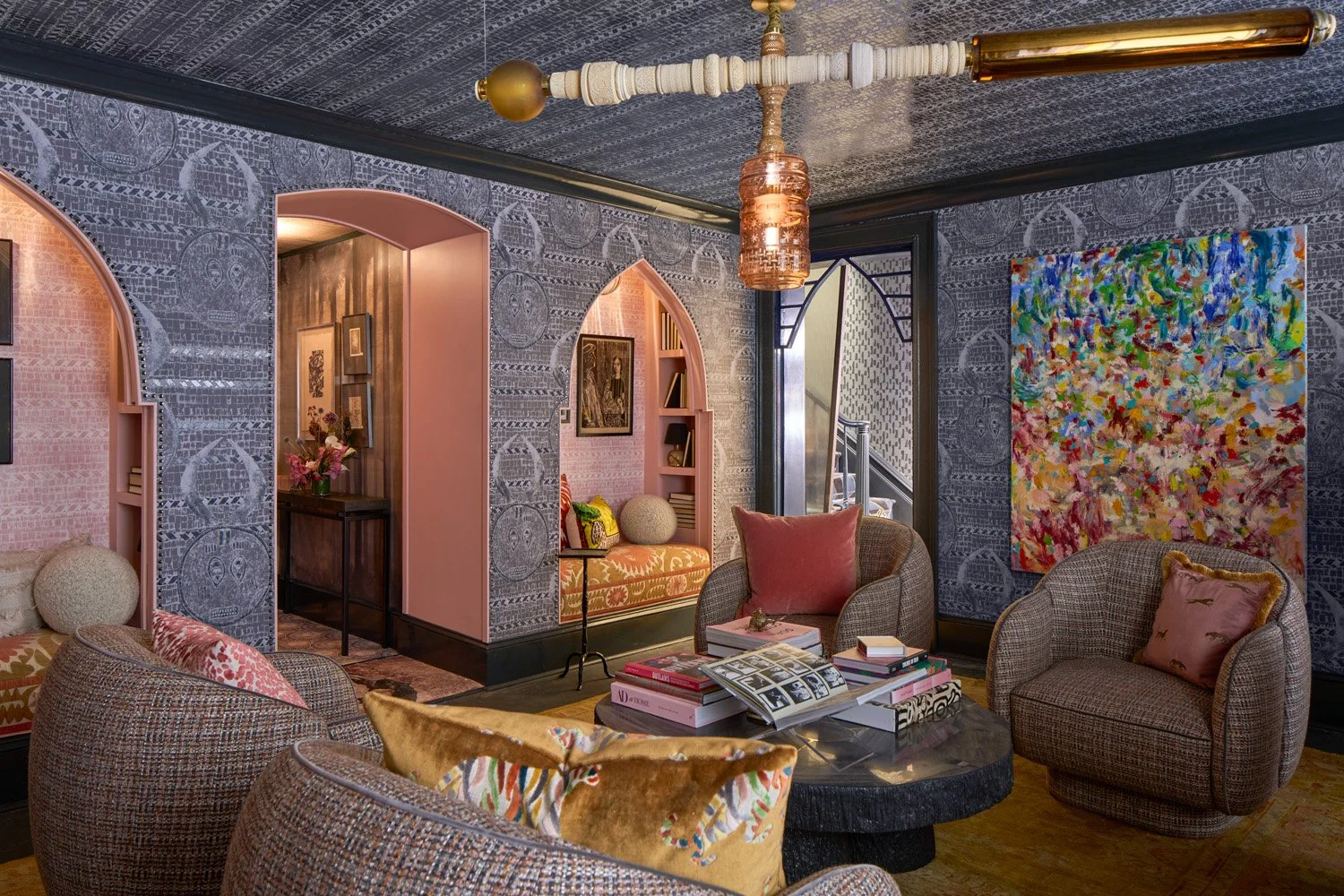
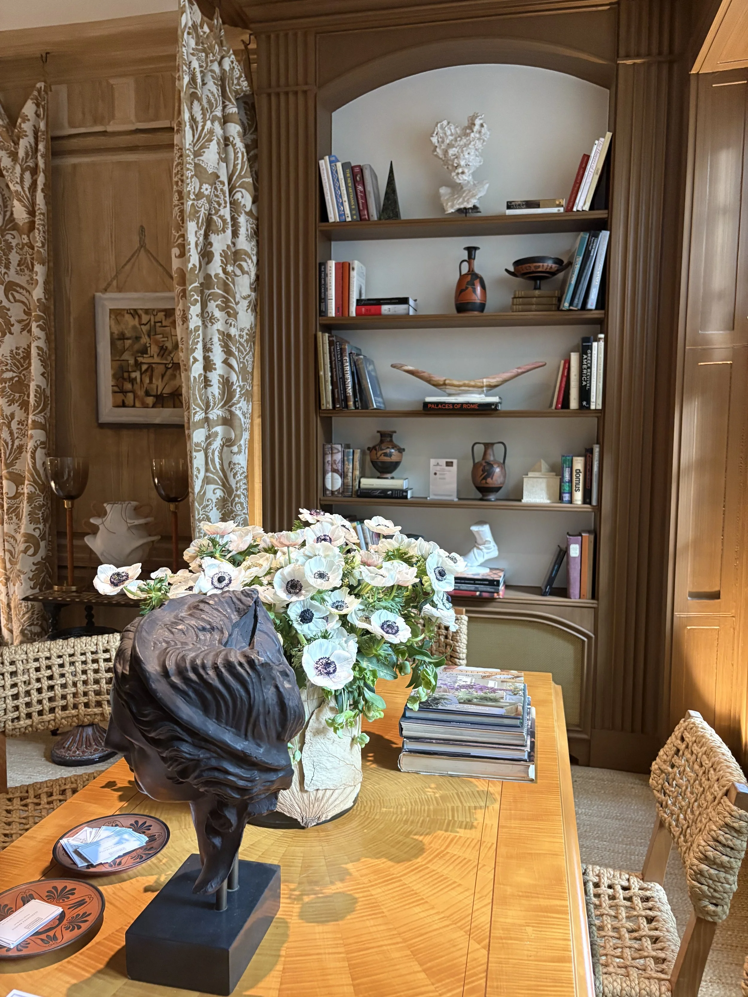
Drawing Room
Chicago’s Alessandra Branca took several favorite spaces as her muse in designing what she calls a New Drawing Room. “Many of the iconic rooms that I love, like those of Hubert de Givenchy and Yves Saint Laurent, looked collected,” she says. “They were personal, they were comfortable. This room is also collected, as you can tell!”
Branca has filled it with pieces belonging to different periods and styles: a 1950s André Arbus ormolu-mounted sycamore table with an inlaid starburst design, topped by a bronze bust of Hera; mid-century oak and rope chairs by Adrien Audoux and Frida Minnet for Vibo from Maison Gerard; and bookshelves displaying her own collection of Grand Tour pottery based on ancient Greek vessels.
In a room this well-curated, of course, you expect incredible accessories. And Branca obliged with a pair of Gio Ponti vases from Obsolete, a Horst P. Horst photograph and lamps by Frances Elkins.
It’s been written that Branca is single-handedly bringing trompe-l'œil back to the design table. The art technique, meaning to "fool the eye" in French, uses extreme realism and perspective to create an optical illusion of three-dimensional objects on a flat surface.
I couldn’t get over it! Talk about a trick of the eye. It brought to mind that old Groucho Marx line, “Who ya’ gonna beleive, me or your lyin’ eyes!”

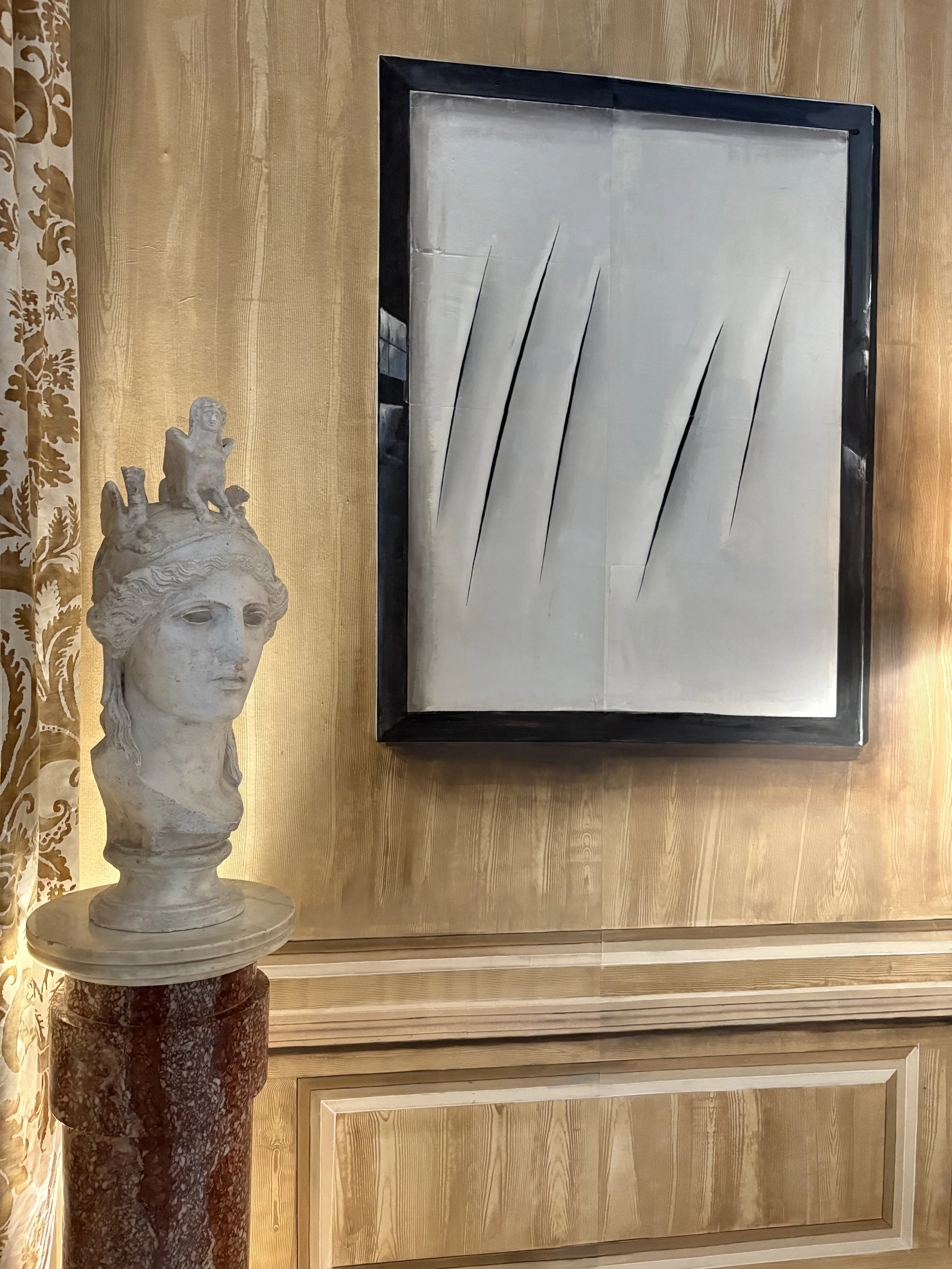
The drawing room appeared to have wall-to-wall wood paneling with a collection of Lucio Fontana artwork and vintage pieces hung along it, but in fact, the whole space was hand-painted by Gracie wallpaper.
The art you see framed on the walls? Trompe l’oeil. The walls’ wood paneling? Ditto.
Nothing is as it seems!
But boy is this a design look you can use to great effect.
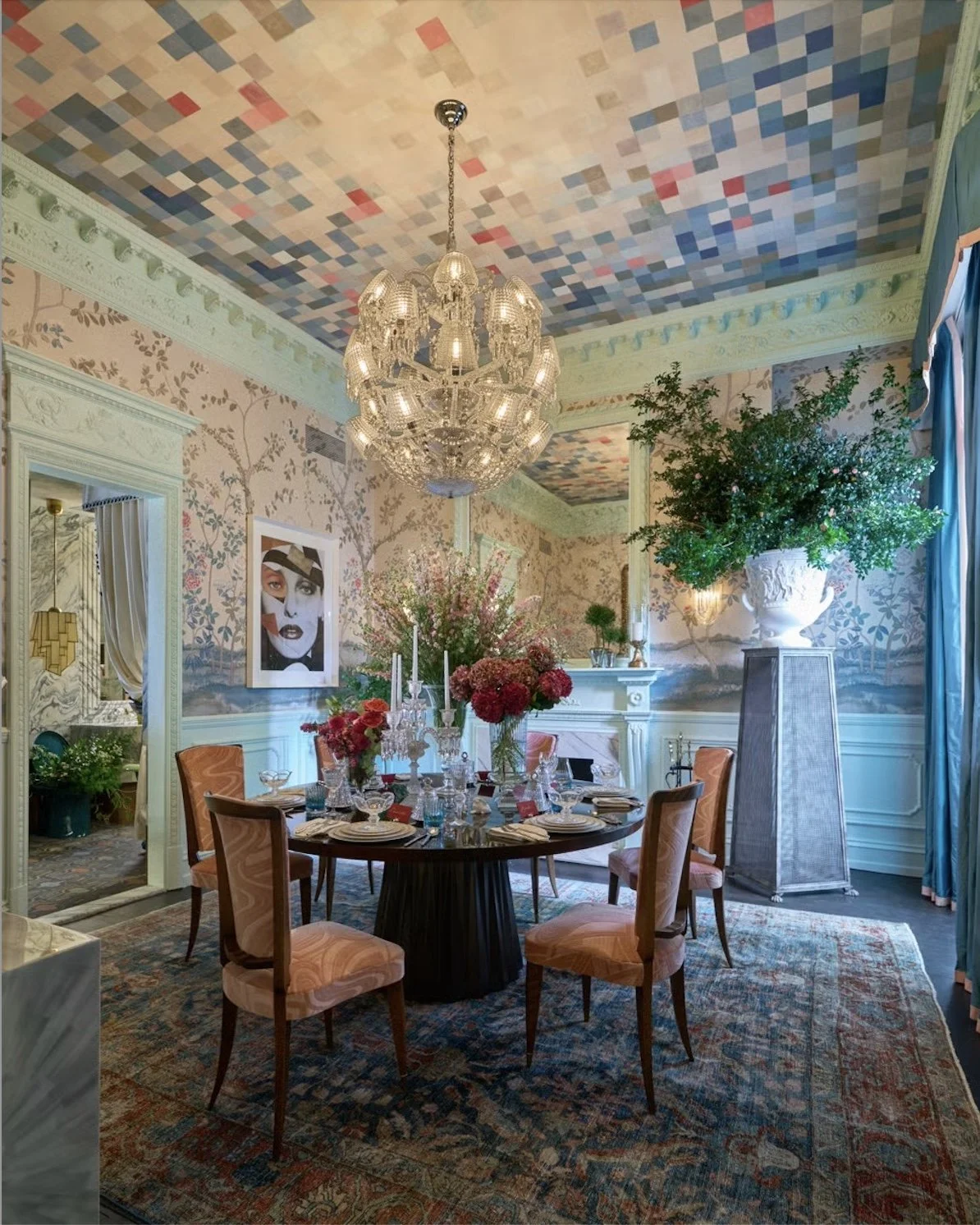
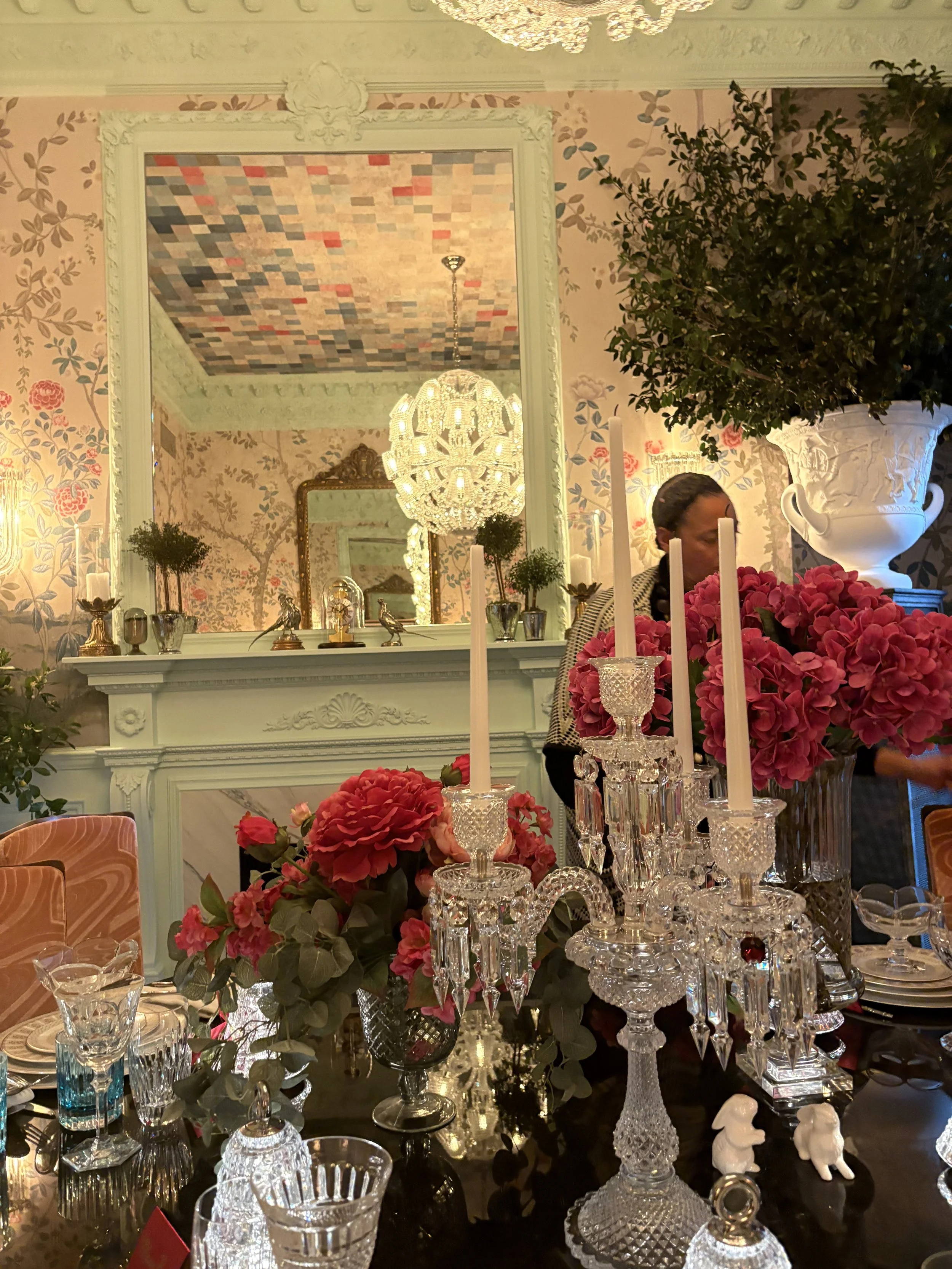
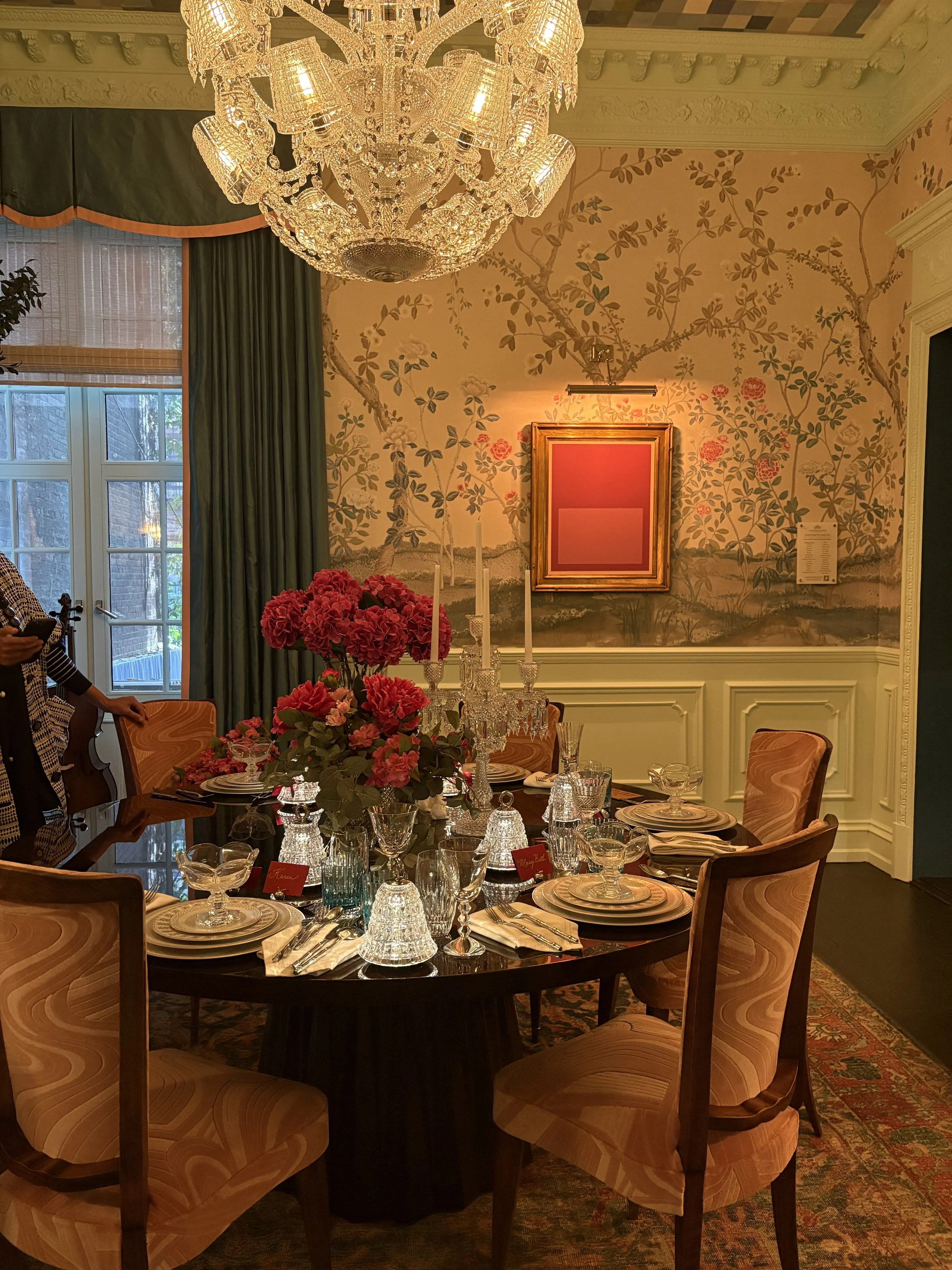
Dining Room
Inspired by Lewis Carroll’s 1871 Through the Looking Glass and What Alice Found There — the sequel to the author’s Alice’s adventures in Wonderland — New York’s Corey Damen Jenkins combined traditional tropes with modern fantasy in his dining room. Jenkins covered the walls, for instance, in Schumacher Madame de Pompadour paper (created by in collaboration with Miles Redd), which depicts an English garden, and then wittily covered the ceiling with a pixelated version of it, bringing in a contemporary element that contrasts beautifully with the elaborate classical plaster moldings he also installed.
When interior designer Corey Damen Jenkins was creating his dining room, Through the Looking Glass: A Dining Room Reimagined, Jenkin's actually commissioned local artisans to craft elaborate plaster moldings for the dining room. Every modillion, rosette, frieze, and egg-and-dart motif was crafted and applied by hand, proving meticulous craftsmanship is not just a trade of the past but something we should use and revere.
A walnut flame-lacquer table sitting center stage is set as if for the Mad Hatter’s tea party, with gold and platinum plates, crystal glassware and candelabra, all by Baccarat.
Some years ago, I created a Mad Hatter tablescape for one of my Ladies Who Lunch Conversations that had a tea party theme. It is zany and happy and fun. Ask me if you want to see. For here, Jenkins’ elegant Through the Looking < Baccarat > Glass will fire up your emotion.
Other Noteworthy Iconic Rooms
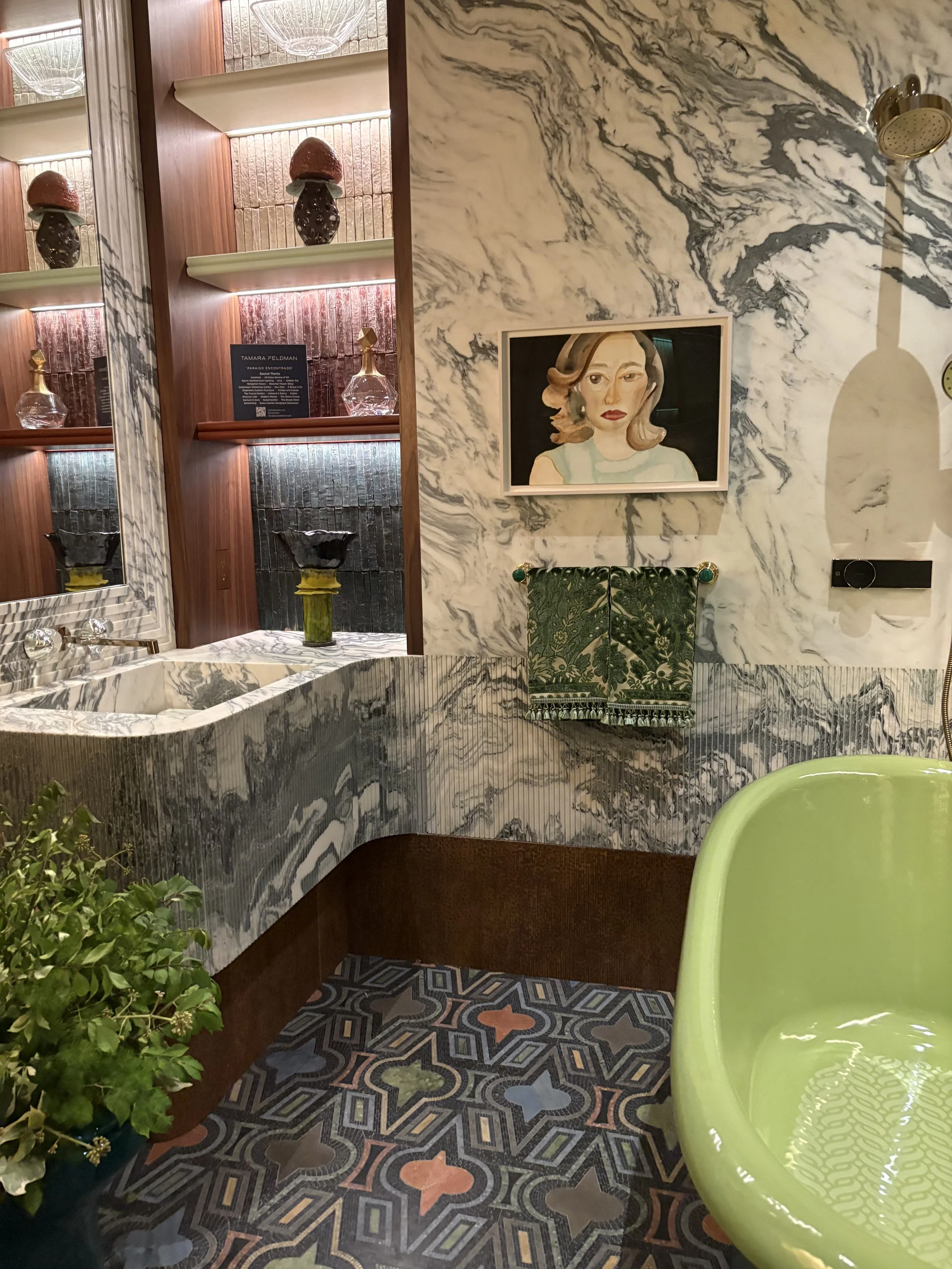
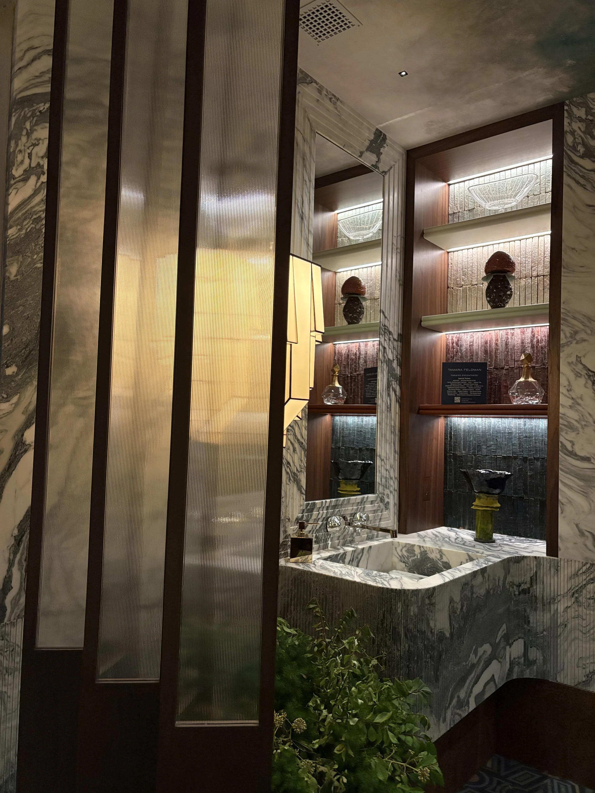
Miami designer Tamara Feldman wrote that she was indelibly impressed by the aesthetics of Alfonso Cuarón’s 1998 film Great Expectations: the theatricality; the textures, from glass and stone to vegetation; and, especially, the verdant hues that infused everything and became a signature of the film.
Now, those colors have become the signature of the showhouse bathroom she designed. In crafting the space, Feldman took her cues in particular from the home of one of the film’s central characters, Nora Dinsmoor, played by Anne Bancroft, channeling it in all its layered, green glory.
She began by using a bright-green clawfoot tub from Kohler as a focal point, then covered the floor with Artistic Tile’s geometric Casino Royale mosaic, designed in collaboration with Donghia. I’ve seen this green tub in the Kohler showroom ~ I love its gardeny possibilities…
Feldman selected a Holland & Sherry fabric to cover the seat of a custom chair that cleverly disappears into the front of the vanity
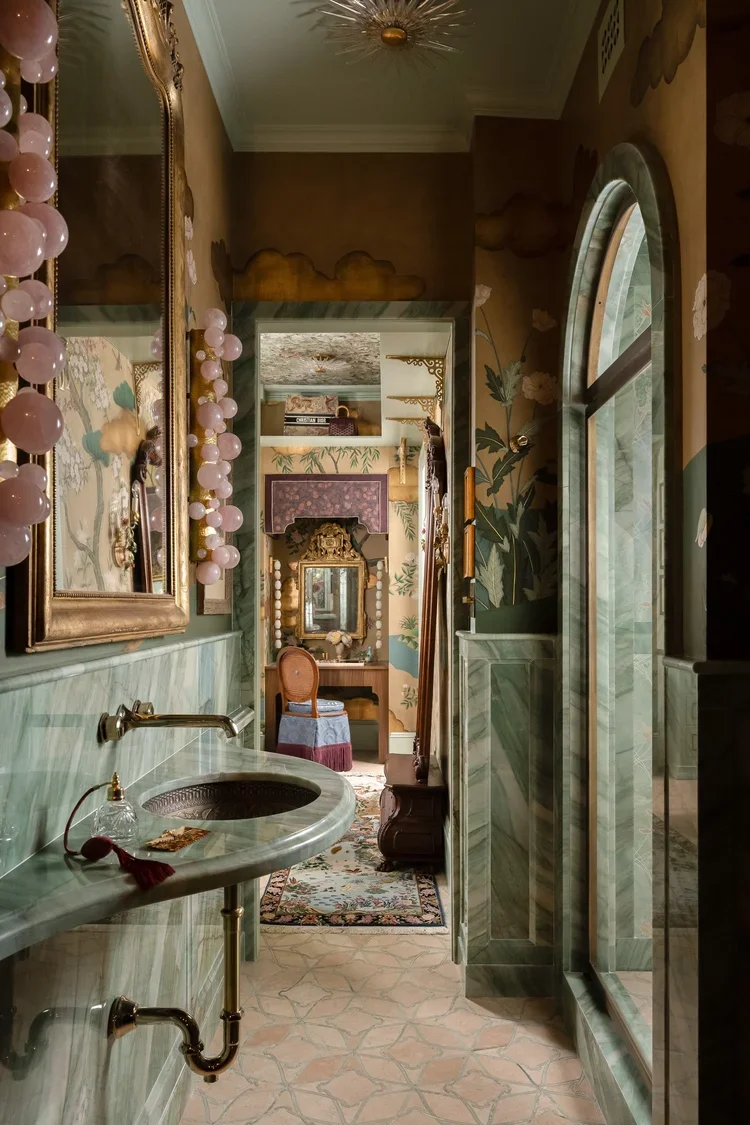
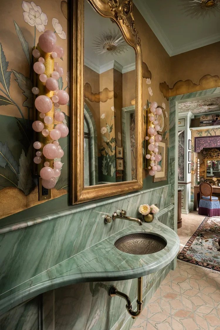
In James Thomas's Painted Passage, we see perhaps the strongest example of how to expertly execute a space that exists within only one strong color story. There is something so satisfying about a design that flourishes through a set amount of hues.
Inspired by golden hour in Ravello, Thomas stuck to a palette of rich blues, deep terracotta accents, and creamy neutrals, with shades pulled from weathered tile, antique Roman olive jars, and wild lemon trees. Phillip Jeffries' grasscloth adorned with custom moldings and hand-stenciled patterns, paired with a custom Stark runner, envelopes the space. I adore Philip Jeffries’ wallpaper and used it with passion in more than a few of our rooms. It’s pure magic. In any of his designs.
From Thomas’ IG: “Painted Passage” came to life through true partners. The marble mosaic underfoot, generously donated by our friends at the @thefinelinechi, sets the tone the moment you enter with rust, gray, white, and inky accents, @benjaminmoore’s layered neutrals and soft blues keep the palette serene, while a hand-painted banister adds a quiet counterpoint. @phillipjeffriesltd’s African Raffia “Capri” grasscloth brings the sun-soaked, garden-walk texture we imagined.
Plus, Thomas’s landing in the “ Painted Passage” is a rich tableau of fabrics and flowers. The Clarence House textiles silk velvet, and Zak and Fox - their Temari fabric is just the right mix of chic and fun, according to Thomas. Schumacher1889 and Cowtan and Tout created the window treatment fabrics.
It seems Thomas just couldn’t help himself ~ as he also designed this nature-inspired loo. I really “took a shine” to his shimmery vanity and wallpaper.
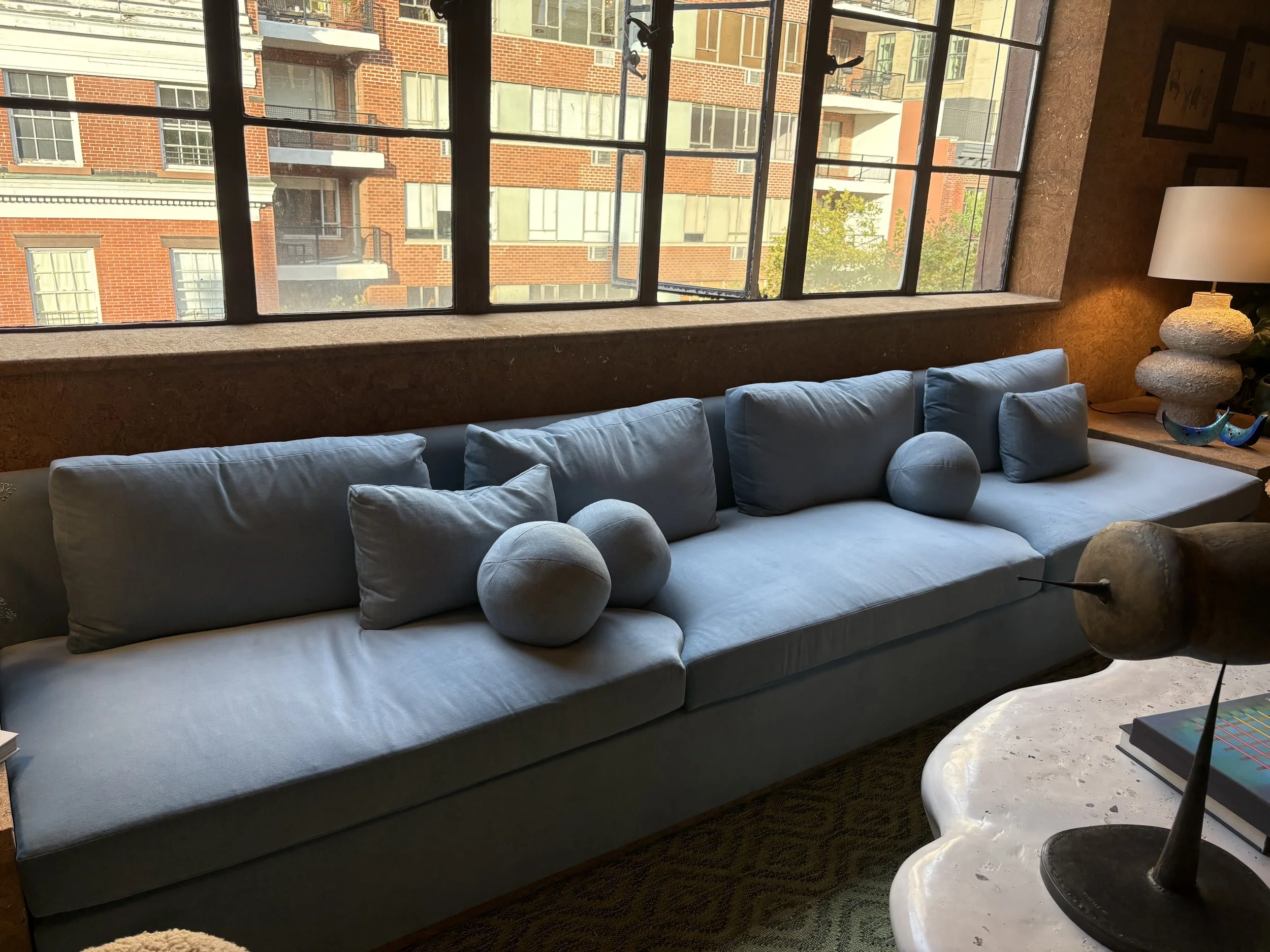
Designer James Huniford said that when he saw the space on the top floor of the showhouse, with its wall of casement windows, he knew it was the room he wanted to design. “The idea was to create something that feels a bit like a modern treehouse,” he explains. “Above the city yet connected to nature.”
To incorporate both aesthetics, Huniford first wrapped the walls and ceiling in a gold-flecked cork from Phillip Jeffries, for a subtle tree-like vibe. He then selected a delicate sky-blue velvet to upholster the mammoth 23-foot built-in sofa he designed to run the length of one wall. In crafting the built-in side tables at the sofa’s ends, he says, “I was inspired by Mexican modernist designers like Clara Porset and Luis Barragán, who often integrated furniture directly into their architecture.”
I loved this expansive sofa with ball pillows!
On the building’s top floor, Los Angeles designer Olivia Williams created a stylish studio apartment within the larger home. Awash in an aubergine hue, the unit boasts a most impressive hero piece: a framed 1850s Japanese embroidery from Rug & Kilim that enjoys pride of place between the kitchen and the bedroom. Decorated with a traditional motif of three dragons and a pearl, it provided the foundation for the rest of the project. “I built the wall to accommodate it, and then everything, including my whole color palette was built off of that,” Williams says.
Nearby, a bed cleverly enclosed by high-gloss lacquer walls fitted with handmade solid brass hardware creates a surprisingly ample bedroom. A Vespera sconce by WDSTCK makes for a chic reading lamp.
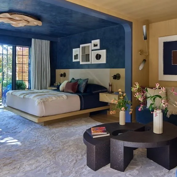
Contrast Cased Openings
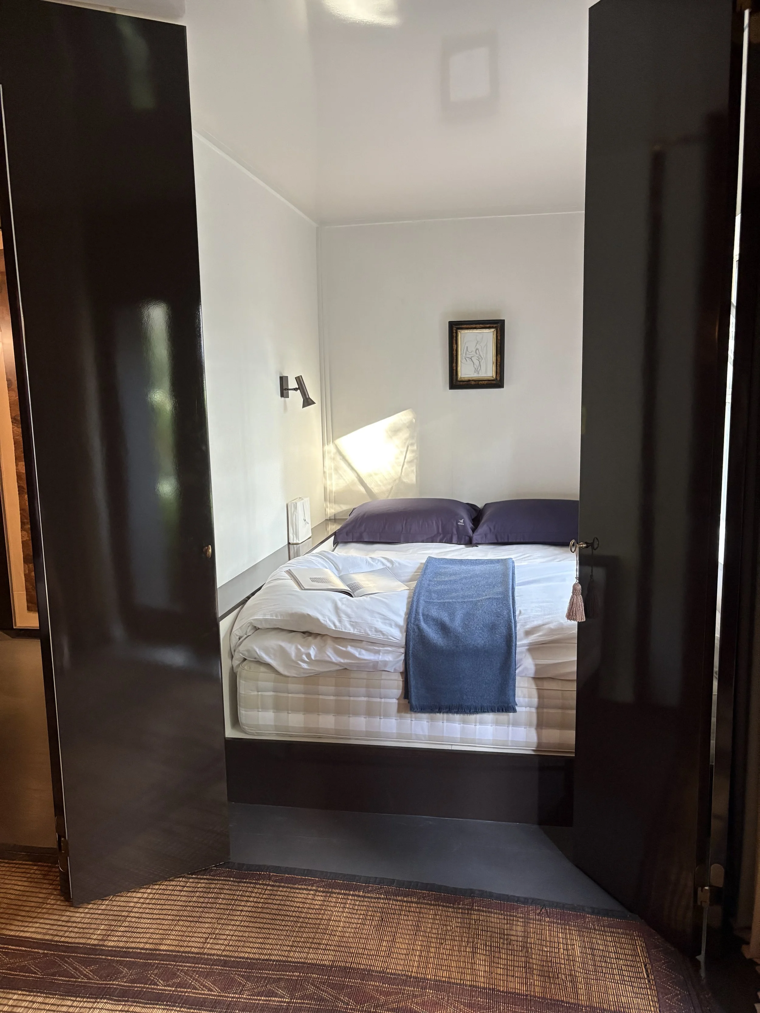
In this peaceful, primary bedroom, Eve Robinson Associates Inc. created the perfect place to recharge one's battery. "Much like New York City, this space is not without contrast. It is supple in its textures, rich in contrast, organic but refined, quiet in attitude—refreshing yet oh so enveloping," says the designer of the space.
See the contrast of the case opening, where sapphire blue meets the bleached oak paneling of the sitting room. And the terrace garden and “shower” are just beyond.
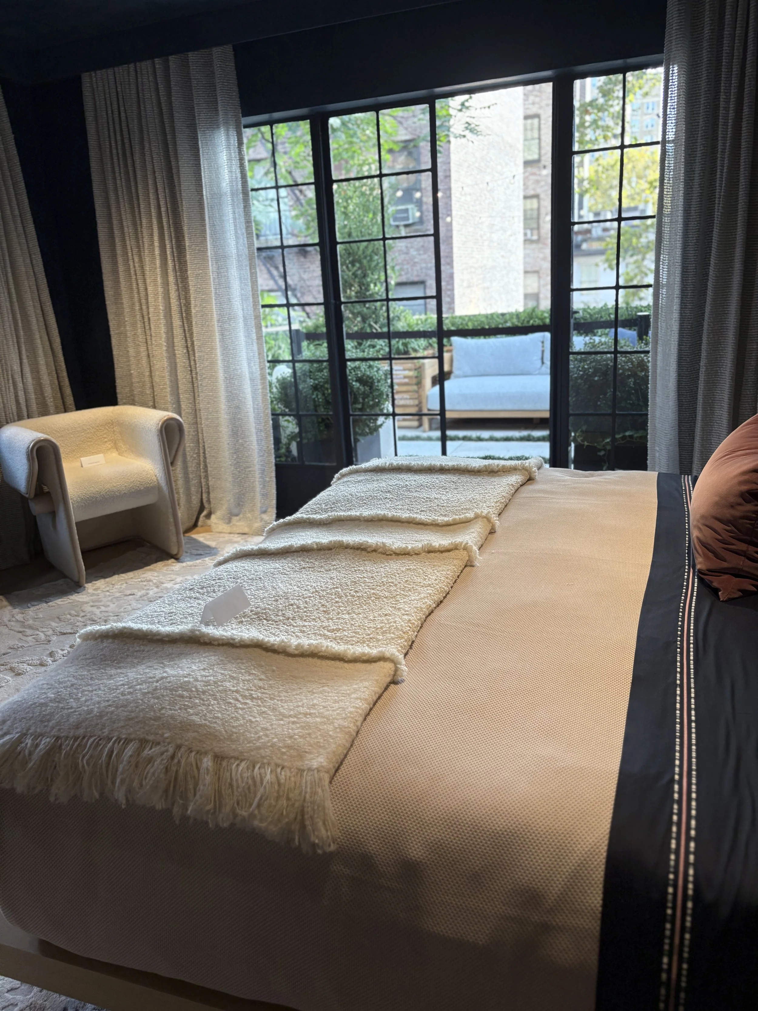
Exterior Design
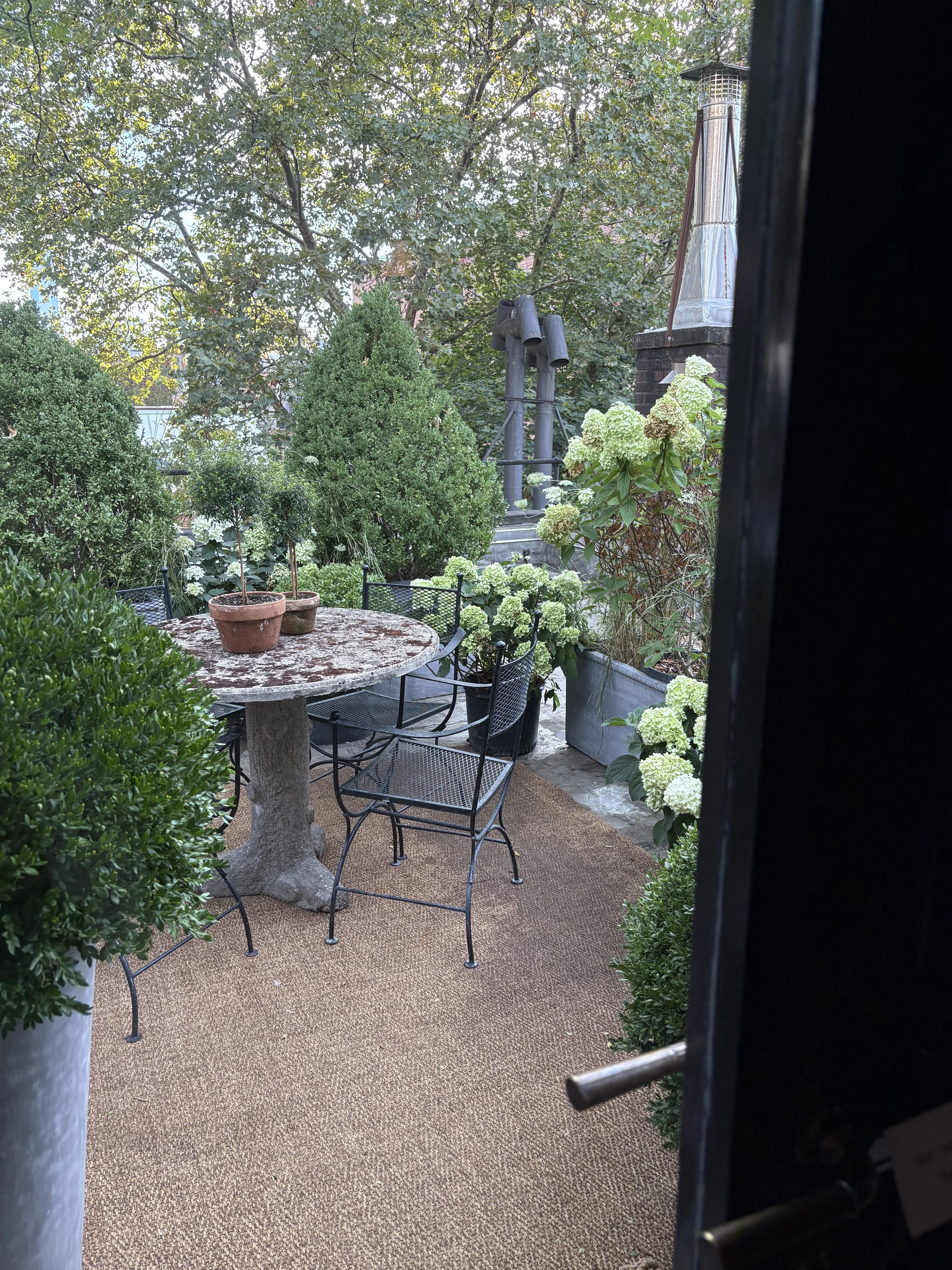
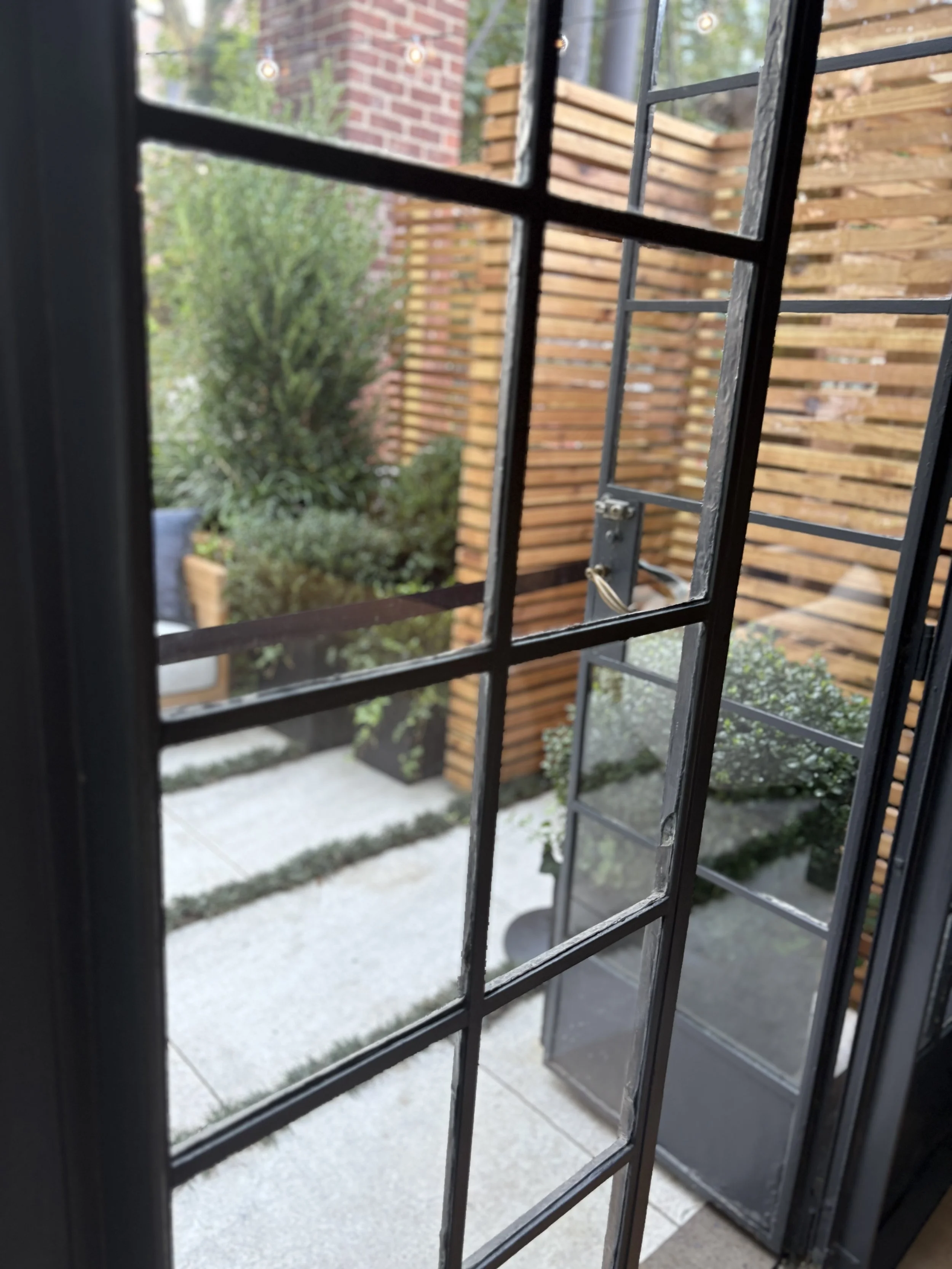
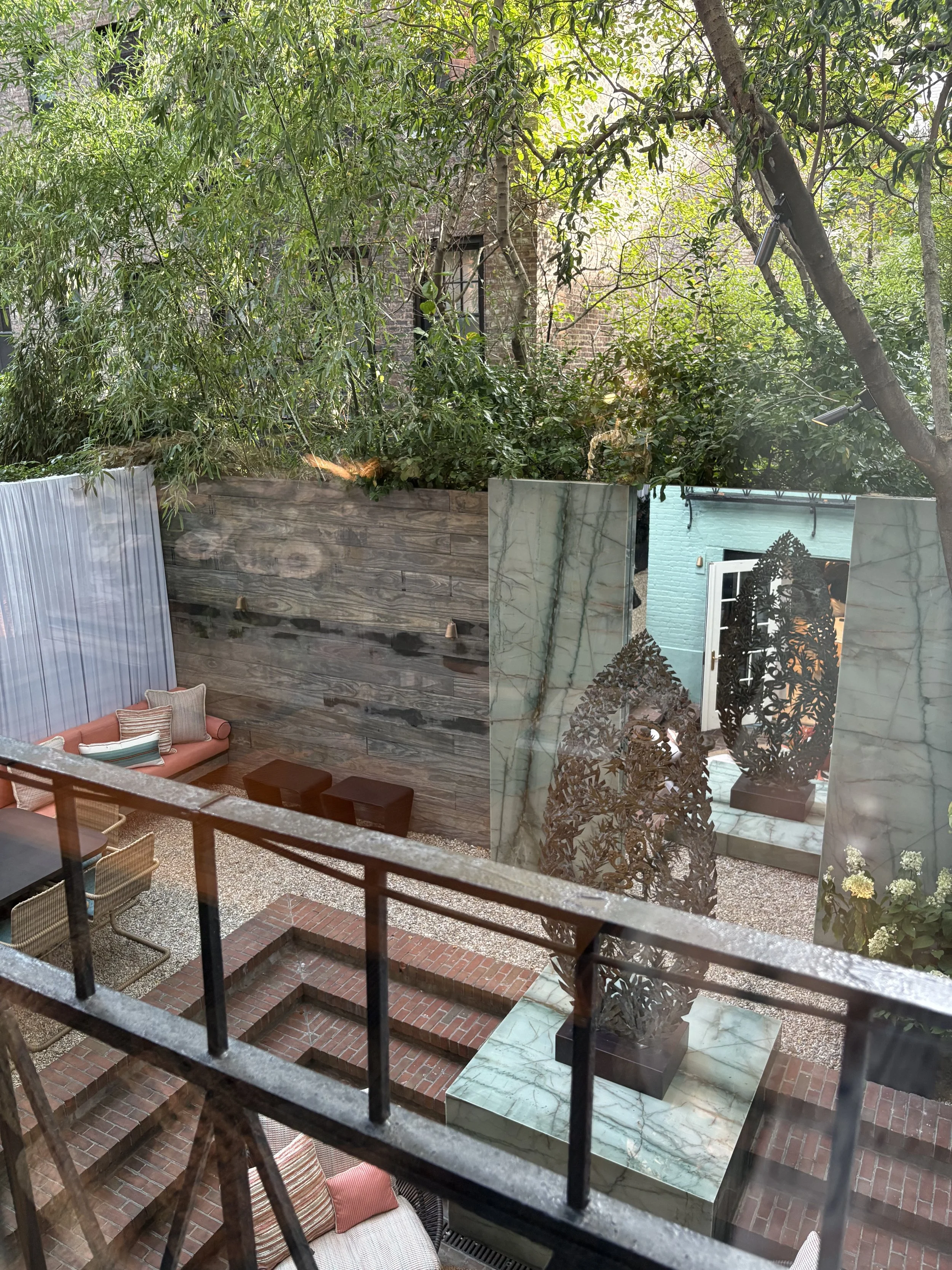
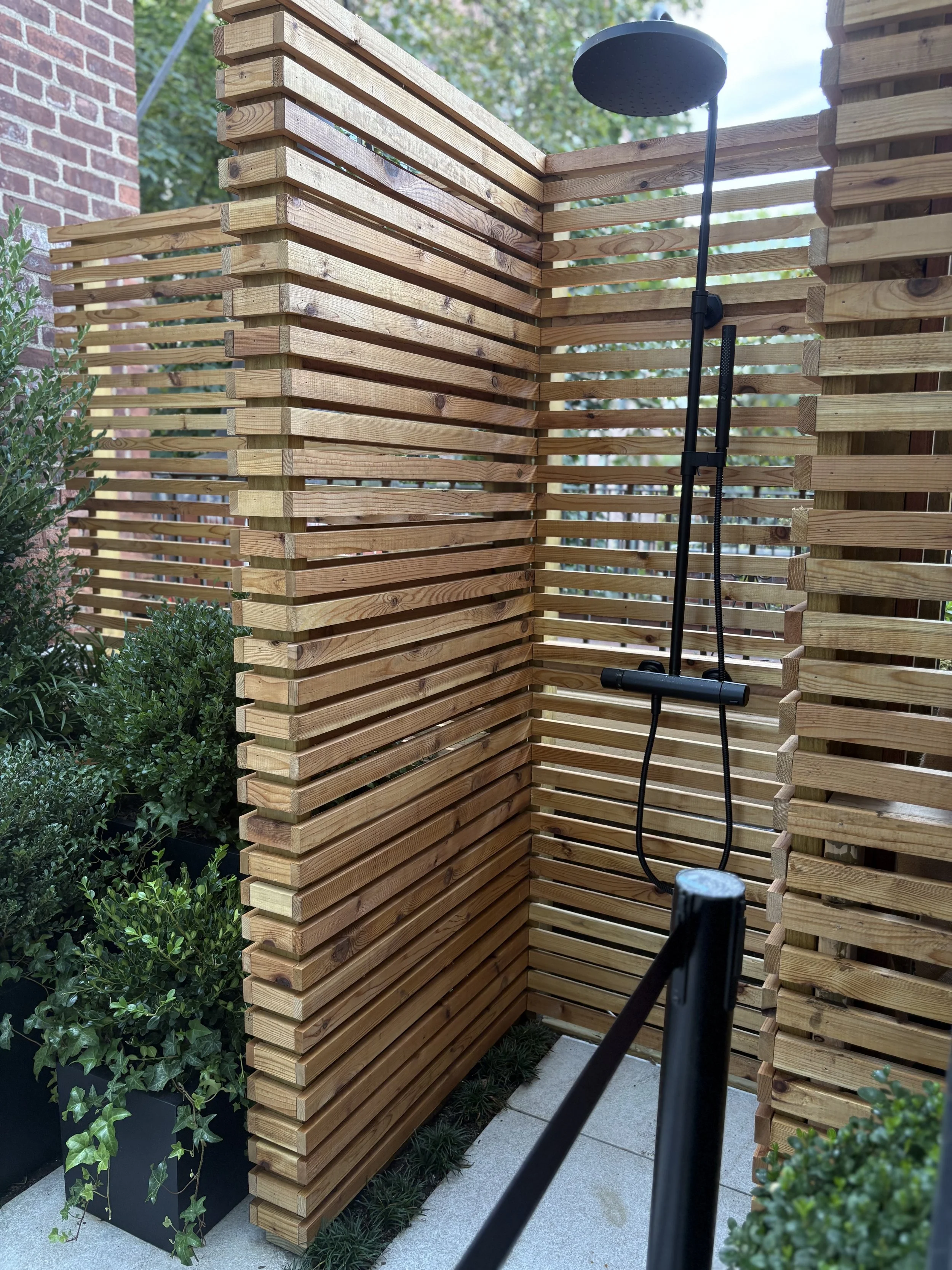
The Showhouse is in one of the fabulous brown townhouses located in our part of town, as well as Brooklyn. This Italianate style features big, long windows, entryways, stoops, and of course terraces ~ offering many garden spots. Here’s a few. I love the one off the bedroom. A cup of tea and a good book on a summer evening before retiring. A shower too!
The big garden is on the lower, ground level, off the kitchen.
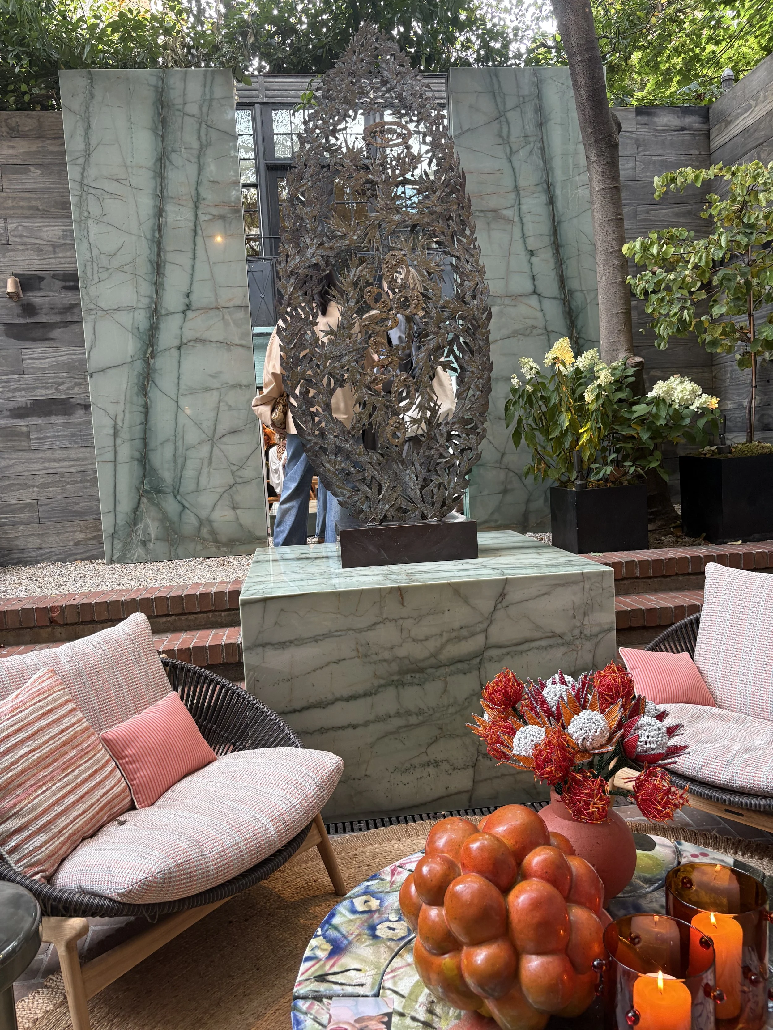
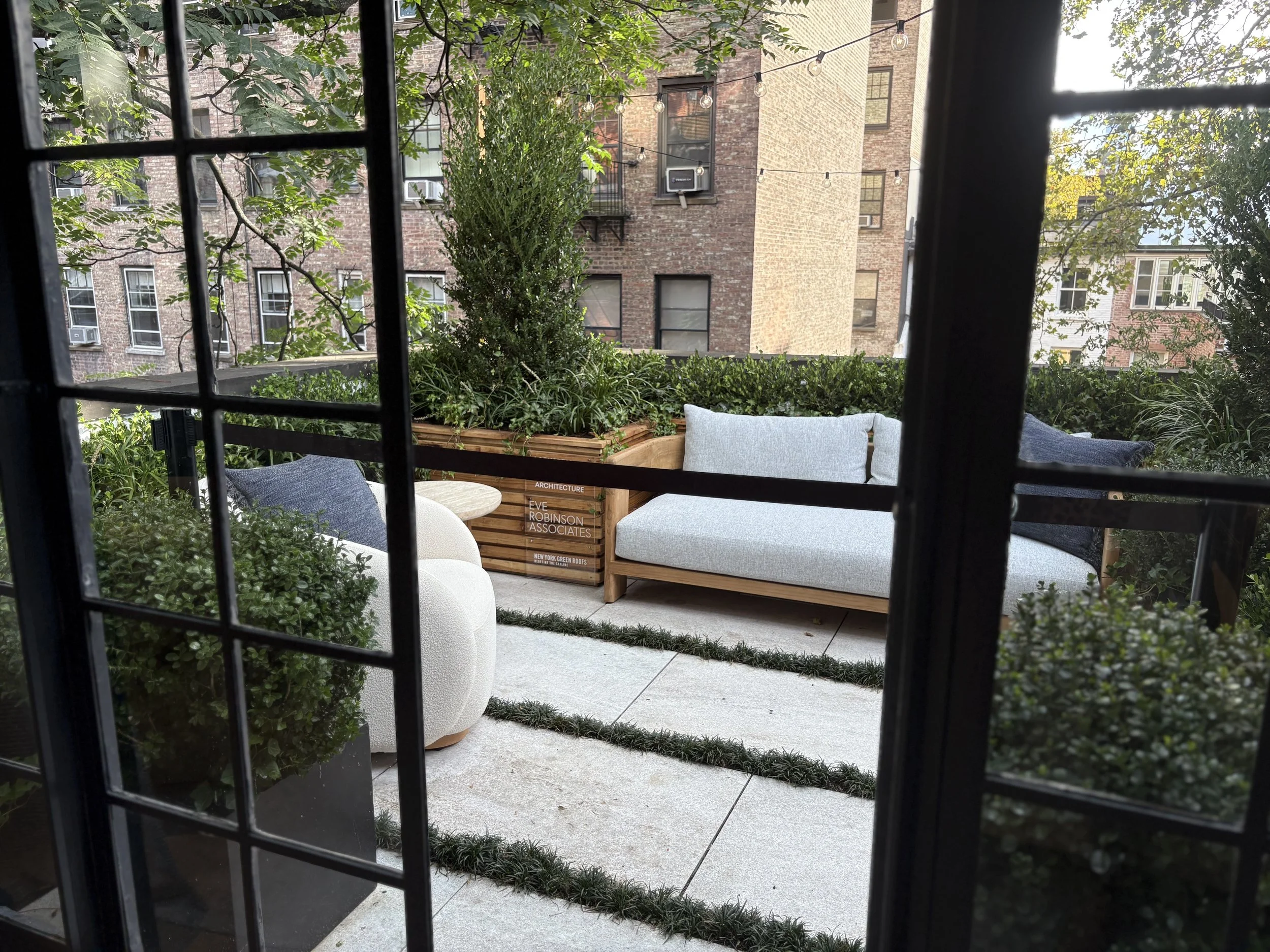
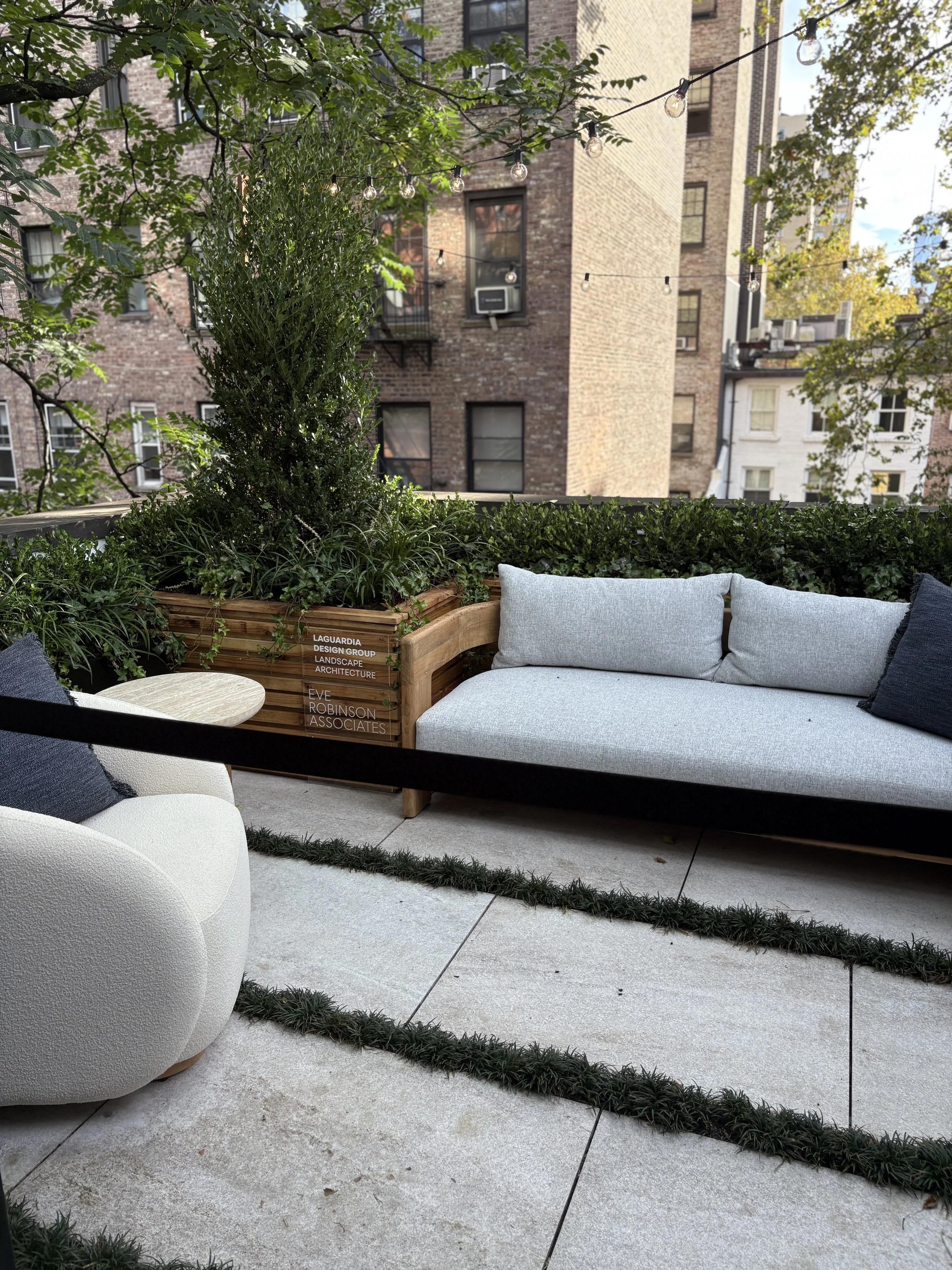
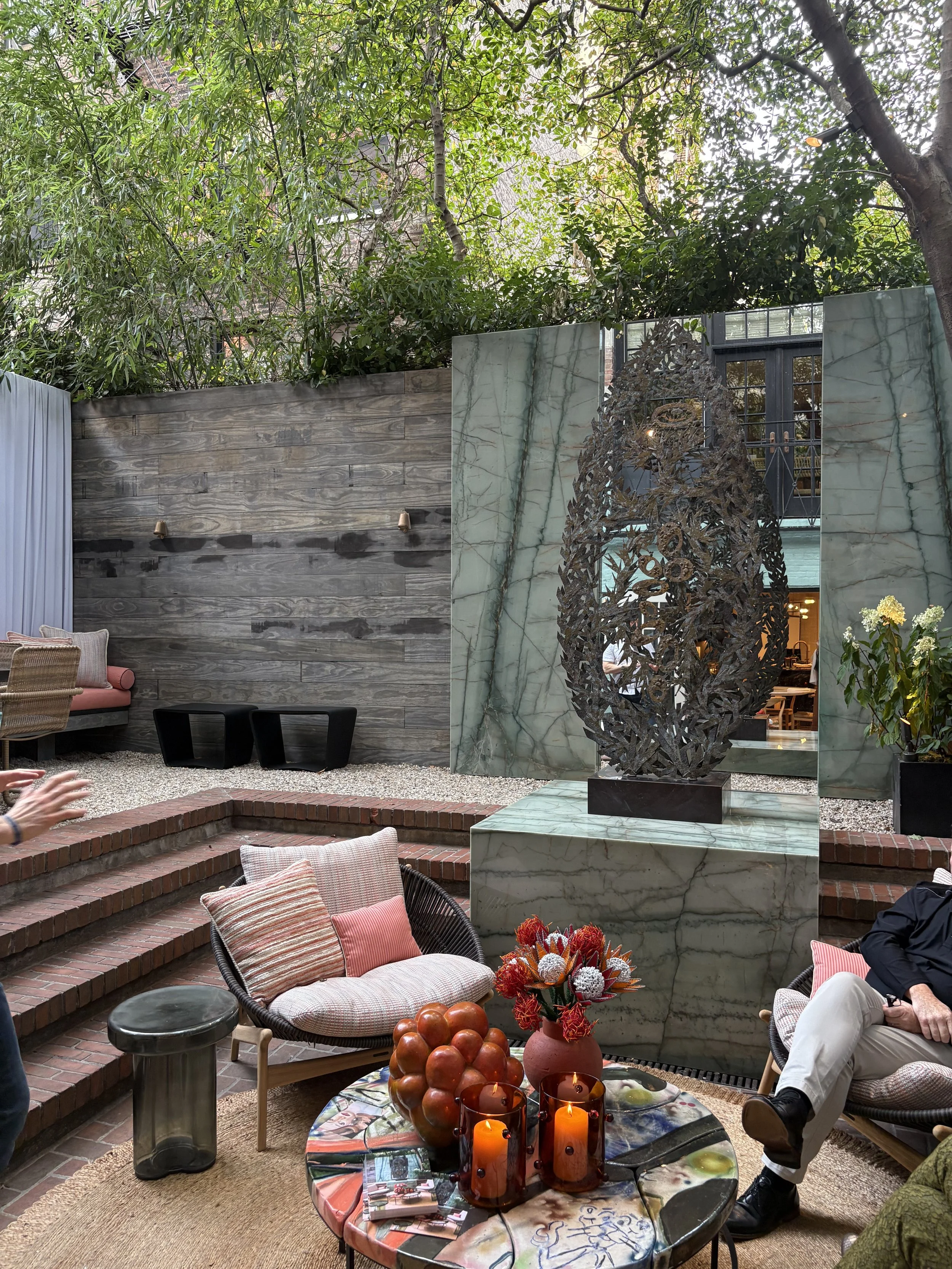
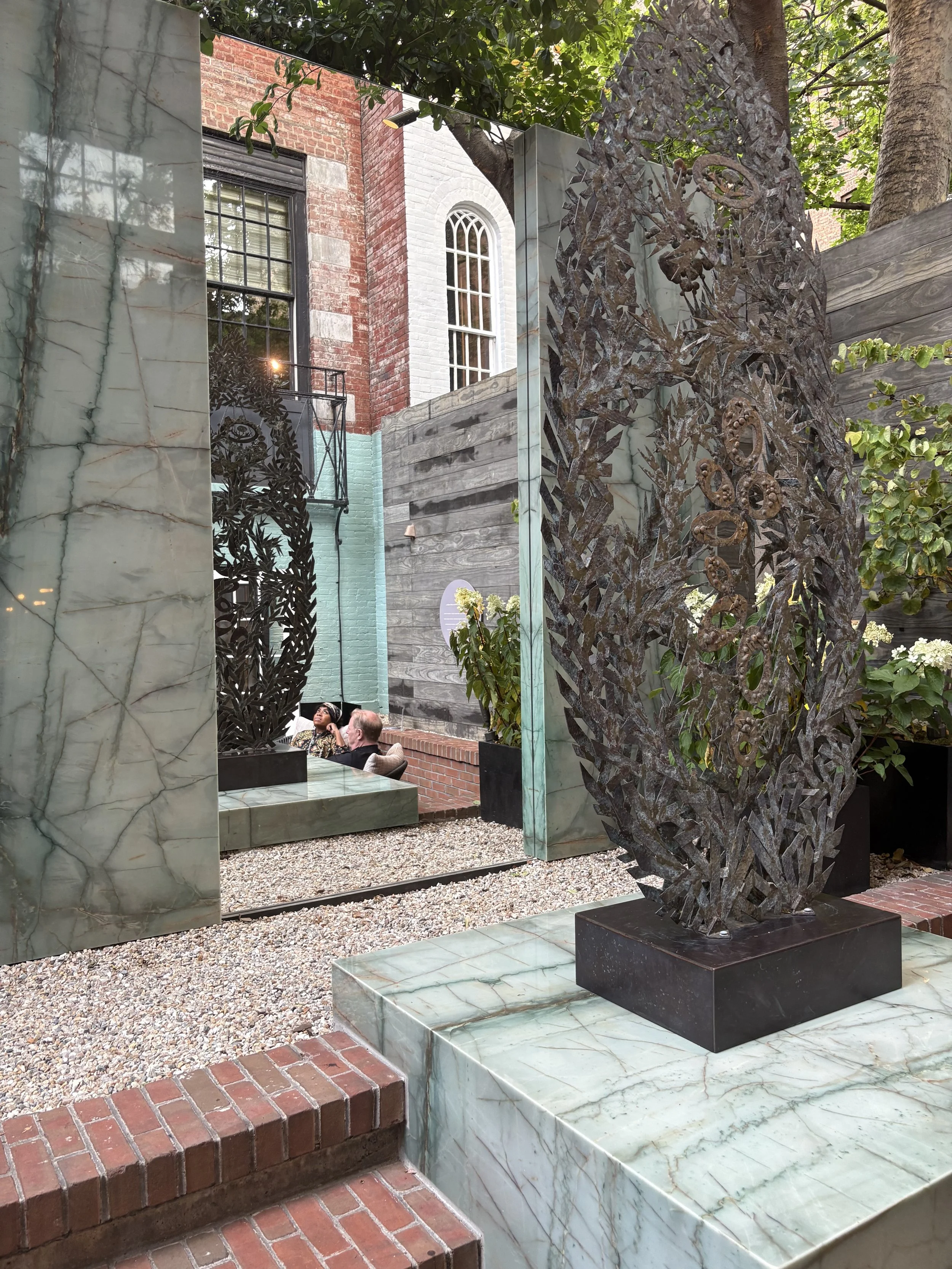
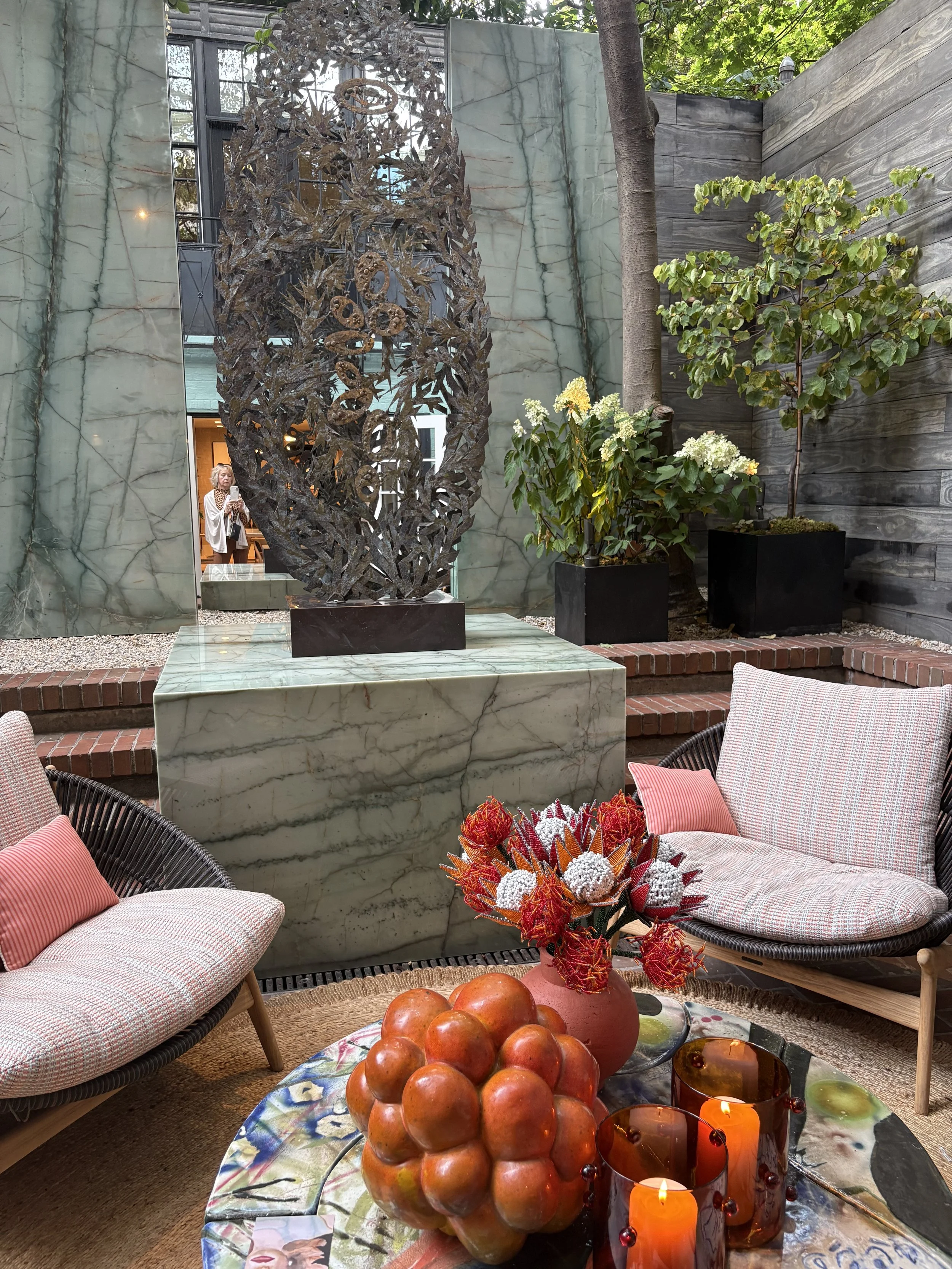
Influenced by the work of designers Ludwig Mies van der Rohe, Louis Kahn and John Saladino, New Yorker Jamie Drake — who has co-chaired the Showhouse for 15 years — took serenity as the central theme of his rear garden. “ We live in times of such intense mental pressure,” he says. “I think you should be able to have a backyard to go out into and breathe deep.”
To provide something to meditate upon, he foregrounded the fine arts. “I love to fill my interior spaces with art and sculpture,” he explains. “I don’t see why you can’t live with art and sculpture outside as well.”
Couldn’t agree more.
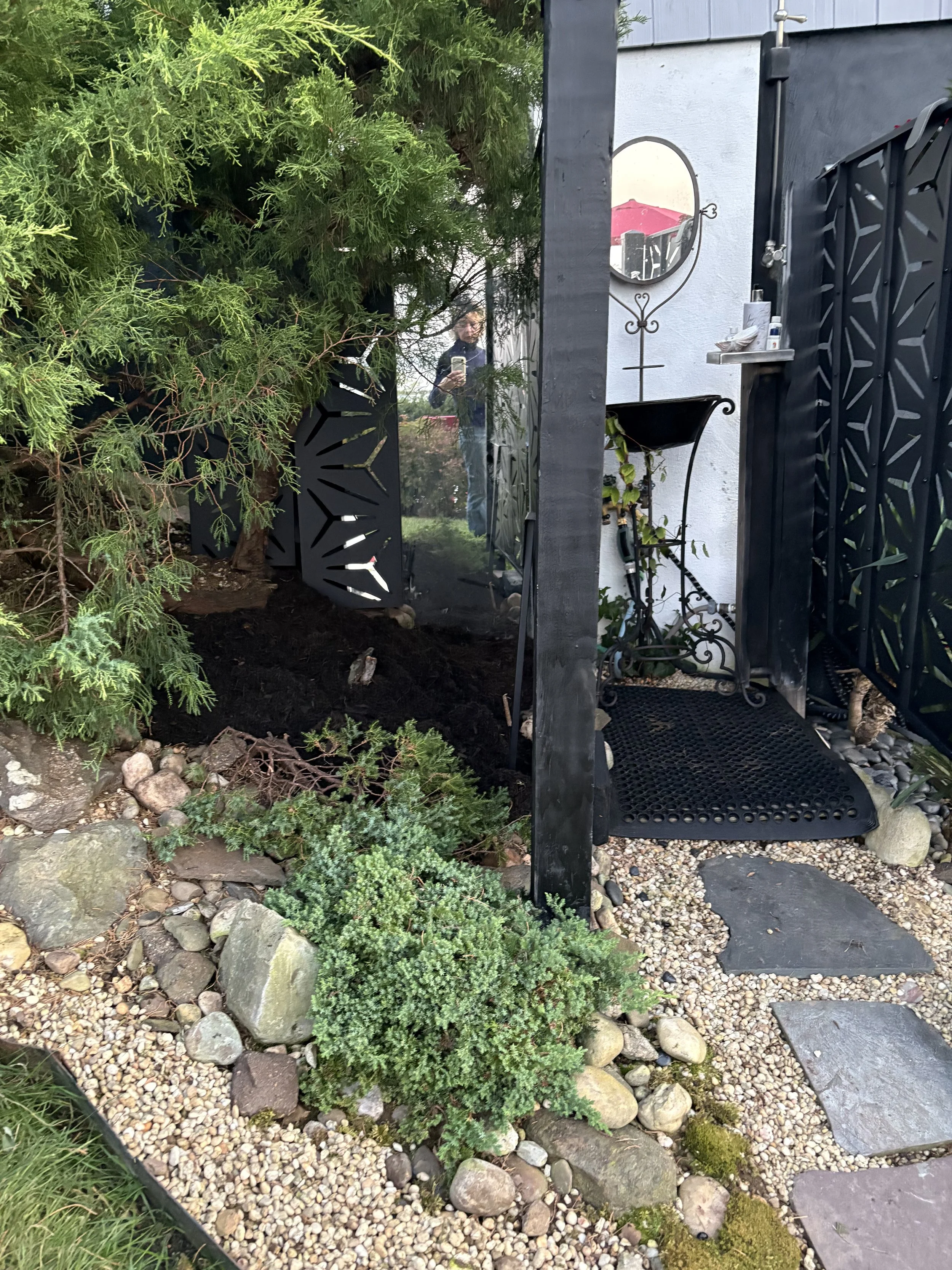
Stepping into the garden space, I couldn’t help but see the mirror behind the sculpture art.
Welllll, I’d like to say “great minds think alike” but I dare not put myself even close to Mr. Drake’s superior design prowess.
But. Still.
The truth is, I really do use mirrors in my gardens!
As far back as (gulp) 2006, I featured this charming mirror composition for a favorite client whose view looked out on the bay and Gotham skyline. It so enchanted author, Caroline Seebohm, that upon seeing it, she declared, “Look, Leeann ~ it is Magritte!) and had Peter Cook photograph it for her book, Cottages and Mansions of the Jersey Shore (I am honored to have two client landscape designs featured in this gorgeous house and garden book.)
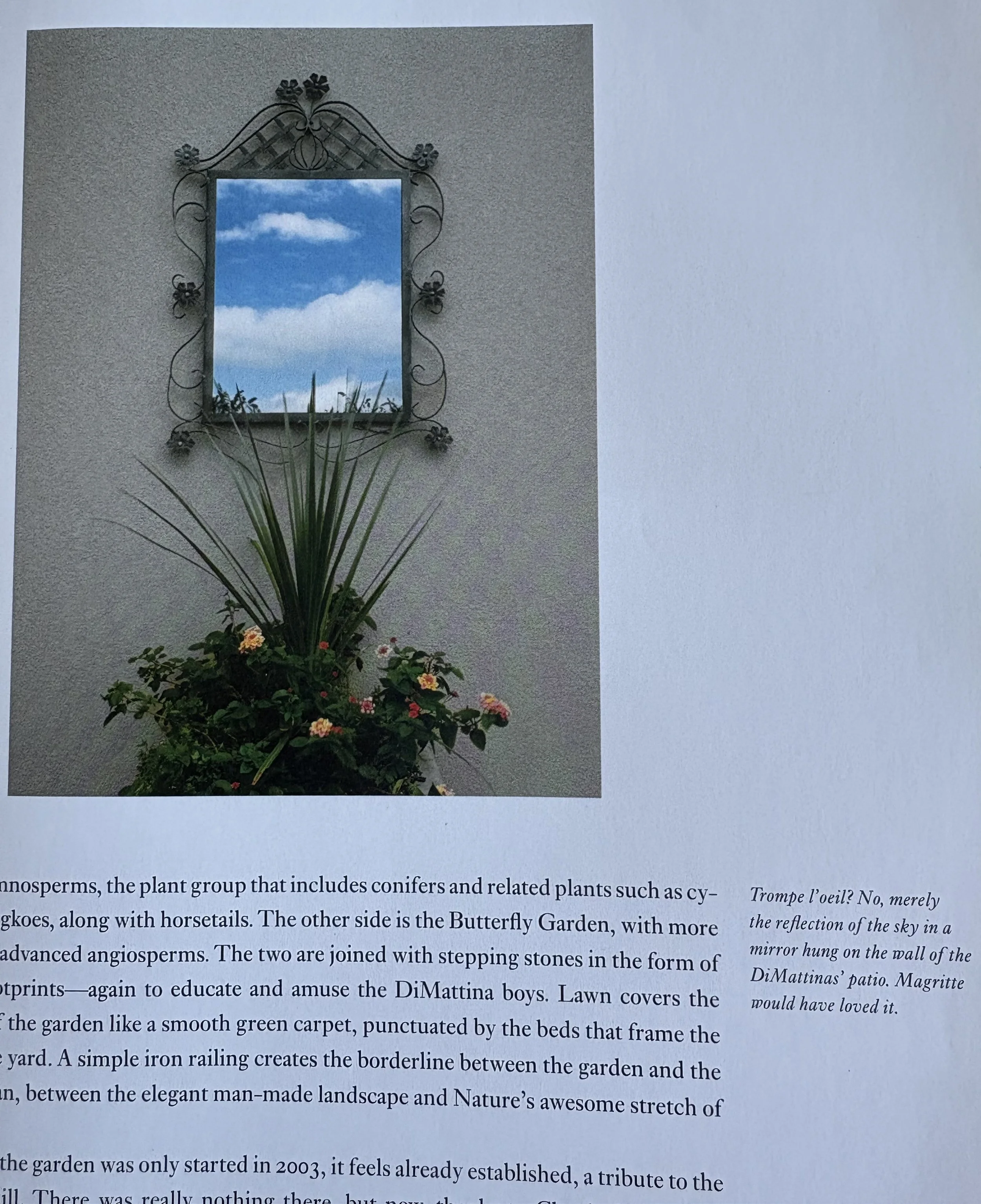
Photo Caption: Trompe l’oeil? No, merely the reflection of the sky in a mirror … Magritte would have loved it.
The most recent “mirror magic” was back at the end of August/early September.
I redesigned a space at our country house next to the outdoor shower in time for the Fall Into Natives Garden tour for our Garden State community and I had the idea to repurpose a very nice mirror that had been tucked away in a corner of our garage and use it in the new garden space, next to the shower, after I removed a dying lilac.
As a garden designer, I have used mirrors in my gardens and in my clients’ gardens to brighten shady areas, to reflect a borrowed landscape ~ to make an impact.
In mythology and legends, mirrors in the garden symbolize wisdom, divinity, and magic ~ connecting the garden to a mystical realm.

When I shared my work-in-progress with my “garden-forward” sister, Sharon, noting I wanted to get a piece of garden art sculpture to place in front of the mirror to amplify the look, she recommended their friend and neighbor, Roger Halligan. Alas, his art couldn't quite work for me for pocketbook and scale reasons, but I’ll find some art that does work. But check out Roger’s work ~ you may find the perfect art sculpture for your garden.
My main point in bringing it up here is to align the exterior garden design of Mr. Drake and moi 🙂to inspire you to add/include outdoor art ~ and mirrors in your garden, as he/we suggests. I’ve discovered some terrific mirrors for the garden at flea markets and garage sales.
Back to the Showhouse.
In one corner of the space, Drake set up his mirrored, artful design with a leafy-looking 1960s Richard Filipowski bronze-and-silver sculpture from Hostler Burrows. (You can see me in the mirror). In front of this, he formed a small seating area by setting 1970s-style teak-and-rope circular lounge chairs from Gloster around a painterly glazed-ceramic-topped Reinaldo Sanguino coffee table.
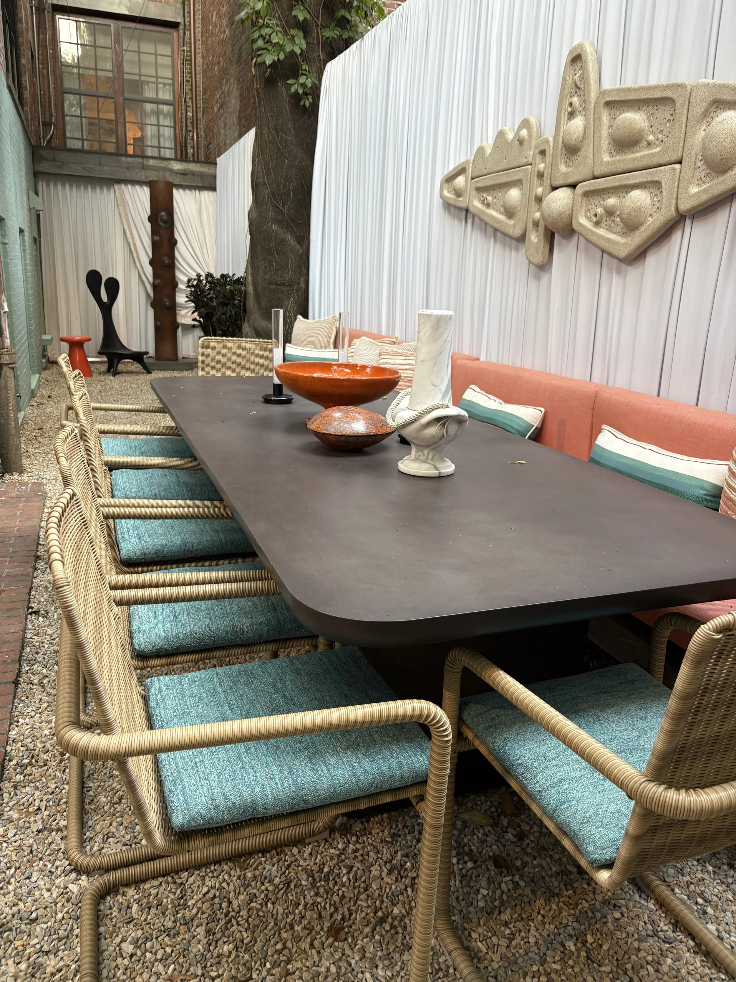
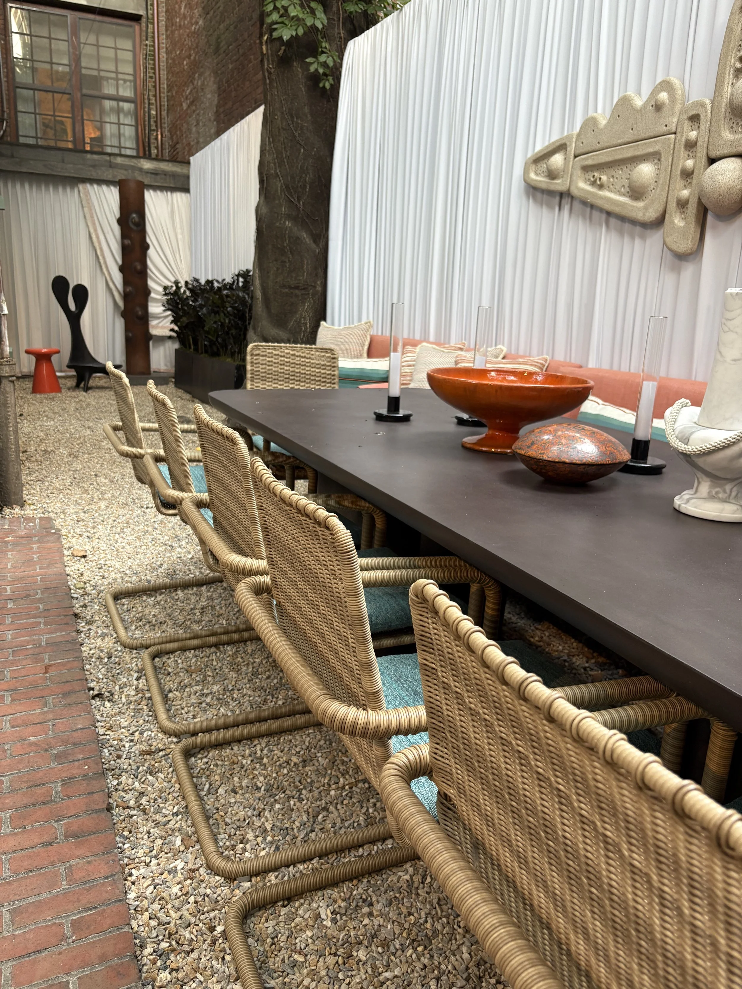
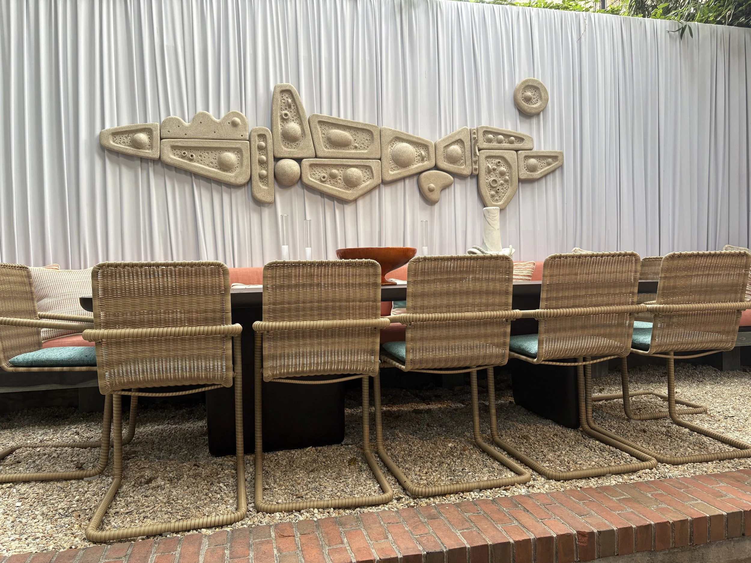
On the upper garden level, the designer adorned the wall behind a long dining table from Made Goods with an abstract contemporary ceramic stoneware sculpture by Carlos Otero. It is also from Hostler Burrows, as is a totemic steel-and-granite Jakob Jørgensen piece with an industrial feel that occupies a small alcove near a playful wavy Pau Hana lounge chair by John Koga.
I loved the garden. Plus, Drake used “our” home colors of blue and tangerine ~ echoing our majestic sunrise and sunset views on the water. What’s not to love?!
The Design Trends
In no particular hierarchy, I noted these design trends:
Hand painted walls
Using the fifth wall ~ the ceiling ~ with high gloss rich jewel toned paints, shimmery gold, wallpaper
Streamlined, Zen-inducing looks for small spaces
Antiqued Glamour
Color ~ Lots of jewel-toned colors. Paired with organic, earthy browns and greens.
Newer, fresher, tromp l’oeil
This trick of the eye creates an artistic depth. In addition to the astonishing Branca wall art portfolio in the Drawing Room, elsewhere in the Show House, Alexa Hampton used a trompe l’oeil mirror by artist Celia Rogge to make a sly statement above the fireplace. And on floors. And had the fireplace wrapped.
Paper wrapping objects. You’ve seen these marbleized designs. Here, in the Showhouse, the wraps were used in a number of rooms, including Hampton’s.
Alexa Hampton enlisted Englehart to devise a fantastical fireplace finished in rich magenta-painted paper, resembling crystal-embedded stone. It’s a brilliant solution for enhancing spaces that might not otherwise support heavier, bulky pieces.
Craftsmanship, stirring imagination and creativity
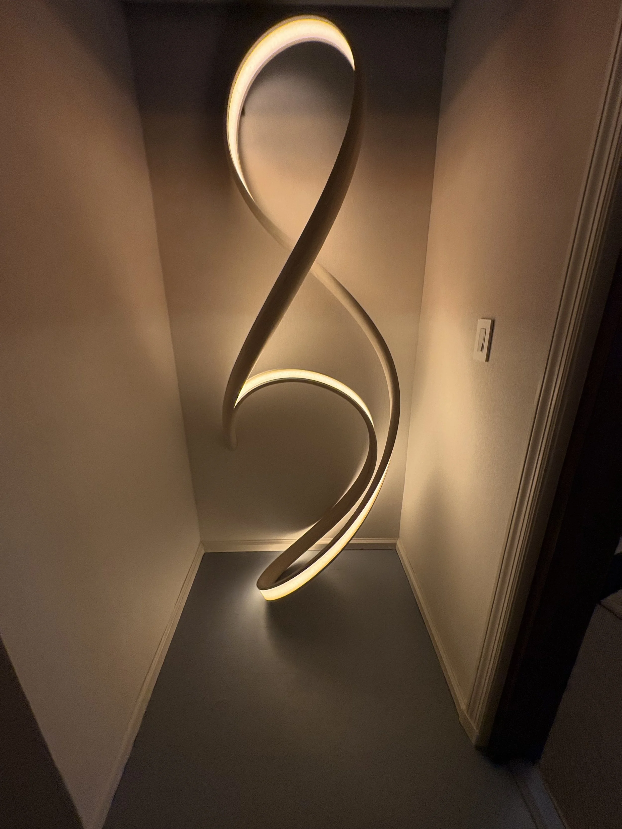
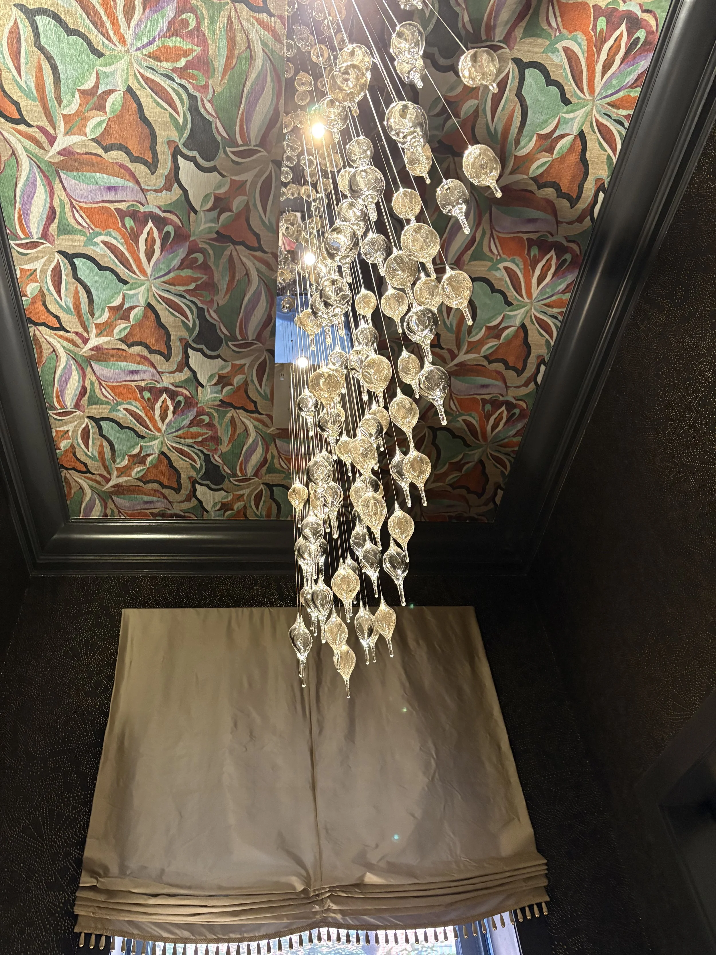
Lighting ~ from the chandelier by Feyza Kemahlioglu to the dripping organic, bulbous shapes to celestial ceiling stars. There are plenty of ideas to steal from these other-worldly spaces. The Showhouse’s lighting on display is a scene-stealing feature in its own right. Think shapes and spatial location that suspends the usual and offers moody, artful colors for ambient, task and accent lighting. Very exciting! I really like the organic shpes and hanging lights ~ in unexpected/new places.


Over the past five decades, this highly anticipated event has become essential for thousands of design enthusiasts. Each year, the nation’s top interior designers transform a luxury Manhattan townhouse into an elegant exhibition showcasing extraordinary designs, fine furnishings, art, and technology. This event has also become the primary fundraiser for the Kips Bay Boys & Girls Club, raising essential funds for after-school and enrichment programs for children.
Hurry to the Show. It closes soon Get tickets to the Kips Bay 2025 Showhouse here
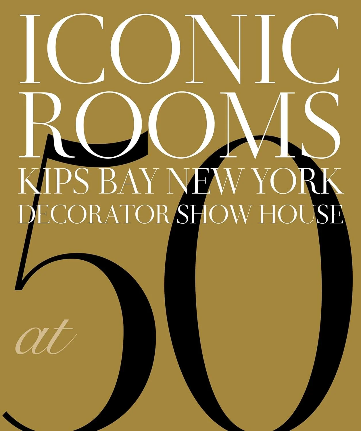
To commemorate this milestone, KBNY has created a special book featuring 175 images of iconic Show House rooms selected from the past 50 years. It honors the remarkable work of its design community and highlights the impact of the Show House in transforming both spaces and lives.
Tonight, a clutch of the celebrated designers were on hand to sign copies of the book, Iconic Rooms: Kips Bay New York Decorator Show House at 50.
You can purchase the book here, or wherever you buy your books.
Cheers to turning 50, Kips Bay ~ to all the good work you do, and for sustaining the art of design and good taste for the last half century. Timeless design is a glamorous luxury we all need. Especially now.